Layout Design: Rules, Grids and Examples for Beginners
Layout design made simple: common layout types, grids, margins and reading patterns, plus a step-by-step method with Indian poster and menu examples.
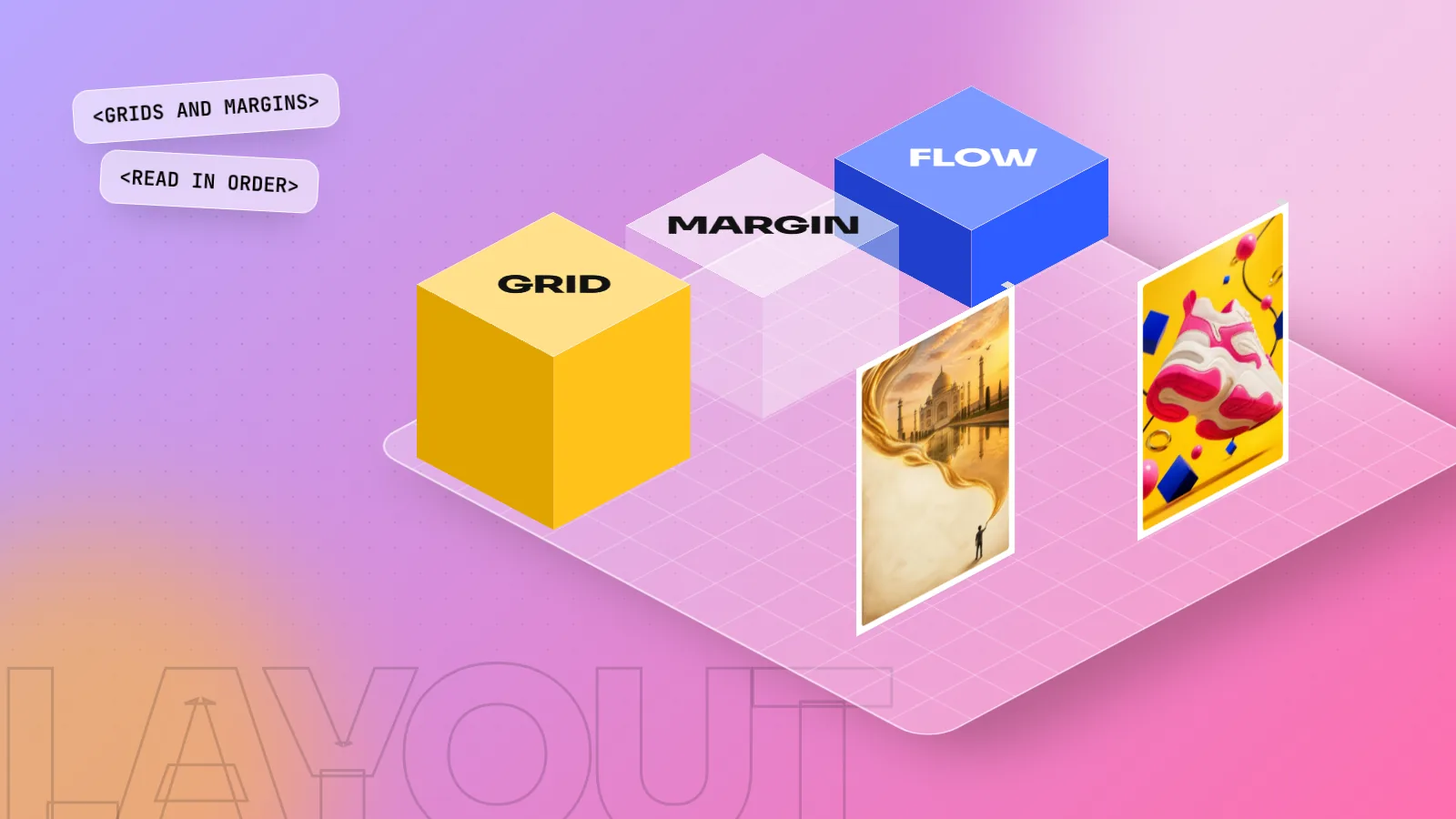
Layout design is the arrangement of text, images and space on a page or screen so people read things in the right order. A good layout uses a grid, consistent margins, a clear hierarchy and enough white space. Start with the one message, pick a grid, place the biggest item first, then align everything else to it.
Layout design is how you arrange text, images and empty space on a page or screen so people understand it quickly and read it in the right order. Every poster, menu, Instagram post, brochure and website has a layout, good or bad. This beginner's guide explains the main layout design types, how grids and margins work, the reading patterns people follow and a step-by-step method you can use on your next project.
What is layout design?
A layout is the plan of a page. It decides where the headline sits, how big the photo is, how much space goes between items and what the eye sees first, second and third.
Think of a mithai shop's Diwali poster. It has a headline, a photo of sweets, an offer, the address and a phone number. The same five items can look calm and clear, or crowded and confusing. The difference is the layout, not the content.
Good layout design does three jobs:
- Makes the message clear in the first two seconds.
- Guides the eye from the most important item to the least important.
- Feels organised, so the brand looks trustworthy.
Layout uses the core ideas covered in our guide to the principles of graphic design, especially hierarchy, alignment, proximity and white space.
The building blocks of a layout
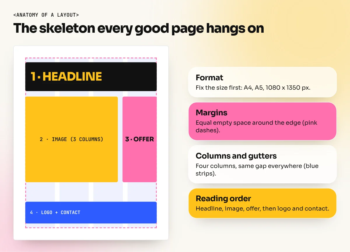
Before you place anything, set up these parts. They are the skeleton every good layout hangs on.
| Part | What it is | Beginner rule |
|---|---|---|
| Format | The page size and shape: A4, A5 leaflet, 1080 x 1350 px social post | Fix it first, never change it halfway |
| Margins | Empty space around the edge | Equal on all sides to start, bigger at the bottom for a classic look |
| Columns | Vertical strips that hold text and images | 2 to 4 for posters, more for magazines and websites |
| Gutters | The gap between columns | Keep the same gap everywhere |
| Baseline grid | Invisible lines text sits on | Helps text line up across columns |
| Safe zone | Area away from the trim edge | Keep text at least 5 mm inside for print |
| Bleed | Extra image area past the trim edge | Usually 3 mm for print |
The standard A4 size (210 x 297 mm) comes from the international ISO 216 paper standard, which India also uses. That is why most office brochures and letterheads start there.
Grids: the secret behind clean layouts
A grid is a set of lines that divides the page into columns and rows. You do not see it in the final design, but you feel it, because everything lines up.
The Swiss designer Josef Müller-Brockmann wrote a famous book, "Grid Systems in Graphic Design", that showed how grids bring order to posters, books and corporate design. Designers still use the same ideas today in InDesign, Figma and website code.
Common grid types:
- Manuscript grid: one big text block. Used for books and long reports.
- Column grid: two or more columns. Used for magazines, brochures and newspapers.
- Modular grid: columns plus rows, making boxes. Used for catalogues, menus and product sheets.
- Hierarchical grid: areas sized by importance rather than equal columns. Used for websites and complex posters.
A simple tip: if two items are close but not lined up, either line them up exactly or move them clearly apart. "Almost aligned" looks like a mistake.
8 common layout types (with examples)
You will see these layouts again and again. Learn to spot them and you can borrow the right one for each brief.
| Layout type | How it looks | Good for |
|---|---|---|
| Single column | One stack from top to bottom | Instagram posts, invitations, simple flyers |
| Multi-column | Text and images in 2 to 4 columns | Brochures, newsletters, magazines |
| Modular (boxes) | A neat grid of equal blocks | Restaurant menus, product catalogues |
| Big image (full bleed) | One photo fills the page, text on top | Fashion ads, travel posters |
| Symmetrical / centred | Everything balanced on a centre line | Wedding cards, formal invitations, premium brands |
| Asymmetrical | Unequal sides, still balanced | Modern posters, tech brands |
| Z-pattern | Eye moves top left, top right, diagonal, bottom | Ads and landing pages with little text |
| F-pattern | Eye scans across the top then down the left | Text-heavy web pages and articles |
The F-pattern comes from eye-tracking research published by the Nielsen Norman Group, which found that people often scan web text in an F shape. That is why headings and the first words of each paragraph matter so much on screens.
How to design a layout step by step
Use this method for any poster, post or page. It works whether you use InDesign, Illustrator, Photoshop or Canva.
- Write the one message. For example: "Flat 30% off Diwali sweets this weekend." Everything else supports this line.
- List your content in order of importance. Headline, photo, offer, details, logo, contact.
- Fix the format. A4 leaflet, 1080 x 1350 px post, 6 x 3 ft flex banner. Set margins and bleed now.
- Pick a grid. Three or four columns is a safe start for most single-page work.
- Place the biggest item first. Usually the photo or the headline. Give it real size.
- Add the rest along the grid. Align left edges and tops. Group related items close together.
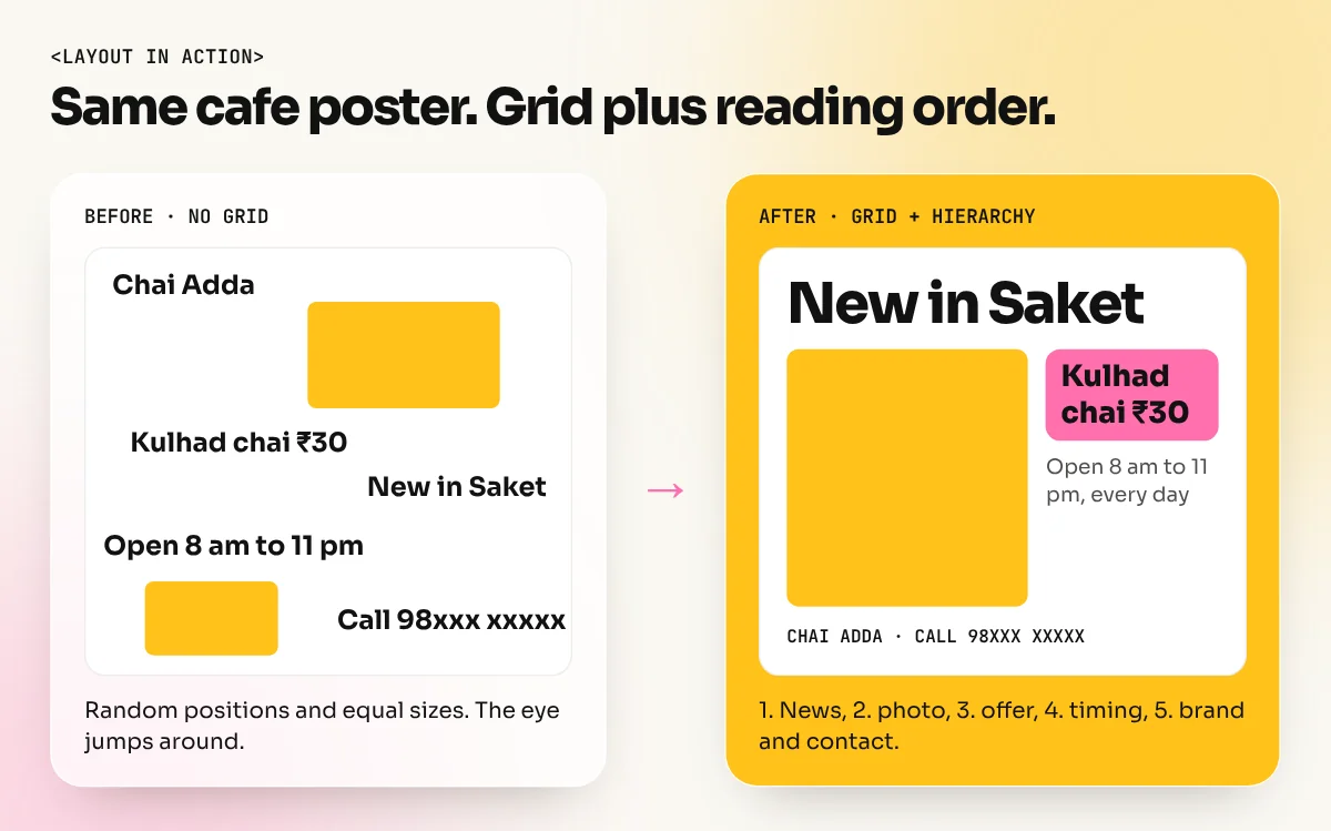
- Check the reading order. Squint at the design. The order you notice things should match your list from step 2.
- Add white space, not more stuff. If it feels crowded, remove or shrink something.
- Test at real size. Print the leaflet or view the post on a phone. Small text that looked fine on a big screen often fails here.
Layout design for print vs screen
The same principles apply everywhere, but each medium has its own rules.
| Point | Print (leaflets, brochures, hoardings) | Screen (posts, websites, apps) |
|---|---|---|
| Units | Millimetres, points | Pixels |
| Colour mode | CMYK | RGB |
| Extra space | Bleed and safe zone | Space for app buttons and captions |
| Text size | Readable from the expected distance | Readable on a phone screen |
| Final file | Print-ready PDF | PNG, JPG or web code |
| Common tool | InDesign, Illustrator, CorelDraw | Figma, Photoshop, Canva |
For a hoarding seen from a moving car, the layout must be even simpler: one image, a few words, a big logo. For a magazine page read slowly, you can use more columns and smaller text.
Common layout mistakes and quick fixes
| Mistake | Quick fix |
|---|---|
| Everything the same size | Make the headline at least twice the size of body text |
| Too many fonts | Use one font family, or two at most |
| Items "almost" aligned | Turn on the grid and snap to it |
| Text touching the page edge | Keep a margin all around |
| No breathing room | Remove one item or reduce the photo |
| Logo fighting the headline | Move the logo to a corner and make it smaller |
Learn layout design properly
Layout is a skill you build with practice and feedback. Start by redesigning real things around you: a local cafe menu, your society notice board flyer, a coaching centre pamphlet. Put the before and after in your portfolio. If you are new to the field, our guide on what graphic design is explains where layout fits among all the other design jobs.
In our 6-month graphic design diploma you practise layout on real briefs: posters, menus, brochures and social campaigns, with a trainer checking every grid. For multi-page work, the InDesign course covers master pages, paragraph styles and print-ready PDFs.
The bottom line
Layout design is not decoration. It is the plan that makes people read your design in the right order. Fix the format and margins, use a grid, place the biggest item first, line everything up and leave enough white space. Do that on every project and your work will look professional even before you add colour and images.
Frequently asked questions
What is the difference between layout and composition?
The words are often used for the same thing. Composition usually means how parts are arranged in one image or artwork. Layout usually means arranging text, images and space on a page, poster or screen, often with a grid.
Which software is best for layout design?
Adobe InDesign is the standard for multi-page layouts such as brochures, magazines and books. Illustrator and Photoshop work well for single posters and ads. Canva is fine for quick social posts. Figma is used for app and website layouts.
How many columns should a layout grid have?
For posters and social posts, 2 to 4 columns are usually enough. Magazines and websites often use 6 or 12 columns because these divide in many ways. Choose the fewest columns that let you place your content cleanly.
What are common layout design mistakes?
Too many fonts, items that almost line up but not quite, margins that change from page to page, text set right to the edge of the page and every item made the same size so nothing stands out.