12 Principles of Graphic Design (With Indian Ad Examples)
The 12 principles of graphic design explained simply: balance, contrast, hierarchy, alignment, white space and more, with Indian ad examples and a checklist.
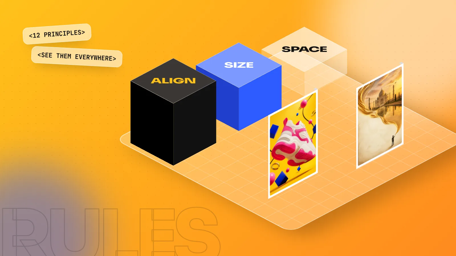
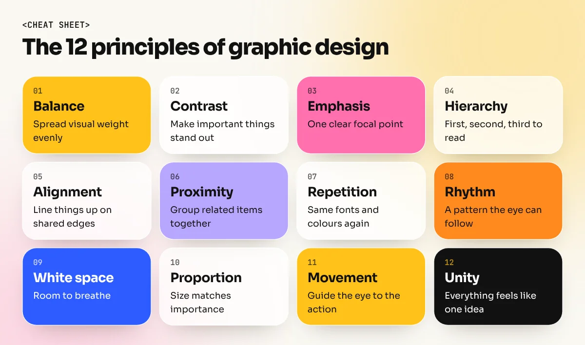
The principles of graphic design are the rules that decide how the parts of a design work together. The 12 most useful are balance, contrast, emphasis, hierarchy, alignment, proximity, repetition, rhythm, white space, proportion, movement and unity. Use them to make any poster, post or ad clear, easy to read and pleasing to look at.
The principles of graphic design are the rules that decide how text, images, colour and shapes work together on a page. Learn them and your posters, posts and ads start to look planned instead of crowded. The 12 principles of graphic design in this guide are balance, contrast, emphasis, hierarchy, alignment, proximity, repetition, rhythm, white space, proportion, movement and unity. For each one you get a simple meaning, an everyday Indian example and a quick fix you can try today.
Why design principles matter
A design can use a lovely photo, a good font and brand colours and still fail. Usually the problem is not the parts. It is how the parts are arranged.
Principles give you a way to check your own work. Instead of saying "something feels off", you can say "the headline and the offer are the same size, so nothing stands out". That is a problem you can fix.
They also help you talk to clients. "I made the price bigger so it is the first thing people read" is a much stronger reason than "I liked it this way".
One note before we start: there is no single official list. Some books name five principles, some name fourteen. The ideas below are the ones that come up in almost every list and in almost every real project. If you are completely new to the field, first read our guide on what graphic design is, then come back here.
Principles 1 to 4: balance, contrast, emphasis and hierarchy
1. Balance
Balance is how visual weight is spread across the design. Big, dark or bright things feel heavy. Small, light or pale things feel light.
- Symmetrical balance: both halves mirror each other. Wedding cards and temple-style festive posters often use it because it feels formal and calm.
- Asymmetrical balance: different items balance each other, like a large photo on the left and a block of text plus a logo on the right. It feels more modern and lively.
Quick fix: squint at your design. If one side looks like it might tip over, move or resize something.
2. Contrast
Contrast is difference: dark against light, big against small, bold against thin, warm against cool. Without contrast, nothing stands out and text becomes hard to read.
Think of a yellow and black "SALE" board outside a shop in Karol Bagh. You can read it from across the road because the contrast is strong.
Quick fix: never put light grey text on a white background or dark text on a busy photo. Add a solid band of colour behind the text if needed.
3. Emphasis
Emphasis is the one thing you want people to notice first. In a food delivery ad it might be the dish. In a sale poster it is the discount.
Quick fix: decide the single most important item before you design. Make it the biggest, boldest or brightest thing on the page. Only one item gets this treatment.
4. Hierarchy
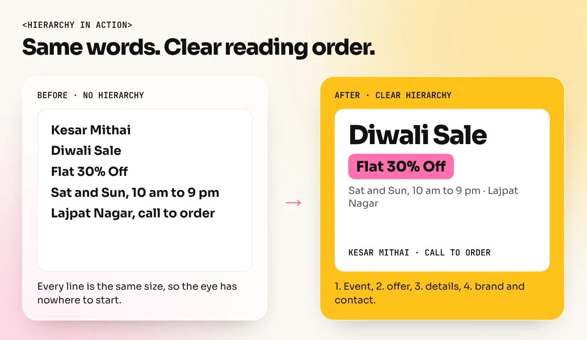
Hierarchy is the reading order: first, second, third. A good event poster usually reads in this order:
- Event name
- Date and place
- Short details
- Contact, QR code or logo
You create hierarchy with size, weight, colour and position. If everything is bold, nothing is bold.
Quick fix: use no more than three text sizes on a poster. One large, one medium, one small.
Principles 5 to 8: alignment, proximity, repetition and rhythm
5. Alignment
Alignment means lining things up along shared edges or a shared centre. It is the quickest way to make a layout look professional.
Many local flyers place every line at a slightly different position. They look homemade. A flyer where every text block starts from the same left edge looks clean, even with simple fonts.
Quick fix: turn on guides or a grid in Photoshop, Illustrator or InDesign and snap every item to them.
6. Proximity
Proximity means keeping related items close together and unrelated items apart. On a restaurant menu, a dish name, its description and its price belong together. A gap then separates it from the next dish.
Quick fix: group information into clear blocks and leave more space between blocks than inside them.
7. Repetition
Repetition is using the same colours, fonts, shapes or styles again and again. It builds recognition and makes a set of designs feel like one family.
Amul's topical hoardings are a well-known Indian example. For decades they have kept the same mascot, the same type of short pun and the same logo placement. People know the brand before they read the line. The Delhi Metro does something similar by repeating each line's colour on maps, signs and platform boards.
Quick fix: in a carousel or a set of social posts, fix your fonts, colours and logo position before you start and keep them the same on every slide.
8. Rhythm
Rhythm is repetition with a pattern, like a beat in music. Regular rhythm feels calm, such as product photos in an even grid. Alternating rhythm feels lively, such as a photo, then text, then a photo again.
Quick fix: on a brochure spread or an Instagram grid, plan the pattern across all pieces, not just one at a time.
Principles 9 to 12: white space, proportion, movement and unity
9. White space
White space, also called negative space, is the empty area around and between items. It does not have to be white. It is the breathing room that makes the important parts easy to see.
Premium brands often use lots of empty space on purpose, because space feels expensive and calm. A cluttered discount flyer feels cheap partly because every gap is filled.
Quick fix: when a design feels crowded, remove something instead of shrinking everything.
10. Proportion and scale
Proportion is how big items are compared with each other. Scale can create drama: a huge product with tiny text beside it says "look at this". Wrong proportion, such as a logo bigger than the product, confuses the message.
Quick fix: check that the size of each item matches its importance in the message.
11. Movement
Movement is the path the eye follows. Lines, arrows, a person's gaze in a photo, or the direction of a car all pull the eye somewhere. In English and Hindi both, people read left to right and top to bottom, so most layouts start top left and end with the call to action at the bottom right.
Quick fix: if a model in your photo looks out of the page, flip the photo so they look towards your headline.
12. Unity
Unity is the feeling that everything belongs together. It comes from the other eleven principles working at once: consistent colours, aligned items, clear grouping and one strong focus. A design with unity feels like one idea, not a collage of parts.
Quick fix: remove any item that does not support the main message, even if you like it.
Elements vs principles: a quick comparison
Beginners often mix these two ideas up. The difference is simple.
| Elements of design | Principles of design | |
|---|---|---|
| What they are | The ingredients | The recipe |
| Examples | Line, shape, colour, texture, type, space | Balance, contrast, hierarchy, unity |
| Question they answer | What am I using? | How am I arranging it? |
| Kitchen example | Tea leaves, milk, sugar, ginger | How much of each and in what order |
You need both. Great ingredients with no recipe give you a mess. A good recipe with poor ingredients gives you a weak result.
Common mistakes and how to fix them
| Mistake | Principle broken | Fix |
|---|---|---|
| Five or more fonts on one poster | Unity, repetition | Use two fonts at most |
| Headline and offer the same size | Hierarchy, emphasis | Make one clearly bigger |
| Text placed randomly | Alignment | Snap everything to a grid |
| Every corner filled | White space | Remove the least important item |
| Logo bigger than the product | Proportion | Resize to match importance |
| Light text on a busy photo | Contrast | Add a colour band or darken the photo |
| Each social post in a new style | Repetition, unity | Make a simple template and stick to it |
How to practise the principles of design
Reading about principles is the easy part. Seeing them takes practice. Try this simple weekly routine:
- Collect. Photograph five ads, menus or packets you see this week.
- Name. For each one, write which principles it uses well and which it breaks.
- Redesign. Pick the weakest one and rebuild it in Photoshop or Canva, fixing only hierarchy and alignment.
- Compare. Put the old and new versions side by side and ask a friend which one they read faster.
- Repeat. Do one redesign a week. In three months you will notice a big change.
Our guide on how to learn graphic design shows where this kind of practice fits into a full learning plan.
Principles are also the first thing a good course should teach, before any software shortcuts. In our 6-month graphic design diploma, students apply them to real briefs every week, from posters and packaging to social campaigns. If you have just finished school, the graphic design course after 12th starts from these same basics.
The bottom line
The principles of graphic design are not strict laws. They are tested habits that help people understand your design quickly. Start with hierarchy, alignment and contrast, because fixing those three improves almost any layout. Add the others one by one. Once they become automatic, you can break them on purpose and your work will still look intentional.
Frequently asked questions
How many principles of graphic design are there?
There is no single official number. Different books list between 5 and 14. Most lists share the same core ideas: balance, contrast, emphasis, alignment, repetition, white space and unity. This guide covers 12 that beginners use every day.
What is the difference between elements and principles of design?
Elements are the raw ingredients: line, shape, colour, texture, type and space. Principles are the rules for arranging those ingredients, such as balance and contrast. Elements are what you use; principles are how you use them.
Which design principle is the most important?
Hierarchy is the one most beginners get wrong, so it often makes the biggest difference. If the viewer cannot tell what to read first, the design fails even if the colours look good.
Can I break the principles of design?
Yes, once you understand them. Experienced designers break a rule on purpose to grab attention. Beginners usually break them by accident, which just makes the design look messy.