Leaflet and Pamphlet Design: Step-by-Step Guide with Print Tips
Leaflet design made simple: sizes, folds, layout, colour and the print checks that stop costly mistakes. A step-by-step pamphlet guide with Indian examples.
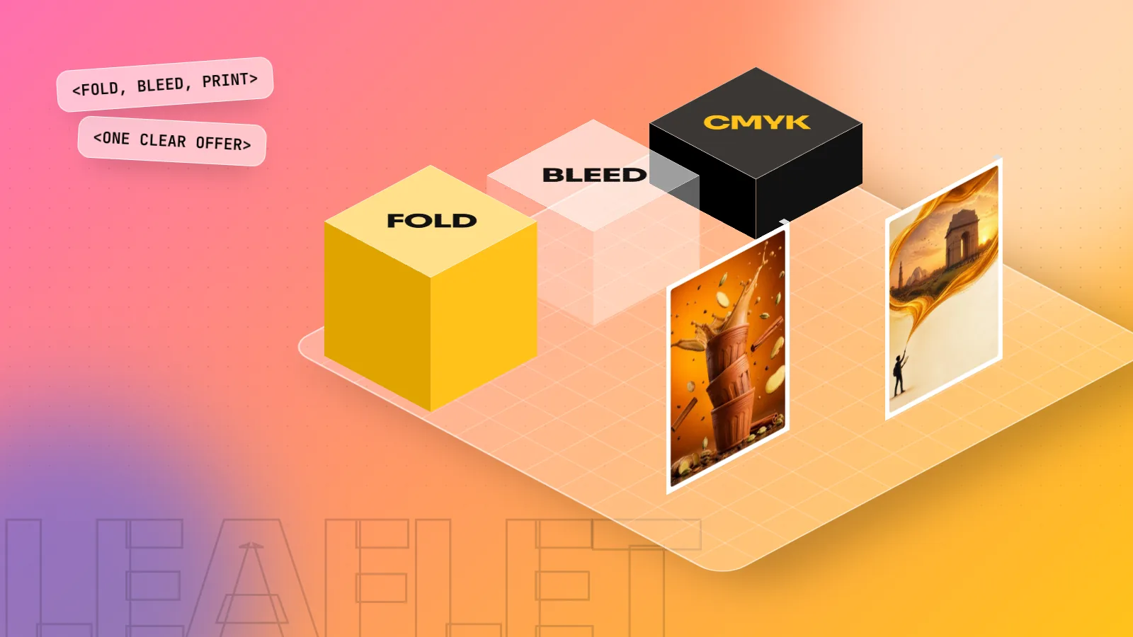
Good leaflet design starts with one goal and one offer. Pick the size and fold first, set 3 mm bleed and safe margins, then place a bold headline, one strong image, short benefit points and a clear call to action with phone, WhatsApp and address. Design in CMYK at 300 ppi and export a print-ready PDF.
Leaflet design is the planning of a single printed sheet, flat or folded, that tells people about one offer and makes them act on it. Coaching centres, clinics, restaurants, gyms and new shops in every Indian market still hand out leaflets and pamphlets every day, because they are cheap and they work locally. This step-by-step guide covers sizes, folds, layout, colour, type and the print checks that save you from a costly reprint.
Leaflet, pamphlet, flyer and brochure: what is the difference?
People use these words loosely. A printer in Chandni Chowk and a client in Gurugram may mean the same thing by "pamphlet" and "leaflet". Here is how most designers use them:
| Word | What it usually means | Typical use |
|---|---|---|
| Flyer | Single sheet, one side or two, no fold | Sale offer, event, new shop opening |
| Leaflet | Single sheet, flat or with one or two folds | Clinic services, coaching batches, menu |
| Pamphlet | Same as leaflet in Indian usage; sometimes a small unbound booklet | Newspaper inserts, door-to-door drops |
| Brochure | Folded or stapled, more pages, more detail | Company profile, real estate project, college |
The design process is the same for all of them. The difference is mostly size, fold and how much information you have to fit. When a client says "pamphlet", ask three questions: what size, how many folds and how many copies. Those answers decide your layout and your print cost.
How to design a leaflet, step by step
Follow these six steps for any leaflet or pamphlet, from a single A5 hand-out to an A4 tri-fold.
Step 1: Fix the goal, the audience and the one offer
Before you open any software, write down three lines:
- Who gets this leaflet? Parents outside a school, office workers at a metro gate, homes in one sector through newspaper inserts.
- What do you want them to do? Call, send a WhatsApp message, walk into the shop or scan a QR code.
- What is the single offer? "First month free", "Flat 20% off till Sunday", "Free eye check-up on Saturday".
A leaflet with five offers ends up with none. If the client insists on many services, make one the hero and list the rest in a small block. This one decision makes the rest of the design easier.
Step 2: Choose the size and the fold
Paper sizes in India follow the international ISO 216 A series, so A4 and A5 are what every printer stocks. Pick the size from where the leaflet will be used, not from habit.
| Size | Measurements | Good for |
|---|---|---|
| A6 | 105 x 148 mm | Counter cards, small coupons |
| A5 | 148 x 210 mm | Hand-outs, newspaper inserts |
| DL | 99 x 210 mm | Rate cards, pocket menus, envelopes |
| A4 | 210 x 297 mm | Folded leaflets, menus, detailed services |
Common folds:
- Half fold (bi-fold): one fold, four panels. Simple and cheap.
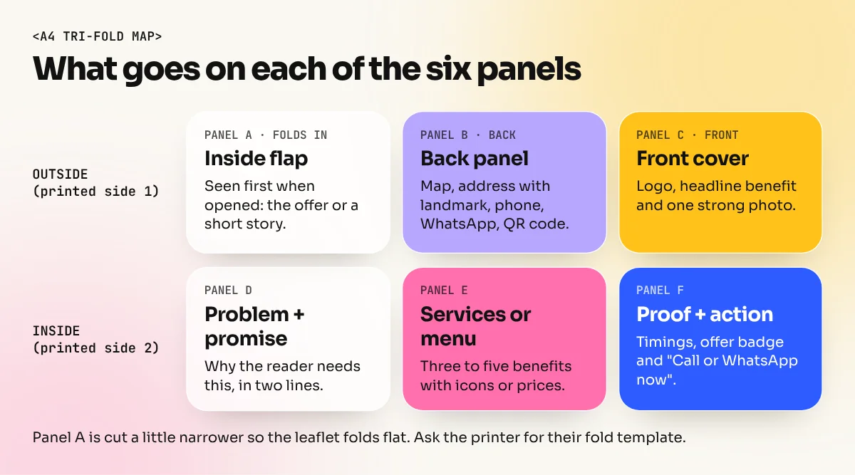
- Tri-fold (letter fold): A4 folded into three DL-size panels. The classic clinic and coaching centre leaflet.
- Z-fold: three panels folded like a zigzag. Good for step-by-step content or a timeline.
On a tri-fold, the inside panel that folds in is usually a couple of millimetres narrower than the other two, so it closes cleanly. Ask your printer for their fold template before you start. It is the quickest way to avoid a panel that ends up cut or creased in the wrong place.
Step 3: Set up the file the right way
Most reprints happen because of file setup, not because of a bad idea. Set these before you design anything:
- Document size: the exact finished size, for example A5 at 148 x 210 mm.
- Bleed: 3 mm on every side is the standard most Indian printers ask for. Backgrounds and photos that touch the edge must run into the bleed.
- Safe margin: keep all text and logos at least 5 mm inside the trim line. The cutting machine can move slightly.
- Colour mode: CMYK, because printing presses use cyan, magenta, yellow and black inks. Bright RGB screen colours like electric blue or neon green print duller.
- Resolution: photos at 300 ppi at their printed size. A 72 ppi image from a website will print blurry.
- Black text: set small text in 100% black (K only), not a mix of all four inks, so it stays sharp.
In InDesign you enter bleed when you create the document. In CorelDraw you set it in the document options and show the bleed area. Either way, turn on guides for trim, bleed and safe area and keep them on while you work.
Step 4: Build the layout and the hierarchy
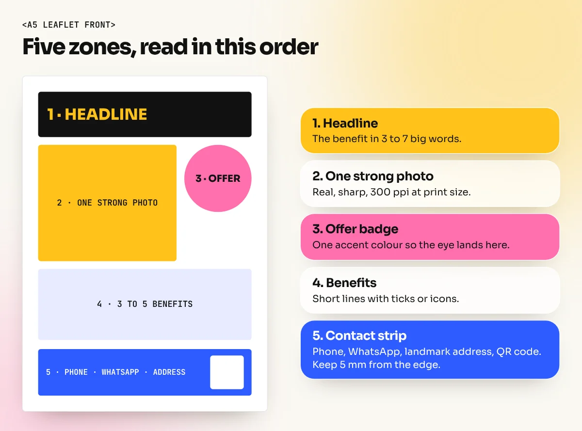
People decide in a few seconds whether a leaflet goes in a pocket or in the dustbin. Your layout has to win those seconds. Use a clear reading order:
- Headline: the benefit in a few big words. "Spoken English in 60 Days" beats "Welcome to Bright Future Academy".
- One strong image: a real photo of the food, the clinic or the product. One good photo beats six small ones.
- The offer: in a colour block or a badge so the eye lands on it.
- Three to five benefit points: short lines with icons or ticks.
- Call to action and contact: phone number, WhatsApp number, address with a landmark ("Opposite Metro Gate 2") and a QR code.
Work on a simple grid. Two or three columns are enough for A5. Keep margins equal on all sides and line items up to the same edges. If you want a refresher on grids and margins, our guide to layout design rules and grids explains them with examples.
Step 5: Colour, type and images
Colour. Use the brand colours and add one accent colour for the offer. Two or three colours look planned. Seven colours look like a cheap sale. Remember that colours look different on paper than on a phone screen, so ask for a printed proof for big runs.
Type. Use one font family, or two at most: a bold one for the headline and a clean, readable one for the text. Body text on a hand-out should not go much below 9 or 10 points. If the leaflet is for a local audience, a Hindi or bilingual version may work better than English only. Use a proper Devanagari font, not a font that only looks Hindi in the menu.
Images. Use real photos you have the right to use. Client photos taken in good daylight on a modern phone are often fine for an A5 leaflet if they are sharp and large enough. Avoid low-quality images copied from Google; they print badly and can bring a copyright problem.
These choices follow the same basics that every good design follows: contrast, alignment, repetition and enough white space. Our guide to the principles of graphic design explains each one with Indian ad examples.
Step 6: Write copy that fits the space
Designers in India often receive a page of text from the client and are asked to "fit everything". Push back politely and suggest a shorter version. A simple formula works for most leaflets:
| Part | Length | Example (dental clinic) |
|---|---|---|
| Headline | 3 to 7 words | Painless Root Canal in One Visit |
| Sub-line | One line | Experienced dentists, modern equipment, Lajpat Nagar |
| Offer | One line | Free check-up and X-ray this month |
| Benefits | 3 to 5 short points | Evening slots, EMI options, Female dentist available |
| Action | One line plus contact | Call or WhatsApp to book: phone number |
Check spelling, phone numbers and the address three times. A wrong digit in the phone number makes 5,000 printed leaflets useless. Ask the client to approve the final text in writing (an email or WhatsApp message is fine) before you send files to print.
Export and check before printing
When the design is approved, export a print-ready PDF:
- Export as PDF/X (PDF/X-1a or PDF/X-4 are common choices in InDesign) with bleed and crop marks turned on.
- Make sure fonts are embedded or converted to outlines, especially if you are sending a CorelDraw file.
- Open the PDF and zoom to 100%. Look for blurry photos, text in the bleed area and spelling mistakes.
- Check the paper with the printer. Hand-outs are often printed on 90 to 130 GSM paper; thicker card is used for menus and rate cards that people keep.
- For runs of thousands, ask for one printed proof before the full job.
Common leaflet design mistakes
- No clear offer. The leaflet describes the business but never says why to act now.
- Too much text in small type, so nobody reads it.
- Contact details hidden in a corner or printed too small.
- Text too close to the edge, so the cutting machine trims part of a word or phone number.
- RGB colours and web images, so the print looks dull and blurry.
- Fold ignored, so the logo or a photo sits right on the crease.
Learn leaflet and print design properly
Leaflets are one of the first paid jobs many designers get, from local shops, coaching centres and printers. They teach you layout, copy and print production all at once. In our InDesign course you design folded leaflets, brochures and menus and export real print files. Our CorelDraw course covers the single-sheet flyers, flex and print shop work that local printers handle every day.
Start with one A5 leaflet for a real shop in your area. Fix the offer, set up the file properly, follow the reading order above and get one printed. Holding your own leaflet in your hand teaches more than ten screen mock-ups.
Frequently asked questions
What is the difference between a leaflet, a pamphlet and a flyer?
In India the words are mostly used for the same thing: a single printed sheet handed out to promote something. Some printers call an unfolded sheet a flyer or leaflet and a folded sheet a pamphlet or brochure. Always confirm size and fold with the printer.
Which software is best for leaflet design?
Adobe InDesign is best for folded leaflets and anything with a lot of text. CorelDraw is very common in Indian print shops and works well for single sheets. Illustrator suits graphic, illustration-led leaflets. Canva is fine for quick drafts, but check the export settings for print.
What size should a leaflet be?
A5 (148 x 210 mm) is the most common size for hand-out leaflets. A4 (210 x 297 mm) is used for folded leaflets and menus. DL (99 x 210 mm) fits in a pocket or an envelope. Add 3 mm bleed on every side to the size you choose.
How much text should a leaflet have?
As little as possible. A headline, three to five short benefit points, the offer and the contact details are enough for a single sheet. People decide in two or three seconds whether to keep a leaflet, so cut anything that does not help that decision.