Branding Design: How a Brand Identity Is Built Step by Step
Branding design explained: brand vs logo vs identity, the parts of a visual identity, the 9-step process, brand guidelines and portfolio tips.
Branding design is the work of creating a brand's visual identity: logo, colours, typography, imagery style and the rules for using them. Designers start with research and strategy, then build the logo and system, test it on real items like packaging, signboards and social posts and finish with a brand guidelines document so everyone uses it the same way.
Branding design is the work of creating everything people see when they meet a brand: the logo, colours, fonts, images, icons and the rules that hold them together. A logo alone is not a brand identity. The identity is the full system that makes a brand look like itself on a visiting card, a hoarding, a pack of biscuits and an Instagram reel. This guide explains the parts of a visual identity, the 9-step process designers follow, what goes into brand guidelines and how to present a branding project in your portfolio.
Brand, branding and brand identity: the difference
These three words get mixed up all the time, even by clients. Clear terms make your work easier to explain.
| Term | What it means | Who shapes it |
|---|---|---|
| Brand | What people feel and believe about a company | Customers, through every experience |
| Branding | The work of shaping that feeling on purpose | The business, marketers and designers |
| Brand identity | The visible tools: logo, colours, type, images, voice | Designers, with the client |
| Logo | One mark that signs the brand | Designers |
A designer cannot fully control the brand, because customers decide how they feel. A designer can control the identity, which is why this is the part branding design focuses on.
The parts of a visual identity
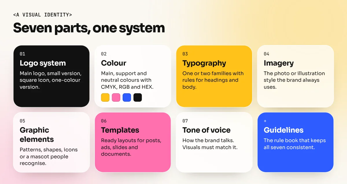
Most identities, from a Lajpat Nagar sweet shop to a national bank, are built from the same parts.
- Logo system. The main logo plus versions for small sizes, a square icon for apps and social profiles and a one-colour version.
- Colour palette. One or two main colours, a few support colours and neutrals, each written as CMYK, RGB and HEX values, plus a Pantone reference for print if needed.
- Typography. One or two font families with clear rules for headings, body text and numbers.
- Imagery style. What kind of photos or illustrations the brand uses: bright or moody, posed or candid, flat or textured.
- Graphic elements. Patterns, shapes, borders, icons or a mascot that make the brand recognisable even without the logo.
- Layouts and templates. Ready grids for social posts, presentations, ads and documents.
- Tone of voice. How the brand talks. A designer does not always write this, but the visuals must match it.
An Indian example: the Amul girl
The Amul girl is one of the best lessons in branding design in India. The mascot was created in the 1960s by the advertising agency ASP, led by Sylvester da Cunha, with art director Eustace Fernandes. Verghese Kurien, who headed Amul's marketing federation, wanted a mischievous little girl who was easy to draw and easy to remember.
Look at what makes it work:
- One character, used for decades. People recognise her even when a hoarding shows no logo.
- A fixed visual style. The blue hair, the polka-dot frock and the simple, hand-drawn look stay the same.
- Fresh content inside a fixed frame. Each topical ad comments on the news, but the format is always familiar.
This is exactly what a good identity system does: strict on the parts that build recognition and flexible on the message.
The branding design process in 9 steps
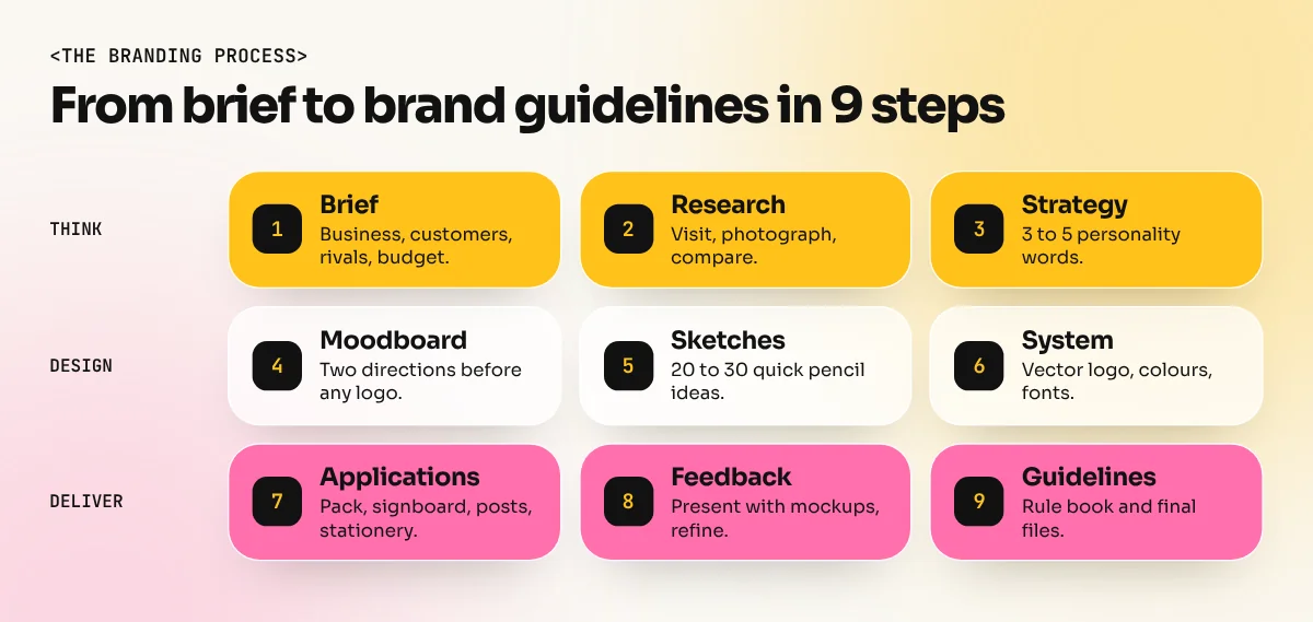
- Brief and discovery. Meet the client. Ask about the business, the customers, the competition, the price level and where the brand will appear. Write it down as a one-page brief.
- Research. Visit the shop or use the product. Collect photos of competitors' signboards, packaging and social pages. Note what everyone does, so you can do something different.
- Strategy. Agree on three to five words that describe the brand's personality, such as "warm, honest, local, modern". Every design choice will be checked against these words.
- Moodboard. Collect colours, type, photos and textures that match those words. Show the client two moodboards before drawing any logo. It is much cheaper to change direction here.
- Logo sketches. Fill pages with quick pencil ideas. Twenty or thirty small sketches is normal. Pick the best three.
- Digital logo and system. Build the chosen ideas as vectors in Illustrator. Choose the colours and fonts. Test the logo at visiting card size and at hoarding size, in colour and in black.
- Applications. Put the identity on real items: packaging, signboard, letterhead, uniform, delivery bag, website header and three or four social posts. This is where weak systems show their problems.
- Feedback and refinement. Present with mockups and explain each choice using the strategy words. Agree on the number of revision rounds at the start.
- Brand guidelines and handover. Deliver the final files and a guidelines document so printers, developers and the client's own team use the identity correctly.
What goes into brand guidelines
Brand guidelines, also called a brand book or style guide, are the rule book for the identity. A small business might need 10 to 20 pages. A large company may need far more.
| Section | What it covers |
|---|---|
| Brand story | Purpose, personality words and audience |
| Logo use | Versions, clear space, minimum size, wrong uses to avoid |
| Colour | Every colour with CMYK, RGB, HEX and Pantone values |
| Typography | Fonts, sizes, weights and examples |
| Imagery | Photo and illustration style with good and bad examples |
| Graphic elements | Patterns, icons and how to use them |
| Applications | Real examples: packaging, signage, social posts, stationery |
| File list | Which file to use where, with clear names |
The "wrong uses" page is one of the most useful. Show the logo stretched, recoloured, placed on a busy photo or with effects added, each crossed out. Printers and junior designers learn faster from these than from long paragraphs.
Files a client should receive
| File | Format | Used for |
|---|---|---|
| Master logo | AI, EPS or SVG (vector) | Printing, signboards, any size |
| Web logo | PNG with transparent background, SVG | Website, presentations |
| Social icon | Square PNG or JPG | Profile pictures |
| One-colour logo | Vector and PNG | Stamps, embroidery, single-colour print |
| Guidelines | Anyone using the brand | |
| Templates | Editable files | The client's team for daily posts |
Always check that the client owns the fonts you used or can get a licence for them. Many fonts need a licence for commercial use. A logo also needs to be original: search to make sure it does not look like another brand in the same field and advise the client to speak to a trademark professional before launch.
How to show branding in your portfolio
Branding projects are among the strongest portfolio pieces because they show thinking, not only skill. A good case study has:
- The brief in two or three lines.
- The research with a few competitor photos and your key insight.
- The strategy words and the moodboard.
- Sketches, even rough ones. They prove the idea is yours.
- The final identity on a clean background.
- Applications in realistic mockups, such as packaging, signage and social posts.
- One page from the guidelines to show you think in systems.
Branding work often connects to packaging. Our guide to packaging design from dieline to shelf shows how an identity carries onto boxes and labels. For the basics behind good identities, read 12 principles of graphic design with Indian ad examples.
Mistakes to avoid
- Designing the logo before understanding the business
- Following a trend so closely that the identity looks dated in two years
- Using too many colours or fonts, so nothing feels consistent
- Showing the client 15 logo options instead of two or three strong ones
- Forgetting the small sizes: a detailed logo turns into a blur on a phone screen
- Skipping guidelines, so the brand looks different on every item within months
Learn branding design with real projects
Branding brings every design skill together: research, sketching, vector drawing, colour, typography and presentation. Our 6-month graphic design diploma has you build a portfolio of real brand projects and the Adobe Illustrator course builds the vector skills every logo and icon set depends on. Start with one local business you know well and build its identity from brief to guidelines.
Frequently asked questions
What is the difference between a logo and branding?
A logo is one mark. Branding design is the full system around it: colours, fonts, images, icons, layouts and the rules for using them. A brand can be recognised even when the logo is hidden, because the rest of the system is consistent.
How long does a branding design project take?
For a small business, a simple identity often takes three to six weeks, depending on research, rounds of feedback and how many items need designing. Large companies with many products can take months.
Which software is used for branding design?
Adobe Illustrator for the logo, icons and patterns, since they must be vectors. Photoshop for mockups and photo styles, InDesign for the brand guidelines document and tools like Figma or Canva for templates the client's team will use.
Can I do branding design without a client?
Yes. Pick a real local business or invent a realistic one, write a proper brief and build the full identity. Say clearly in your portfolio that it is a self-initiated project.