Gestalt Principles for Graphic Designers, With Examples
Gestalt principles explain how people group what they see. Learn proximity, similarity, closure, figure-ground and more, with Indian design examples.
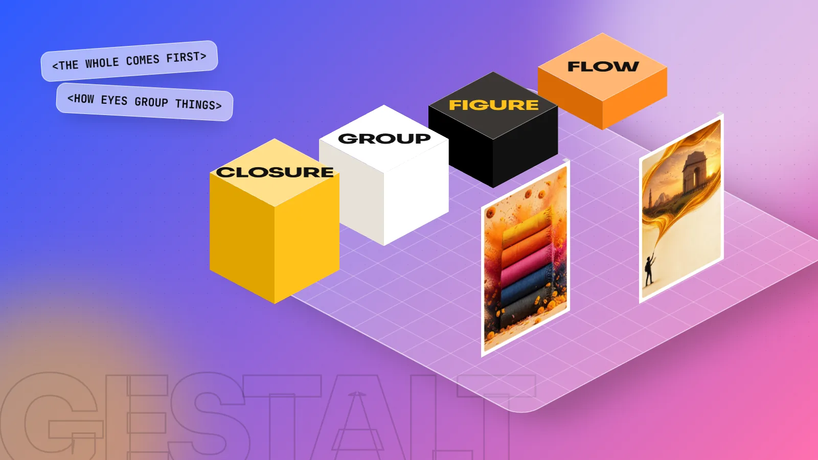
Gestalt principles are rules from psychology that describe how the eye groups shapes into a whole. The main ones for designers are proximity, similarity, closure, continuity, figure-ground, common region, common fate and simplicity. Designers use them to group related items, guide the eye and make layouts, logos and menus easy to understand at a glance.
Gestalt principles are a set of rules that explain how the human eye groups separate shapes into one whole picture. When you look at a page, you do not see 40 loose items. You see a headline, a group of prices and a logo, because your brain sorts them by distance, likeness and shape. Designers use Gestalt principles to control that sorting, so people understand a layout in seconds. This guide explains the eight principles you will use most, with simple examples from posters, menus, logos and Instagram posts.
Where the Gestalt principles come from
The word Gestalt is German for "form" or "shape". Gestalt psychology began in Germany in the early twentieth century with three psychologists: Max Wertheimer, Wolfgang Köhler and Kurt Koffka. Wertheimer's 1912 paper on how we see movement is usually treated as the start of the movement.
Their key idea was simple. The brain does not read a scene piece by piece. It looks for the whole first and then fills in details. Later researchers added more grouping rules. One example is common region, described by the psychologist Stephen Palmer in a 1992 research paper.
Designers did not invent these rules. They are about how people see. That is why they work for a hoarding in Lajpat Nagar, a wedding card and a mobile app in exactly the same way.
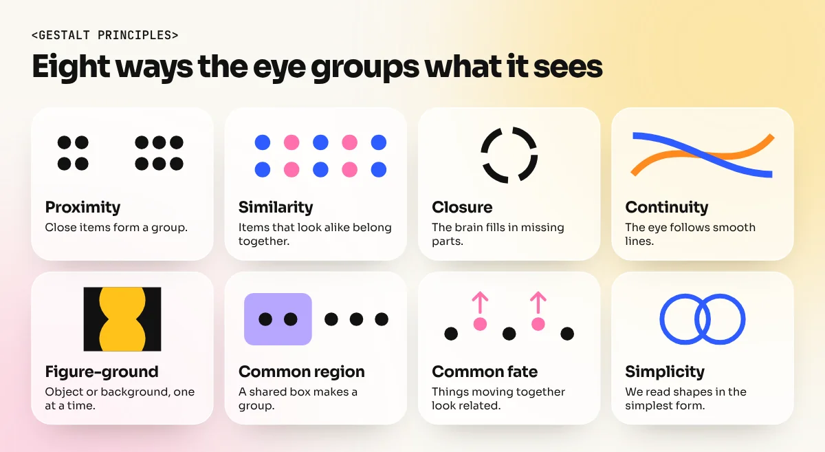
The 8 Gestalt principles at a glance
| Principle | What the eye does | Where designers use it |
|---|---|---|
| Proximity | Groups items that sit close together | Menus, forms, price lists, business cards |
| Similarity | Groups items that look alike | Buttons, icons, headings, colour codes |
| Closure | Fills in missing parts of a shape | Logos, icons, cropped photos |
| Continuity | Follows lines and curves | Metro maps, timelines, reading paths |
| Figure-ground | Splits a scene into object and background | Logos, posters, text on photos |
| Common region | Groups items inside one boundary | Cards, boxes, sections on a page |
| Common fate | Groups items that move the same way | Animations, carousels, arrows |
| Simplicity (Prägnanz) | Reads a shape in its simplest form | Clean logos, icons, layouts |
The principles explained one by one
Here is each principle in plain words, with a real example and a tip for using it.
Proximity: closeness creates groups
Proximity means items placed near each other look related. Items far apart look separate. It is the most useful rule in everyday layout work.
Think of a restaurant menu. If the dish name, the short description and the price sit tight together, with a clear gap before the next dish, the reader never mixes up prices. If the spacing is equal everywhere, the reader has to work hard to see which line belongs to which dish.
The Nielsen Norman Group, a well-known user experience research firm, makes the same point in its guidance: spacing alone can group content, so you often do not need lines or boxes at all.
Quick test: blur your eyes and look at your design. You should see clear clumps of content. If everything looks like one grey block, fix the spacing first.
Similarity: things that look alike belong together
The eye links items that share a colour, shape, size, font or texture. This is why all the links on a website are one colour and all the section headings in a brochure share one style.
You can use similarity in two ways:
- To group. Every vegetarian dish gets a green mark, every non-vegetarian dish a brown or red one. The reader scans for the colour.
- To break a pattern. One item in a different colour stands out. A yellow "Order now" button among white cards is seen first. This is the base of a strong focal point.
Keep it consistent. If two different things share one style, people will think they are the same kind of thing.
Closure: the brain fills in the gaps
Closure means people see a complete shape even when part of it is missing. A circle drawn with a few gaps still reads as a circle. A panda drawn with only black patches and no full outline still reads as a panda. The WWF logo is the classic example that design teachers use.
Closure is useful because it makes designs lighter and more interesting. In logo work, it lets you suggest a shape with fewer lines. In layouts, a photo cropped at the edge of the page feels like it continues beyond the frame.
Use it with care. If too much is missing, people cannot close the shape and the design just looks broken. Test it on someone who has not seen it before.
Continuity: the eye follows a line
Continuity means the eye likes to follow a smooth line, curve or row. Once it starts moving in one direction, it keeps going.
The Delhi Metro map is a good daily example. Each coloured line runs smoothly across the map and your eye follows it from station to station without effort, even where lines cross. In print, a row of product photos or a curved arrow pulls the reader from one point to the next.
Designers use continuity to:
- Line up text and images on one strong edge, often with a grid system.
- Point a person's gaze or an arrow towards the headline or the offer.
- Build timelines and step-by-step graphics that read in one clear direction.
Figure-ground: object and background
Figure-ground means the eye splits any scene into a main object (the figure) and the area behind it (the ground). Good designs make that split clear. Clever designs play with it.
The FedEx logo hides an arrow in the white space between the E and the x. Once you see it, you cannot unsee it. That is figure-ground used on purpose. Many poster designers use the same trick, such as a face hidden in the shape between two objects.
For everyday work, figure-ground is about contrast. Text on a busy photo fails because the eye cannot separate figure from ground. Add a dark overlay, a solid band or move the text to a calmer part of the photo.
Common region, common fate and simplicity
Common region means items inside one boundary look like a group, even if they are not close. A card, a coloured box or a thin border all create a region. The Nielsen Norman Group notes that a boundary can be stronger than proximity, but warns against adding borders everywhere. Try spacing first and use boxes only when spacing is not enough.
Common fate means items moving in the same direction look related. It matters in motion design, Instagram Reels and website animations. If three icons slide in together, people read them as one set.
Simplicity, also called the law of Prägnanz, means the eye prefers the simplest reading of a shape. People see the Olympic rings as five overlapping circles, not as a complicated outline. This is why simple logos are easier to remember and why clean layouts feel calm.
How to use Gestalt principles in your next design
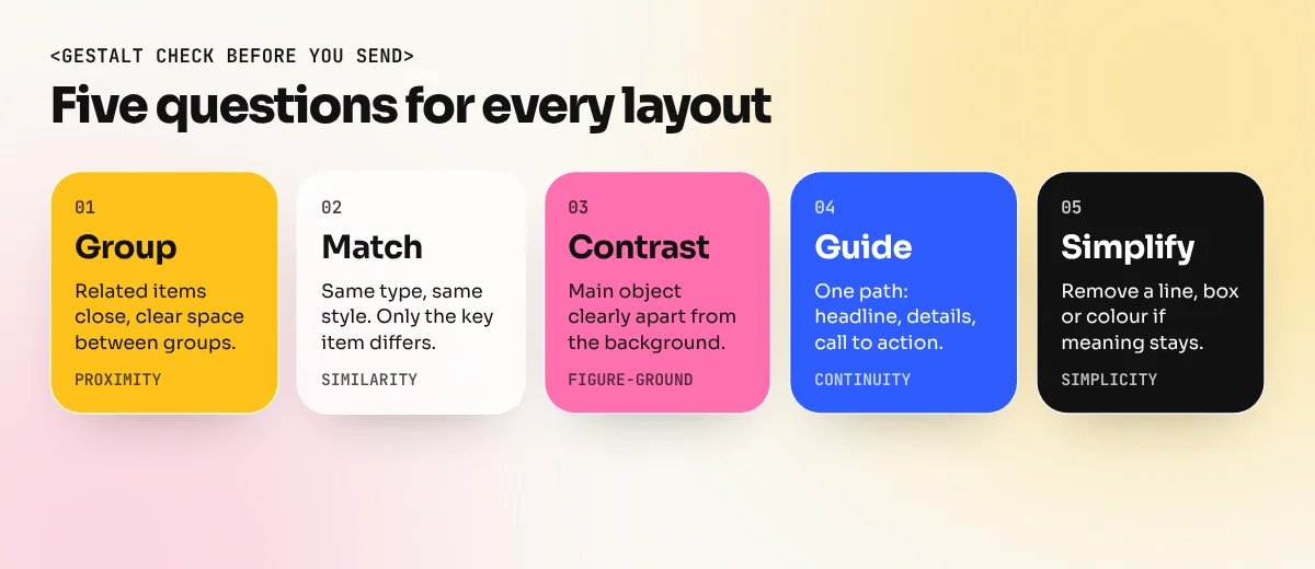
Run this check on any poster, menu or social media post before you send it to a client.
- Group. Are related items close together, with clear space between groups? (Proximity)
- Match. Do items of the same type share one style? Is only the most important item different? (Similarity)
- Contrast. Is the main object clearly separate from the background? (Figure-ground)
- Guide. Does the eye move in one clear path from headline to details to the call to action? (Continuity)
- Simplify. Can you remove a line, a box or a colour without losing meaning? (Simplicity)
These checks work together with the wider principles of graphic design such as balance, alignment and hierarchy. Gestalt explains why those principles work on the human eye.
How to practise Gestalt principles
Reading about the rules is not enough. Your eye learns them through practice.
| Exercise | Principle | Time |
|---|---|---|
| Redesign a cluttered local shop flyer using spacing only, no new boxes | Proximity | 1 hour |
| Make a set of 12 icons with one line weight and corner style | Similarity | 2 hours |
| Draw an animal logo with an incomplete outline | Closure | 2 hours |
| Design a poster with a hidden second shape in the empty space | Figure-ground | 3 hours |
| Make a 5-step process graphic that reads left to right | Continuity | 1 hour |
Logo and icon exercises are easiest in a vector tool. An Illustrator course teaches the pen tool, shapes and pathfinder you need for closure and figure-ground logos. For a full path through layout, type, colour and software, the 6-month graphic design diploma covers these basics with real projects and a portfolio at the end.
The bottom line
Gestalt principles describe how every person reads a design: by grouping, matching, filling gaps, following lines and separating objects from backgrounds. Learn the eight rules, test every layout with the five-step check and practise them on small projects. Your designs will look cleaner and people will understand them faster, which is what clients really pay for.
Frequently asked questions
What are the Gestalt principles in simple words?
They are rules that describe how our brain sees a group of shapes as one picture. Things that are close, look alike, sit inside one box or follow one line are read as belonging together.
How many Gestalt principles are there?
There is no single official number. Most design guides list between five and ten. Proximity, similarity, closure, continuity and figure-ground appear in almost every list, with common region, common fate and simplicity often added.
Which Gestalt principle is most useful in layout design?
Proximity is the one designers use most. Putting related items close together and adding space between groups makes a page clear without extra lines, boxes or colours.
Are Gestalt principles used in logo design?
Yes. Closure and figure-ground are common in logos. A logo can suggest a shape with only part of its outline, or hide a second shape in the empty space between letters.