Graphic Design Trends 2026 Worth Learning (and Which to Skip)
Graphic design trends 2026 explained simply: handmade texture, bold type, collage, surreal images, desi culture and calm minimal. What to learn, what to skip.
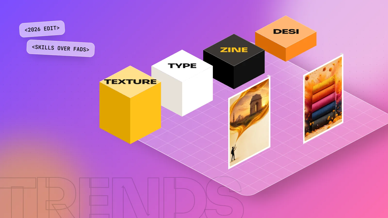
The biggest graphic design trends of 2026 are handmade and imperfect texture, oversized expressive type, collage and zine-style layouts, surreal images, local and cultural styles and, on the other side, calm minimal design. Adobe Express and Canva both named these in their 2026 trend reports. Learn the skills behind them, not just the look.
Graphic design trends 2026 are pulling in two directions at once: loud, handmade and playful on one side, calm and minimal on the other. The common thread is a human feel. After a few years of shiny, perfect AI images everywhere, brands now want design that looks touched by a real person: rough texture, hand-drawn letters, cut-paper collage and local culture. At the same time, many people are tired of noise, so clean serif layouts and soft off-white colours are growing too. This guide explains the eight trends worth learning, where they come from, how to try each one and which ones to skip.
Where these trends come from
Trend lists online are often guesses. We based this guide on three public sources, all published in December 2025 for the year 2026.
| Source | What it is | Main message |
|---|---|---|
| Adobe Express "Top 10 graphic design trends for 2026" | Trend list from Adobe's design team | Sensory, playful, imperfect and cultural design |
| Canva Design Trends Report 2026 | Built from Canva's own design and search data, its designer advisory board and a survey of 1,000 creators in the US and Brazil, with one trend picked for India | "Imperfect by Design": human, lo-fi and nostalgic |
| Pantone Color of the Year 2026 | Pantone's yearly colour pick | Cloud Dancer (PANTONE 11-4201), a soft warm off-white |
When two big platforms agree on a trend from different data, it is worth your time. When only one blog mentions it, treat it as a guess.
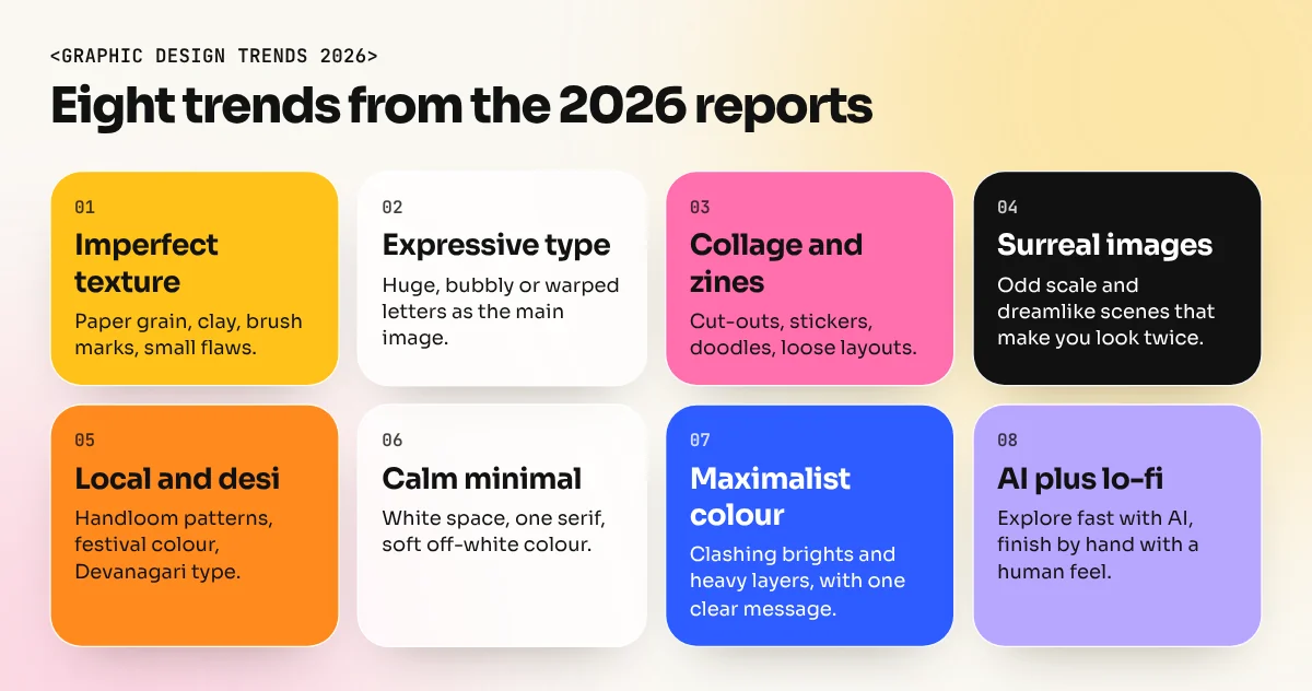
The 8 trends worth learning
1. Imperfect, handmade texture
This is the trend almost every report agrees on. Adobe Express calls it "Organic and imperfect design": hand-drawn or letterpress-style type, natural textures such as sand, stone and bark and small deliberate flaws. Canva's "Texture Check" trend agrees that surfaces are now the star, from glossy to waxy to tactile, with related searches up 30 percent.
What it looks like: paper grain, brush strokes, risograph-style print marks, slightly wobbly lines, scanned objects.
Indian example: a kulhad chai brand with a clay texture background and a hand-lettered name, or a handloom label with a scanned khadi texture.
How to try it: scan or photograph real surfaces at home and use them as overlays in Photoshop with blend modes such as Multiply. Keep texture away from small text so it stays readable.
2. Big, expressive type
Adobe Express lists "Exaggerated, playful letters and text": oversized, bubbly and wavy letters plus loose handwritten scripts. Canva's "Zinegeist" trend, spotted in Mexico, pairs bold oversized type with collage. Searches for "brutalist design" and "type poster" rose 77 percent.
What it looks like: a headline so big it fills half the poster, stretched or warped letters, type used as the main image.
How to try it: design a poster with no photo at all, only one huge word and one small line of detail. This trains your eye for size contrast. Our typography in graphic design guide covers the type basics you need before you start bending letters.
3. Collage and zine-style layouts
Adobe Express names two related trends: "Collage and layered visual elements" and "Freeform and storytelling layouts". Canva reports "Explorecore", calm zine and newsletter-style layouts made for slower reading (up 85 percent), plus "Notes App Chic", messy scrapbook visuals that show progress over polish, with DIY and collage searches up 90 percent.
What it looks like: torn paper, photo cut-outs, stickers, doodles, stamps, overlapping boxes and text that does not sit on a strict grid.
How to try it: make a one-page zine about your neighbourhood market. Use your own phone photos, cut them out in Photoshop and layer them with hand-written notes.
A loose collage still needs order. Decide what the reader sees first, second and third, then let the rest feel free.
4. Surreal and absurd images
Adobe Express calls this "Surreal and absurdist imagery": visual jokes, odd scale and dreamlike scenes. Canva's version, "Reality Warp", saw searches for "liminal" and "uncanny" up 220 percent.
What it looks like: a giant samosa on a city skyline, a chair melting into a floor, a product floating in an impossible room.
How to try it: this is where Photoshop compositing and Generative Fill are useful. Combine two real photos into one scene that makes people look twice. Our guide to Photoshop Generative Fill shows how to extend and blend images cleanly.
5. Local and cultural flavour
This trend matters most for Indian designers. Adobe Express lists "Local and cultural flavor": heritage patterns, candid documentary photos and regional type. Better still, Canva named one trend for India alone: "GrannyWave", where nostalgia brings back handloom patterns, festival colours and Bollywood glamour. Its report found searches for "Desi" up 26 percent and "Hindi typography" up 17 percent.
What it looks like: truck art lettering, block-print patterns, Devanagari headlines, old Indian matchbox and cinema poster styles, photos of real streets and people.
How to try it: redesign a modern brand's social post with a Devanagari headline and a pattern drawn from a local craft. Respect the source: learn what a pattern means before you use it.
6. Calm, minimal and soft colour
Not everything is loud. Canva calls this the "Opt-Out Era" and found searches for "clean layout", "serif" and "simple branding" up 54 percent. Pantone's Colour of the Year 2026, Cloud Dancer, is a soft warm off-white, which fits this quiet style well.
What it looks like: lots of white space, one serif typeface, a muted palette, one strong photo.
How to try it: take a crowded sale flyer and redesign it with half the content, a serif headline and an off-white background. If it still sells the offer, you have learnt the most useful skill in design: removing things.
7. Maximalist, high-energy colour
The opposite of trend 6. Adobe Express lists "Immersive, high-energy style" and "Maximalist, chaotic layouts": bright clashing colours, heavy layering and a "more is more" attitude. Canva's "Drama Club" trend, with big emotion and cinematic storytelling across social posts and video, sits close to it.
What it looks like: neon on hot pink, five typefaces in one poster, layers on layers.
How to try it: maximalism looks easy but is the hardest to control. Pick one dominant colour and one main message first, then add energy around them. Without a clear hierarchy, maximal turns into messy.
8. AI as a sketch partner, with a lo-fi finish
Canva's "Prompt Playground" trend mixes interface fragments, retro-tech nods and "vibe coding" into designs made for feeling, with searches for "lo-fi aesthetic" up 527 percent. Put that next to the handmade trends above and a clear working style appears: use AI to explore fast, then finish with a rough, human look instead of glossy AI polish.
How to try it: use Photoshop Generative Fill and AI image tools to test three or four rough directions for a poster in an hour. Then build the final design yourself, with your own type, layout and texture. The AI gives you speed; your choices give the work its taste.
Which trends to learn and which to skip
| Trend | Learn it? | Skill behind it | Lasts beyond 2026? |
|---|---|---|---|
| Imperfect texture | Yes | Photoshop blending, scanning, print effects | Likely, in some form |
| Expressive type | Yes | Typography, hierarchy, lettering | Yes, the type skill lasts |
| Collage and zine layouts | Yes | Masking, layering, composition | Yes, for social and editorial |
| Surreal images | Try it | Photo compositing, Generative Fill | Partly, it comes and goes |
| Local and cultural | Yes, strongly in India | Devanagari type, pattern design, research | Yes |
| Calm minimal | Yes | White space, serif type, restraint | Yes, minimal never fully leaves |
| Maximalism | Try one project | Colour control, hierarchy | Comes in waves |
| AI sketch plus lo-fi finish | Yes | Prompting, editing, taste | Yes, the workflow stays |
A simple rule: learn the skill under a trend, not the trend itself. Collage is fashionable now, but masking and composition will be useful for your whole career.
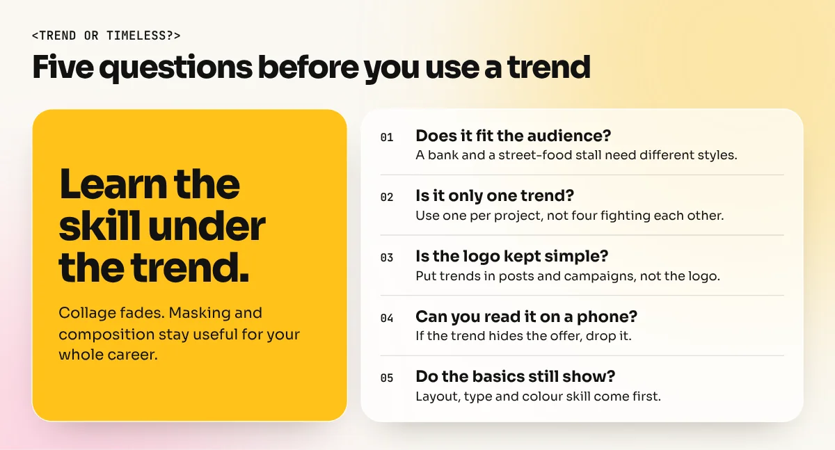
How to use trends without dating your work
- Start with the brief. A bank and a street-food brand should not follow the same trend. Ask who the audience is first.
- Use one trend per project. Texture plus collage plus surreal plus maximal is four trends fighting each other.
- Keep the logo timeless. Put trends in campaigns, posts and packaging, which change often. Keep the logo simple so it lasts ten years.
- Check readability. Test text on a phone screen. A trend that hides the offer is a bad trend for that project.
- Show the basics in your portfolio. Employers want to see layout, type and colour skill first. One trend-based project shows you are current; ten show you only copy.
A two-week practice plan
| Days | Project | Trend |
|---|---|---|
| 1 to 2 | Quote card on a scanned paper or clay texture | Imperfect texture |
| 3 to 4 | One-word type poster for a music night | Expressive type |
| 5 to 6 | One-page zine about a local market | Collage |
| 7 | Surreal product scene for a snack brand | Surreal images |
| 8 to 9 | Festival post with a Devanagari headline and craft pattern | Local and cultural |
| 10 | Minimal redesign of a cluttered flyer | Calm minimal |
| 11 to 12 | Maximal event poster with one clear message | Maximalism |
| 13 to 14 | AI sketches, then a hand-built final design | AI plus lo-fi |
Most of these projects need Photoshop skills: masking, blend modes, compositing and Generative Fill. A focused Photoshop course covers those tools. If you want the full base of layout, typography, colour, software and a portfolio, the 6-month graphic design diploma teaches the skills that sit under every trend on this list.
The bottom line
The graphic design trends of 2026 share one idea: design should feel human. That shows up as handmade texture, bold type, collage, surreal humour and proud local culture, with calm minimal design as the quiet alternative. Use trends as practice projects and as spice in real work. Build your career on the basics underneath them, because next year's list will be different but good layout, type and colour will still win.
Frequently asked questions
What is the biggest graphic design trend in 2026?
A move back to human, handmade design: imperfect texture, hand-drawn type and collage. Both Adobe Express and Canva put this idea at the centre of their 2026 trend reports.
Is minimalism still in style in 2026?
Yes. Canva's report calls it the "Opt-Out Era" and found searches for clean layouts, serif fonts and simple branding up 54 percent. Minimal design now sits next to loud maximalism, not under it.
What is the Pantone Color of the Year 2026?
Pantone chose Cloud Dancer (PANTONE 11-4201), a soft warm off-white. It suits calm, minimal and premium design rather than loud colour.
Should beginners follow design trends?
Learn from trends but do not build your whole portfolio on them. Trends change every year; layout, type, colour and hierarchy skills do not. Use one trend per project, on top of solid basics.