"Logo Design Ideas: 25 Starting Points for Beginners"
Stuck for logo design ideas? Try these 25 starting points, from initials and negative space to mascots and badges, with a simple method to turn one into a real logo.
Good logo design ideas come from the brand, not from the screen. Start with the name, the product, the customer and one feeling, then try a lettermark, a shape trick, a symbol, a mascot or a badge. Sketch twenty small rough versions, pick the three clearest and only then open Illustrator.
If you are looking for logo design ideas, here is the short method: start from the brand, not from the computer. Write down the name, the product, the customer and the feeling. Then pick one of the 25 starting points below, sketch ten quick versions on paper and refine only the best one. This guide gives you the starting points, a few well-known examples and a plan to turn a rough idea into a clean logo file.
Before you pick an idea: four questions
A logo idea is only good if it fits the brand. Answer these four questions in one line each before you sketch anything.
- What is the name? Long, short, easy to say, easy to spell?
- What does the brand sell? One product or many?
- Who buys it? A school student, a bride, a factory owner, a gym member?
- What should people feel? Trust, fun, luxury, speed, warmth?
Keep the answers beside you while you sketch. When an idea does not match them, drop it.
25 logo design ideas to start from
Use these as prompts. Each one is a way to begin, not a finished logo.
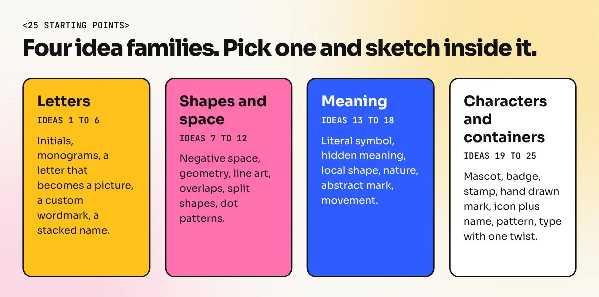
Ideas built from letters
- Single initial. One strong letter, such as the first letter of the name, inside or beside a shape.
- Two initials joined. Let two letters share a stroke or overlap.
- Letter as a picture. Turn the letter into a leaf, a spoon, a key or a mountain.
- Monogram in a shape. Place initials inside a circle, square or shield.
- Custom wordmark. Change one letter of the name, such as a dot, a tail or a cut, so the word feels unique.
- Stacked name. Break a long name into two lines to fit a square profile picture.
Ideas built from shapes and space
- Negative space. Hide a second shape in the empty space. The arrow between the E and x in the FedEx logo is the classic example.
- Simple geometry. Build the mark from circles, squares and triangles only.
- Line art. Draw the symbol with one even line weight.
- Overlapping shapes. Two shapes cross and make a third colour where they meet, as in the Mastercard circles.
- Cut or split shape. Slice a shape and shift the parts a little to suggest movement.
- Dot pattern. Make the symbol from a grid of dots for a tech or data feel.
Ideas built from meaning
- Literal symbol. Show the product, such as a tea cup for a tea brand. It is clear, so make the drawing special.
- Hidden meaning. Add a small second meaning, like the arrow in the Amazon smile that points from A to Z.
- Place symbol. Use a local shape such as an arch, a jharokha window or a lotus when the brand is proud of its city.
- Nature shape. A leaf, a wave, a flame or a mountain suits food, wellness and travel brands.
- Abstract mark. A shape with no literal meaning that you give meaning through the brand story.
- Direction and movement. An arrow, a swoosh or a curve for logistics, sports and fitness. The Nike swoosh is the best known case.
Ideas built from characters and containers
- Mascot. A friendly character people remember, like the Amul girl or the Air India Maharaja.
- Badge or emblem. Text inside a seal for cafes, bakeries and heritage brands.
- Stamp style. A rough round or square stamp with a date or place name.
- Hand drawn mark. A brush or pencil look for handmade, artisan and kids' brands.
- Icon plus name. A small symbol beside the brand name that can also work alone.
- Pattern logo. A logo that changes pattern on each use but keeps one fixed shape.
- Type only with one twist. A clean font, a strong colour and one small change such as a bold full stop.
If you are not sure which family fits, read our guide to the seven types of logos. It explains wordmarks, lettermarks, mascots and emblems with Indian brand examples.
Which idea suits which brand
| Brand | Good starting idea | Why it works |
|---|---|---|
| Neighbourhood bakery | Badge or hand drawn mark | Warm and local |
| Software startup | Geometry or abstract mark | Clean and modern |
| Law or finance firm | Monogram in a shape | Calm and serious |
| Kids' toy shop | Mascot | Friendly and easy to remember |
| Logistics company | Direction and movement | Shows speed |
| Handmade jewellery | Initial with line art | Fine and personal |
From idea to logo in six steps
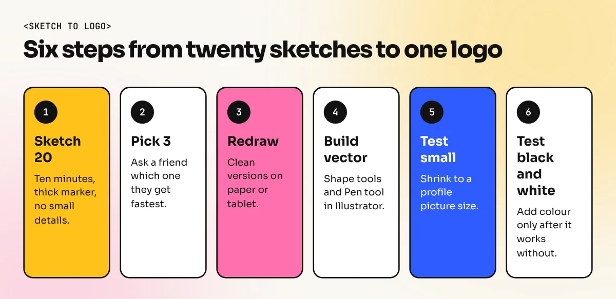
- Sketch twenty rough versions in ten minutes. Use a thick marker so you cannot add small details.
- Circle the best three. Ask a friend which one they understand fastest.
- Redraw them cleaner on paper or on a tablet.
- Build the best one in vector. Use the shape tools and the Pen tool in Illustrator. Our guide on how to design a logo shows the full build.
- Test it small. Shrink it to the size of a phone profile picture. If it turns into a blob, simplify it.
- Test it in black and white. A strong logo works with no colour at all. Add colour only after that.
Common mistakes with logo ideas
- Too much detail. Fine lines vanish on a pen, a stamp or a small phone icon.
- Following trends only. A fashionable effect looks old in two years. Simple shapes last.
- Too many colours. Two or three colours are plenty.
- Copying a known mark. It puts the client at risk. Always check that your idea looks like nothing else in the same field.
- Skipping paper. Starting on screen makes you stop at the first idea.
Where to find fresh ideas without copying
Look at shop signboards, old packaging, temple carvings, textile prints and handwritten rate boards in your own city. Photograph what catches your eye and note why. These sources give you shapes that no logo website has. Keep a small notebook for this. After a month you will have more starting points than you need.
Practise with a 7 day challenge
Pick a made up brand each day, such as a Delhi chai stall, a cycle repair shop or a yoga studio. Spend 30 minutes sketching with one starting point from the list, then build your best sketch in Illustrator. After a week you will have seven logo studies for your portfolio. To learn the tools and the thinking behind them with a trainer, see the Illustrator course or the 6-month graphic design diploma.
Summary
Great logo design ideas start with four honest answers about the brand, then a lot of fast sketches. Choose one of the 25 starting points, test the result small and in black and white, then refine it in vector. The idea matters more than the software.
Frequently asked questions
How do I get logo design ideas when my mind is blank?
Write down the brand name, what it sells, who buys it and three feelings it should give. Then pick one of the starting points in this list and sketch ten quick versions without judging them. The ideas come from the sketching, not from waiting.
Should I use a symbol or only text in my logo?
Both work. A short, unique name often looks strong as text alone. A long name usually needs a small symbol or initials to fit on a profile picture, a stamp or a signboard. Test your logo at a very small size before deciding.
Can I copy a famous logo idea?
You can learn from the idea behind a logo, such as hiding a shape in the space between letters, but you must not copy the look. A logo has to be original so that the client can own it and nobody confuses it with another brand.
How many logo ideas should I show a client?
Two or three strong options is enough. Too many choices confuse the client and weaken your own judgement. Show each one on a plain background and on a real mock-up so they can picture it in use.