"7 Types of Logos With Indian Brand Examples"
Types of logos explained in simple words. Learn the 7 logo styles, wordmark, lettermark, pictorial, abstract, mascot, combination and emblem, with examples and tips.
There are seven main types of logos: wordmark, lettermark, pictorial mark, abstract mark, mascot, combination mark and emblem. A wordmark uses the brand name, a lettermark uses initials, a pictorial mark uses a recognisable picture, an abstract mark uses a shape and a mascot uses a character. Combination marks join text and symbol while emblems place text inside a badge.
There are seven main types of logos: wordmark, lettermark, pictorial mark, abstract mark, mascot, combination mark and emblem. Each type solves a different problem. Some are best for a long name, some for a small icon and some for a brand that wants a friendly face. This guide explains all seven types in simple words, gives well-known examples and helps you pick the right one for a brand.
If you want to draw a logo after reading this, follow our step-by-step guide on how to design a logo. Here we focus on the choice that comes first: which type of logo should you make?
The 7 types of logos at a glance
| Type | What it uses | Best when | Well-known examples |
|---|---|---|---|
| Wordmark | The full brand name as styled text | The name is short and easy to say | Google, Zomato, Coca-Cola |
| Lettermark | Initials only | The name is long | IBM, HP, CNN |
| Pictorial mark | A picture of a real object | You want a clear symbol people recognise | Apple, Shell |
| Abstract mark | A shape that is not a real object | You want a flexible and ownable symbol | Nike swoosh, Pepsi, SBI |
| Mascot | An illustrated character | You want a friendly, family feel | Amul girl, Air India Maharaja |
| Combination mark | Symbol and text together | Almost any new brand | Adidas, Swiggy |
| Emblem | Text inside a badge or crest | Heritage, schools, clubs, premium goods | Starbucks, Royal Enfield |
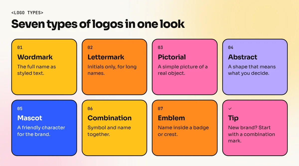
1. Wordmark
A wordmark is the brand name written in a chosen font. There is no symbol. The design work lives in the letter shapes, the spacing and sometimes one clever detail.
Wordmarks work best when the name is short and unique. Google and Coca-Cola are famous examples. In India, Zomato is a good example of a bold, simple name set in one strong style.
Tip: a wordmark depends on typography. Study how fonts feel before you start. Our guide to typography in graphic design is a good place to begin.
2. Lettermark (monogram)
A lettermark uses the first letters of a long name. IBM, HP and CNN are classic cases. People do not need to read "International Business Machines" any more because three letters carry the whole brand.
Use a lettermark when the full name is too long to read on a small space such as a pen, an app icon or a visiting card. The risk is that initials alone say nothing about the business, so a new brand may need a tagline next to it for the first few years.
3. Pictorial mark
A pictorial mark is a simple picture of a real thing. The Apple apple and the Shell shell are the usual examples. The picture is clean, flat and easy to remember.
This style is powerful once the brand is known, because people see the picture and think of the company. For a new business it is harder, since nobody knows yet what the picture stands for. Pair it with the name until the brand grows.
4. Abstract mark
An abstract mark uses a shape that is not a real object. It may be a curve, a circle or a set of lines. The Nike swoosh and the Pepsi circle are well-known examples. The State Bank of India logo, a circle with a keyhole shape, is a familiar Indian example.
The big advantage is that an abstract shape can mean anything you want. A bank, a software company and a hospital can all use one. The challenge is that it carries no meaning by itself, so brand colour and consistent use do a lot of work.
5. Mascot logo
A mascot is a character that speaks for the brand. It is warm, friendly and easy to turn into stickers, cartoons and social media posts. The Amul girl and the Air India Maharaja are two characters many Indians know. Brands that sell to families or young people often choose this type.
Mascots take more drawing skill than the other types, because the character must look good in many poses and sizes. You also need rules for how the mascot may be used so it stays the same everywhere.
6. Combination mark
A combination mark joins a symbol and the brand name. The two can sit side by side or one above the other. Adidas and Swiggy both pair an icon with a name.
This is the most practical type for a new business. You can use the full logo on a signboard and the icon alone on a social media profile picture. If you are building a first logo for a client, this is usually the safest choice.
7. Emblem
An emblem puts the name inside a badge, seal or crest. Starbucks and Royal Enfield are good examples. Schools, colleges, sports clubs and heritage brands use emblems because they feel traditional and trusted.
The catch is detail. A crest with fine lines can turn into a blur on a small screen or on an embroidered shirt. Keep the lines thick and test your emblem at a small size before you finalise it.
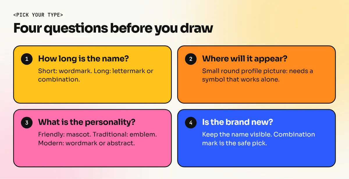
How to choose the right logo type
Ask these four questions about the brand:
- How long is the name? A short name suits a wordmark. A long name suits a lettermark or a combination mark.
- Where will the logo appear most? If it must fit a round profile picture, you need a symbol that works alone.
- What is the personality? Friendly brands can use a mascot. Serious and traditional brands often use an emblem. Modern technology brands lean towards wordmarks and abstract marks.
- Is the brand new? New brands usually need the name visible, so a wordmark or combination mark is the safer pick.
Mistakes beginners make
- Copying a famous logo. Using the Nike swoosh shape or the Apple idea only makes your brand look like a copy. Look for your own idea.
- Too much detail. A logo must still be clear when it is printed on a visiting card or shown on a phone screen the size of a coin.
- Too many fonts and colours. One font and one or two colours are usually enough.
- Starting in the wrong file. Draw the final logo as a vector in Illustrator or CorelDRAW, not as a picture. Vector files stay sharp on a visiting card and on a 40-foot hoarding. If you are unsure, our post on how far Canva logo design can go explains where template tools fall short.
How to practise the seven types
A simple exercise builds real skill. Pick a made-up Delhi brand, such as a kulhad chai stall called "Chai Point South". Draw one logo in each of the seven styles on paper. Pick the best three and redraw them in Illustrator. Compare them at a small size and ask a friend which one they remember after five seconds. You will learn more from this exercise than from reading ten lists.
If you want guided practice with feedback, the Adobe Illustrator course teaches logo drawing from basic shapes to final files. The 6-month graphic design diploma adds typography, colour and branding so your logos fit into a full identity.
The bottom line
The seven types of logos are wordmark, lettermark, pictorial mark, abstract mark, mascot, combination mark and emblem. None is better than the others. The best type is the one that suits the name, the personality and the places the logo will appear. When in doubt, start with a combination mark, keep it simple and test it small.
Frequently asked questions
How many types of logos are there?
Most designers group logos into seven types: wordmark, lettermark, pictorial mark, abstract mark, mascot, combination mark and emblem. Some lists add dynamic or responsive logos, but those describe how a logo behaves, not how it is built.
Which type of logo is best for a new business?
A combination mark is the safest start. The name makes sure people learn who you are and the symbol gives you something small to use on a social media profile or a stamp. A long brand name often works well as a wordmark.
What is the difference between a lettermark and a wordmark?
A wordmark spells the full brand name, like a signboard. A lettermark uses only the initials, like a short monogram. Lettermarks suit long names. Wordmarks suit short and unique names.
Which software is used to design logos?
Adobe Illustrator is the most common tool because a logo must be a vector file that stays sharp at any size. CorelDRAW is also widely used by printers in India. Canva can help with early ideas but is not meant for final logo files.