Visiting Card Design: Size, Layout and Print Guide for Beginners
Visiting card design step by step: the standard size in India, bleed and safe area, what to put on the card, layouts that work and a print-ready file.
For visiting card design in India, start with the common size of 3.5 x 2 inches (about 89 x 51 mm). Add 3 mm bleed on every side and keep text 5 mm inside the trim. Put only the name, role, phone, email and logo on the front, use two fonts at most and export a CMYK PDF.
Visiting card design is the planning of a small printed card that carries a person's name, role and contact details in a clear, memorable way. A good visiting card uses the right size, leaves a safe margin from the cut, shows only the details that matter and arrives at the printer as a clean, print-ready file. This guide covers the size used in India, a simple layout method, the software, finishes and the file checks that save you from a reprint.
Visiting cards (called business cards in most other countries) are often the first paid job a new designer gets. A cousin opens a clinic, a neighbour starts a chai cafe, a CA friend sets up an office in Laxmi Nagar. Each one needs a card. The job looks small, but it tests almost every basic skill: typography, hierarchy, alignment, colour and print knowledge, all inside a space smaller than your palm.
Visiting card size in India
Ask the printer first, because their cutting machine decides the final size. These are the sizes you will meet most often.
| Size name | Inches | Millimetres | Where you see it |
|---|---|---|---|
| Regular (Indian standard) | 3.5 x 2 in | about 89 x 51 mm | Most local and online printers in India |
| Slightly larger | 3.54 x 2.12 in | 90 x 54 mm | Some printers and premium card packs |
| European | 3.35 x 2.17 in | 85 x 55 mm | Cards for clients in Europe |
| Square | 2.5 x 2.5 in | about 64 x 64 mm | Cafes, salons, creative studios |
| Folded | 3.5 x 4 in flat | 89 x 102 mm flat | Cards that open like a small booklet |
The regular 3.5 x 2 inch card fits every card holder and wallet slot, so use it unless the client has a reason to change. Square and folded cards stand out, but they cost more and do not fit standard holders.
Bleed, trim line and safe area
Every printed card has three invisible lines. Beginners lose marks (and money) when they ignore them.
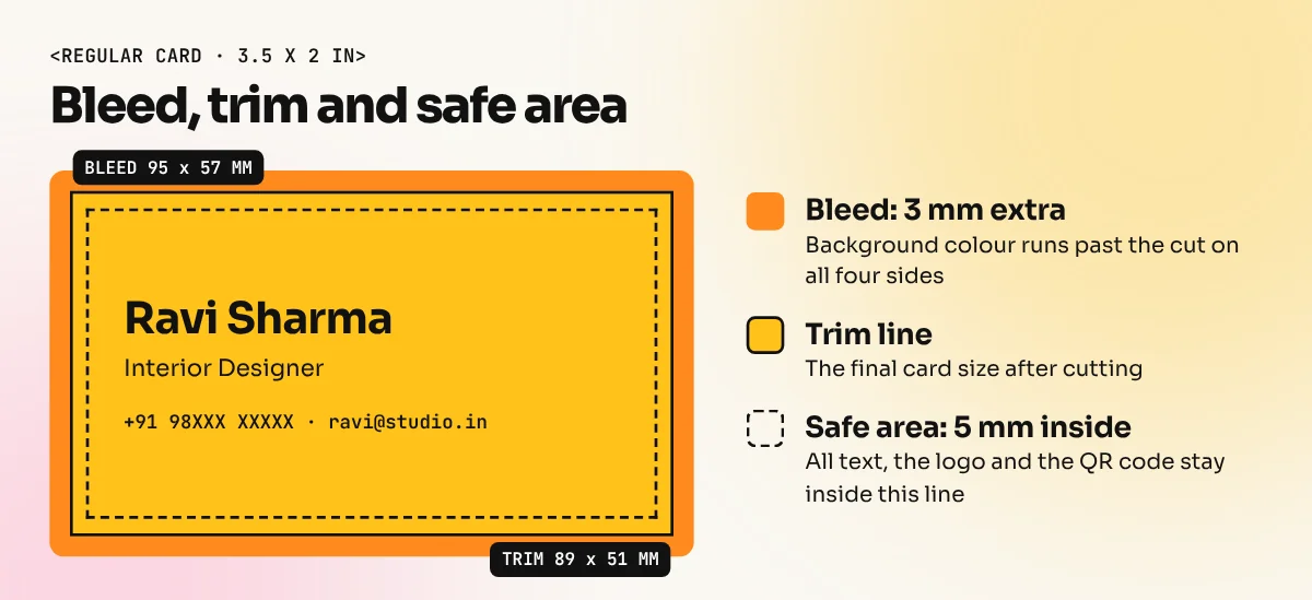
- Trim line. The final size of the card, for example 89 x 51 mm.
- Bleed. An extra 3 mm on every side. If your background colour or photo touches the edge, it must run into the bleed. Cutting machines shift by a millimetre or two. Without bleed you get thin white edges.
- Safe area. Keep all text, the logo and the QR code at least 4 to 5 mm inside the trim line. Anything closer may get cut or look cramped.
So for a regular card your document with bleed is about 95 x 57 mm, but your important content lives inside roughly 79 x 41 mm.
What to put on a visiting card
Clients often want to print everything: three phone numbers, two addresses, every social handle and a list of services. Your job is to say no politely. A card is read in two or three seconds.
| Detail | Include? | Why |
|---|---|---|
| Name | Always | The biggest or boldest text on the card |
| Job title or role | Usually | Tells people why they should call |
| Company name and logo | Usually | Builds recognition |
| Phone (one, with WhatsApp if used) | Always | The most used detail in India |
| Usually | Needed for formal follow ups | |
| Website or QR code | If it is useful | A QR code can open a site, map or WhatsApp chat |
| Office address | Only if people visit | Clinics, shops and offices need it |
| Social handles | One or two at most | Only the ones the client really uses |
| List of services | Rarely | Better on the back side or the website |
A good rule: the front of the card carries identity (name, role, logo) and the back carries contact details or a single brand graphic. Two sides give the design room to breathe without making the card smaller in feel.
How to design a visiting card, step by step
You can follow these steps in CorelDraw or Illustrator. The menus differ a little, but the thinking is the same.
- Collect the brief. Get the exact spellings of the name, role and contact details on WhatsApp or email, not over the phone. Ask for the logo in vector format (CDR, AI, EPS, SVG or PDF).
- Set up the document. Create a page at 89 x 51 mm (or the printer's size) and add 3 mm bleed. In Illustrator you set bleed in the New Document dialog. In CorelDraw, turn on the bleed area in the page layout settings and show the bleed and printable area so you can see the lines.
- Add guides for the safe area. Draw guides 5 mm inside every edge. Nothing important crosses them.
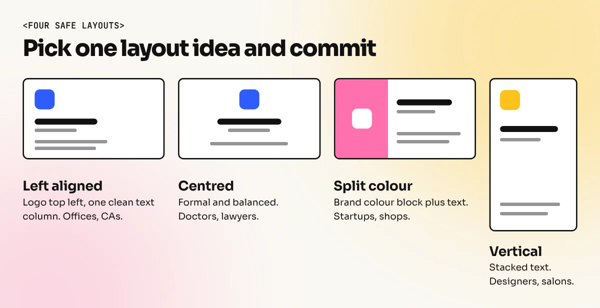
- Choose one layout idea. Left aligned text with the logo top right is the safest. Centred cards look formal. A split card with a colour block on one side looks modern. Pick one and commit.
- Set the type. Use one font family, or two at most. Name in bold at about 10 to 12 pt, role at 7 to 8 pt, contact lines at 7 to 8 pt. Body text below 6.5 pt becomes hard to read on paper.
- Build the hierarchy. Name first, then role, then contact details grouped together. Use size, weight and spacing to show order, not five colours.
- Pick colours. Use the brand colours. Keep strong contrast between text and background. Light grey text on white looks elegant on screen and disappears on paper.
- Design the back. A full colour background with the logo, a pattern from the brand or the contact block. Keep the same fonts and colours as the front.
- Print a test at 100 per cent. Print on your office printer, cut it with scissors and hold it at arm's length. You will catch tiny text and crowded areas instantly.
If you are new to choosing fonts, our guide to typography in graphic design explains weights, sizes and spacing in simple words.
Visiting card layouts that work
| Layout | How it looks | Good for |
|---|---|---|
| Left aligned | Logo top left, text in one clean column | Offices, CAs, consultants |
| Centred | Logo and name in the middle, details below | Lawyers, doctors, formal roles |
| Split colour | One side a brand colour, other side white with text | Startups, studios, shops |
| Vertical | Card used upright, text stacked | Designers, photographers, salons |
| Minimal front | Only the logo on the front, everything on the back | Brands with a strong logo |
Whatever you pick, align everything to one or two edges. Random positions make a card look amateur even when the fonts are good.
Paper and print finishes
Ask the printer for a sample pack before you design. The same artwork feels very different on different stock.
| Finish | What it is | Design tip |
|---|---|---|
| Matt lamination | Smooth, non-shiny surface | Safe default, easy to write on |
| Gloss lamination | Shiny surface, colours pop | Good for photos, shows fingerprints |
| Spot UV | Glossy coating on chosen parts | Make a separate black layer for the UV area |
| Foil stamping | Metallic gold, silver or rose gold | Use on the logo or name only, avoid tiny text |
| Embossing | Raised design pressed into the paper | Keep shapes simple and bold |
| Rounded corners | Corners cut in a curve | Keep text further from the corners |
| Textured paper | Linen, felt or kraft stock | Use darker, bolder text for clarity |
Spot UV and foil need extra files. Printers usually ask for a separate layer or file in 100 per cent black that shows only the area to be coated or foiled. Ask them how they want it before the deadline day.
Prepare a print-ready file
- Convert all text to curves or outlines, or send the fonts with the file, so the printer's computer does not swap your font.
- Check that every colour is in CMYK. Avoid using rich black (a mix of all four inks) on small text, which can blur. Use 100 per cent black for small text.
- Make sure photos and textures are at least 300 ppi at the final size.
- Export a PDF with bleed and crop marks. Name the file clearly, for example
ravi-sharma-card-front-back.pdf. - Ask for one printed proof and check every number by calling it.
Our print-ready file checklist goes through these checks in more detail for every kind of print job.
Common visiting card mistakes
| Mistake | Result | Fix |
|---|---|---|
| Text near the edge | Letters cut off or look cramped | Keep a 5 mm safe area |
| No bleed | White lines on the edges | 3 mm bleed on all sides |
| Too many details | Nothing stands out | Front for identity, back for contact |
| Tiny or thin fonts | Unreadable after printing | 7 pt minimum for contact lines |
| Low resolution logo | Blurry, jagged edges | Ask for a vector logo or redraw it |
| RGB colours | Dull print | Design and export in CMYK |
A visiting card is also a smart portfolio piece. Design a full set for an imaginary brand: logo, card front and back and a mockup photo. It shows employers that you understand small-space typography and print. If you want to practise on real briefs, our CorelDraw course covers cards, letterheads and print files the way Indian print shops use them. The Illustrator course teaches the vector skills agencies expect. To show your card in a realistic photo for your portfolio, read our guide to mockups for graphic design.
Frequently asked questions
What is the standard size of a visiting card in India?
Most Indian printers offer 3.5 x 2 inches (about 89 x 51 mm) as the regular size. Some also print 90 x 54 mm or 85 x 55 mm, which is common in Europe. Ask your printer which size they cut before you start the file.
Which software is best for visiting card design?
CorelDraw is the most common choice in Indian print shops and Adobe Illustrator is the standard in agencies. Both are vector tools, so text and logos stay sharp. Canva works for simple cards, but check that the export has bleed and good resolution.
What should be written on a visiting card?
The name, job title, company name, phone number, email and logo are enough for most people. Add a website, address or QR code only if they are useful to the person receiving the card. Fewer details make the card easier to read.
Should a visiting card be designed in RGB or CMYK?
Design and export in CMYK because the card will be printed with cyan, magenta, yellow and black inks. RGB colours, especially bright blues and greens, can look dull on paper. Ask the printer for their colour profile and a printed proof.