"Certificate Design: Layout, Fonts and Print Tips"
Certificate design made simple. Learn the right size, layout, fonts, border and seal, plus the print settings that stop a good certificate looking cheap on paper.
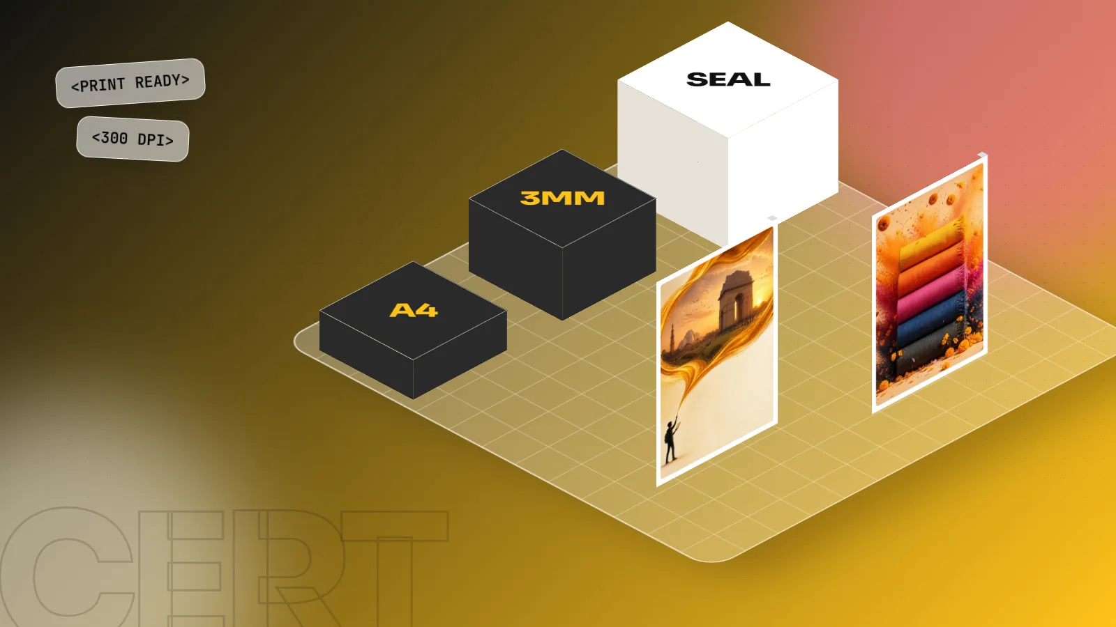
A good certificate design uses a wide A4 page, a clear border, one strong title, the winner's name as the biggest line, a short reason, a signature row and a seal. Use two fonts at most, keep 10 mm safe margins, add 3 mm bleed for print and export a 300 dpi PDF.
Certificate design is the job of making a page feel official, clear and worth framing. A good certificate has a strong title, one name that stands out, a short line saying why the person earned it, two signatures and a seal. This guide gives you the size, the layout, the fonts and the print settings, so your next certificate looks like it came from a real institution and not from a free template.
Certificates are one of the first real jobs a new designer gets. A school needs 200 of them after the annual day. A coaching centre needs one every month. A company needs a neat one for its best employee. If you can do this well, you already have repeat clients.
What a certificate must contain
Before you open any software, write down the content. A certificate is mostly text, so the design only works if the words are right.
| Part | What to write | Tip |
|---|---|---|
| Title | Certificate of Achievement, Participation, Completion or Appreciation | Make it large and use a serif or a decorative face |
| Presented to | The line "This certificate is proudly presented to" | Small size, light weight |
| Name | The winner's full name | The biggest line after the title |
| Reason | What they did and for which event, course or year | One or two lines only |
| Date and place | Date of the event or issue | Keep it near the signatures |
| Signatures | Two names with designations, such as Principal and Director | Leave real space for a pen signature |
| Seal or logo | The organisation logo and a stamp or seal | Place the seal near the signatures |
| Certificate number | A unique number or a QR code | Small text at the bottom edge |
Ask the client for the exact spelling of every name and for the logo as a vector or a clear high-resolution file. Wrong spelling on a printed certificate cannot be fixed with a pen.
The right size and orientation
Most certificates are placed wide, which means the long edge runs left to right. The usual choices are:
| Size | Wide dimensions | Where it is used |
|---|---|---|
| A4 | 297 x 210 mm | School, college and workshop certificates. The most common size |
| A3 | 420 x 297 mm | Large frames for awards and company recognition |
| US Letter | 11 x 8.5 in | Used for international or online courses |
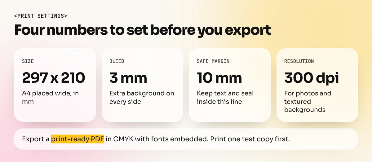
For print, create your file at the final size and add 3 mm bleed on every side. Bleed is extra background that goes beyond the cut line, so that a tiny shift in cutting does not leave a white edge. Keep all text and the seal at least 10 mm inside the cut line. This is called the safe margin. Our print ready file checklist lists every setting to check before a file goes to the printer.
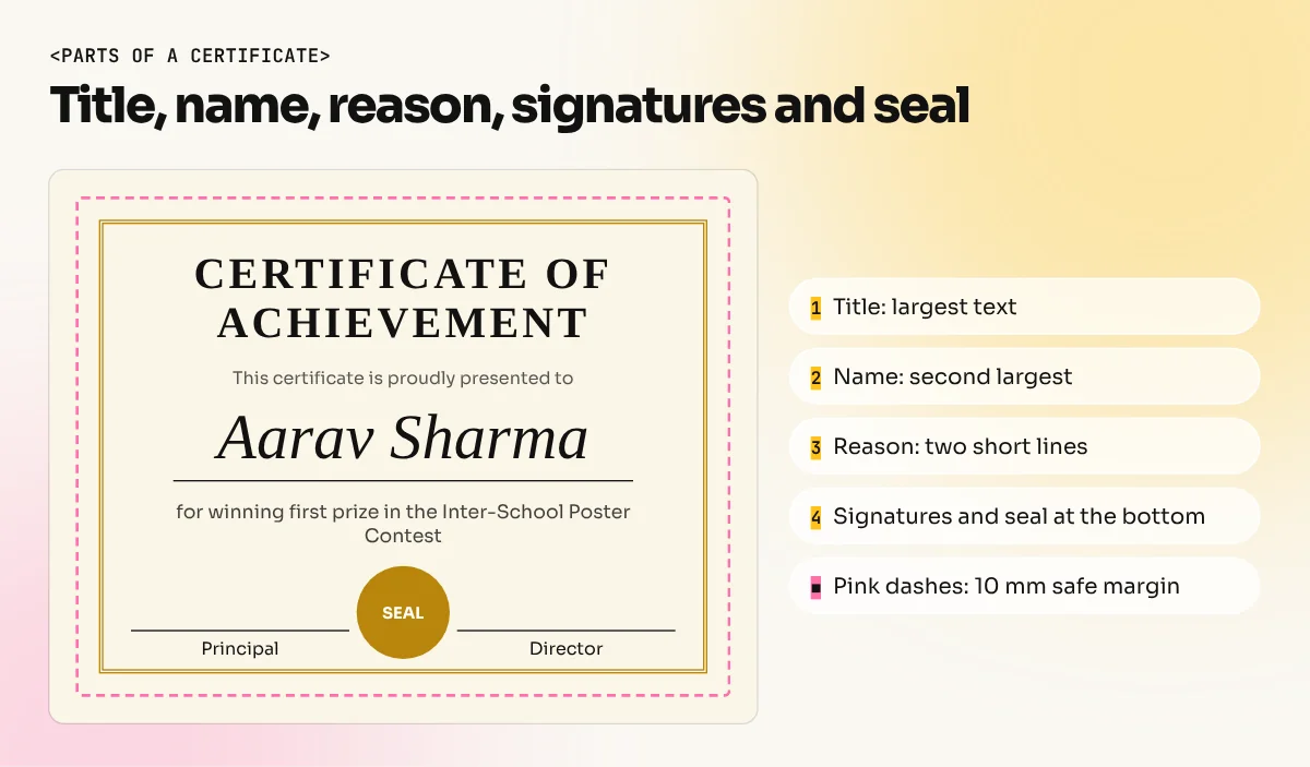
Layout: build a simple structure
A certificate looks formal because its layout is symmetrical and calm. Follow these steps.
- Set up the page. A4, wide, 3 mm bleed, 10 mm safe margin. Turn on guides.
- Draw the border. A thin line inside the safe margin is enough. Add a second thinner line for a double border if you want a richer look.
- Place the title at the top centre. Give it plenty of space above and below.
- Put the name in the middle. Make it clearly the biggest text after the title. Draw a thin line under it if you like.
- Add the reason text in two short centred lines below the name.
- Place the signature row at the bottom. Two signature lines, one at each side, with names and designations under them.
- Put the seal in the centre bottom or the lower right. Do not let it cover text.
- Check the spacing. Equal gaps look neat. If the page feels crowded, remove something instead of shrinking everything.
This is the idea of visual hierarchy at work: title first, name second, reason third and details last. If a reader can find the name in one second, the layout is working.
Fonts that look right
Fonts decide the mood more than any border does. A simple rule: two fonts at most, three sizes at least.
- Title: a classic serif with some weight, or a formal decorative face. Use capital letters with a little extra letter spacing.
- Name: a serif or one elegant script. If you use a script, make it big enough to read clearly and avoid heavy swirls that confuse letters such as n, m and u.
- Small text: a clean sans serif at 11 to 14 pt for the reason line, the date and the signature names.
Avoid comic or playful fonts for formal awards. For a children's competition a rounded friendly font is fine, but the layout should still stay in order. Our guide to font pairing shows combinations that work together.
Colour, border and seal
Most good certificates use one main colour and one accent. Navy with gold, maroon with gold and dark green with cream all feel traditional and trusted. Black text on a light cream or white background prints clearly and saves ink.
| Choice | Works well | Avoid |
|---|---|---|
| Main colour | Navy, maroon or dark green | Neon shades that look cheap on paper |
| Accent | Gold, or a muted yellow for print | A strong gradient that bands when printed |
| Background | White or soft cream | A busy photo behind the text |
| Border | Thin lines or a simple pattern | A thick ornate frame that eats space |
| Seal | A circle with the logo or initials | A pixelated low-resolution stamp |
Draw the border and the seal as vectors in CorelDRAW or Illustrator so they stay sharp at any size. A blurry seal is the quickest way to make a certificate look fake. If you want to see how colours behave together, read our colour theory guide.
Print settings and paper
A certificate is a keepsake, so the print matters as much as the design.
- Resolution: 300 dpi for any photo or textured background.
- Colour mode: CMYK for print. A bright RGB blue often turns duller in print.
- Export: a print-ready PDF with bleed and crop marks. Fonts should be embedded or converted to outlines.
- Paper: use something heavier than office paper. Ask your press for a few paper options and look at the samples before deciding.
- Gold or shine: for foil or embossing, give the printer a separate file that shows only the shape to be foiled.
- Test print: print one copy on an ordinary printer at 100% scale and check names, dates and spelling with a second person.
Common mistakes to avoid
| Mistake | Why it hurts | Fix |
|---|---|---|
| Name set at the same size as the other text | The winner has to hunt for their own name | Make the name the second biggest line |
| Five or more fonts | Looks like a notice board | Keep to two |
| Low-resolution logo | Pixelated edges on print | Ask for a vector logo |
| No safe margin | Text is trimmed in cutting | Keep 10 mm inside the edge |
| Template used unchanged | Looks like every other certificate | Change colour, border and wording |
| Spelling not checked | Costly reprint | Get the names confirmed in writing |
Do it fast for many people
When a school needs 150 certificates, do not retype each name by hand. Build one master file and use a data merge. InDesign can merge a spreadsheet of names into a template. Canva has a bulk create feature for the same job. You can learn the layout side of this in our Canva course.
Start with the page and the skills behind it
Certificates look simple, but they use almost every basic skill: layout, type, colour, vectors and print. If you want to learn all of these step by step with real Delhi client work, see our CorelDRAW course, which is popular for print jobs like this. To practise a similar print job, try a letterhead design.
Pick one real event, such as a local sports day or a workshop, design its certificate this week and keep the result in your portfolio.
Frequently asked questions
What is the standard size of a certificate?
Most certificates in India are printed on A4, which is 297 x 210 mm when placed wide. Some schools and awards use A3 for larger frames. Always check what your printer can handle before you design.
Which software is best for certificate design?
Canva is the quickest for beginners. CorelDRAW is popular with Delhi print shops for exact sizes and borders. Photoshop works for decorative backgrounds and Illustrator for seals and borders. Pick one and learn it well.
Which fonts look good on a certificate?
Use a classic serif for the title and the name with a clean sans serif for the small text. A script font can work for the winner's name but keep to one script font and make sure it stays easy to read.
How do I stop a certificate being copied or faked?
Add a unique certificate number, a signature and a seal or stamp. For important certificates add a QR code that opens a verification page. Nothing is fully copy proof but these make faking harder.