"Contrast in Design: 6 Types and How to Use Them"
Contrast in design is the clear difference between two elements. Learn 6 types, the WCAG text contrast ratios and simple steps to make your posters easy to read.
Contrast in design is a clear difference between two elements, such as light against dark, big against small or bold against thin. It makes text readable, shows what is important and keeps the eye interested. The six useful types are colour, value, size, weight, shape and space. For body text, WCAG asks for at least a 4.5 to 1 colour ratio.
Contrast in design is the clear difference between two elements, such as light and dark, big and small or thick and thin. It is the reason you can read a hoarding from across the road and the reason one button on a page looks more important than the rest. This guide explains the six types of contrast, the real numbers for readable text from the Web Content Accessibility Guidelines (WCAG), Indian ad examples and a step-by-step way to fix a low-contrast design.
What contrast means in design
Contrast works by comparison. One element only looks big because another is small. A yellow sticker only glows because the board behind it is dark. Take away the difference and the design goes flat.
Contrast does three jobs:
- Readability: text must stand apart from its background or people cannot read it.
- Focus: the strongest difference is where the eye goes first.
- Interest: a design with no difference at all is boring. A little tension keeps people looking.
Think of the yellow and black board outside a mechanic's shop in Okhla. The shop name is easy to read from a moving auto. That is contrast doing its first job. It is also one of the 12 principles of graphic design that every layout uses.
The 6 types of contrast
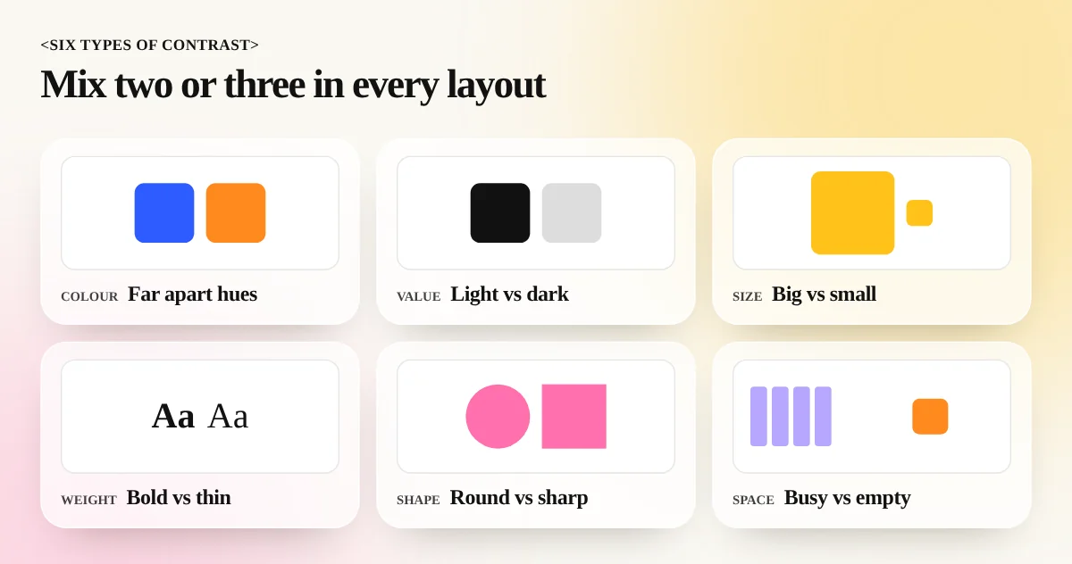
You can create contrast in more ways than light and dark. Good designers mix two or three of these in each layout.
| Type | What differs | Simple example |
|---|---|---|
| Colour | Hue, such as warm against cool | Orange button on a blue page |
| Value | Light against dark | White headline on a dark photo |
| Size | Big against small | A huge price beside tiny terms text |
| Weight | Bold against thin | Bold heading over a light paragraph |
| Shape | Round against sharp | A circle badge on a square grid |
| Space | Crowded against empty | One clear logo in a wide margin |
Colour contrast
Colours that sit far apart on the colour wheel, such as blue and orange or purple and yellow, pop against each other. Colours that sit close together feel quiet and blended. Our colour theory guide explains the wheel and how to pick pairs that work.
Value contrast
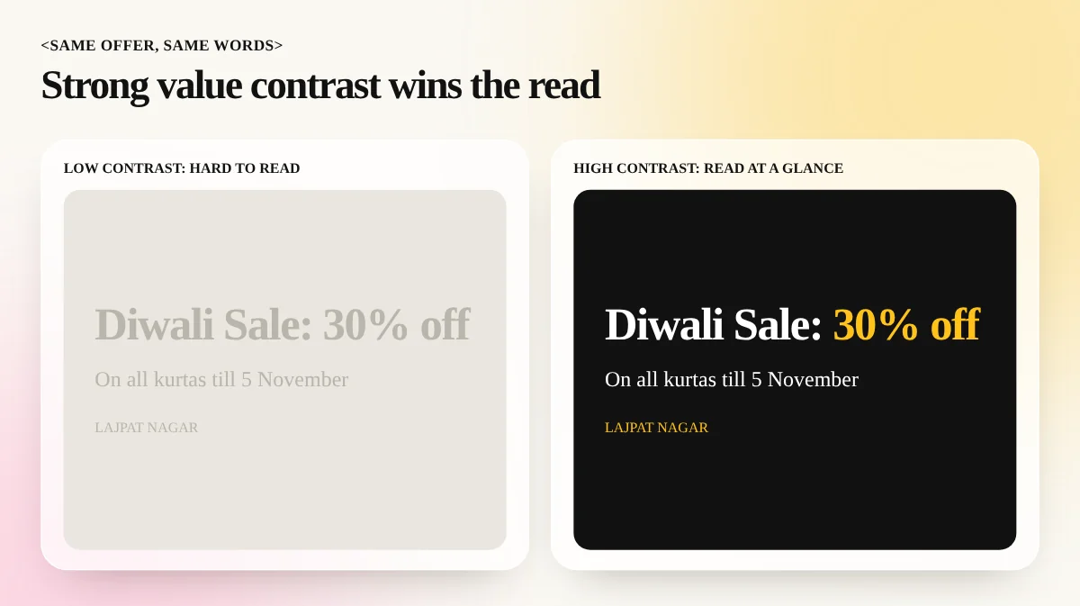
Value means how light or dark a colour is. This is the most important type for reading text. Two very different colours with the same value, such as red text on a green background, can look like a vibrating mess. Many people with colour blindness cannot separate them at all. A quick test is to turn the design to black and white. If the text vanishes, the value contrast is too low.
Size contrast
Make the thing that matters much bigger, not slightly bigger. A headline that is only 10 per cent larger than the body text will not lead the eye. Try a clear jump, such as two or three times the size.
Weight contrast
Pair a bold heading with a light or regular paragraph in the same family. The difference in thickness shows the order without adding another font.
Shape contrast
A round sticker on a grid of rectangles gets noticed. A sharp, angular logo on soft curved packaging does the same. Use one odd shape on purpose and the eye lands there.
Space contrast
A busy area next to an empty area creates a strong pull towards the busy part. This is why a jewellery ad with one ring in a lot of space feels premium. See how this works in our guide to negative space in design.
Contrast ratio: the numbers for readable text
Contrast can be measured. The WCAG, written by the World Wide Web Consortium (W3C), gives a contrast ratio between text and its background. The scale runs from 1 to 1 (no difference) to 21 to 1 (black on white).
| Text type | Level AA (minimum) | Level AAA (enhanced) |
|---|---|---|
| Normal text | 4.5 to 1 | 7 to 1 |
| Large text (18 pt or 14 pt bold and above) | 3 to 1 | 4.5 to 1 |
Level AA is the usual target for websites, apps and social graphics that people read on screens. Free checkers, including the ones built into browsers and design tools, show the ratio for any two colours, so you do not have to guess.
Two practical notes. First, light grey text on white is the most common failure. It looks elegant on your bright monitor and unreadable on a phone in sunlight. Second, text over a photo needs a check at the busiest part of the photo, not the calmest.
Real examples of contrast working
- A cinema poster: a small bright title on a dark scene, plus one oversized actor face. Value and size do the work.
- A matrimonial card: gold script on deep maroon. Value and colour contrast make it feel rich and keep the names readable.
- A mobile app button: one orange "Pay now" button among grey options. Colour contrast sends the eye to the main action.
- A menu card: bold dish names with light descriptions and a lot of space between sections. Weight and space contrast keep a long list calm. Our menu card design guide shows more on this.
How to fix a low-contrast design: 6 steps
- Squint or go greyscale. Turn the design black and white. Anything that disappears has weak value contrast.
- Find the one thing that matters. It may be the offer, the date or the button. Everything else supports it.
- Make that thing different in at least two ways. For example bigger and bolder, or lighter and larger.
- Check text colours against the WCAG numbers. Aim for 4.5 to 1 or higher for small text.
- Calm the supporting parts. Use softer colours and lighter weights for secondary items so the main item can lead.
- Test on a phone. View the design at small size, at low screen brightness and outdoors if you can. Real viewing shows problems that a big monitor hides.
Common contrast mistakes
- Everything loud. If every element is bold and bright, none of them stands out. Contrast needs quiet areas too.
- Thin fonts on dark photos. Light-weight text over a textured picture breaks up. Use a heavier weight or place a soft dark overlay behind it.
- Using colour alone. Red against green for "stop" and "go" fails for people with colour blindness. Add a label, icon or change in lightness.
- Pure black on pure white for long text. It can tire the eyes. Dark grey on off-white often reads better in long paragraphs.
- Low contrast for style. Trendy pale pastel text looks nice in a mockup and fails in real use. If the audience cannot read it, the style has not worked.
Contrast and the other principles
Contrast does not work alone. It builds visual hierarchy, the order in which a viewer reads your design. It also pairs with repetition and rhythm, as you can see in our guide to rhythm in design. A good layout usually mixes contrast to show importance, repetition to show unity and space to give the eye rest.
Learn contrast on real projects
You can read about contrast for hours, but the skill comes from fixing real posters, banners and social posts again and again until your eye spots the problem at once. Our 6-month graphic design diploma trains you on design principles with live briefs. The Photoshop course shows how to adjust levels, curves and colour to boost contrast in photos and text overlays, so your work stays clear in print and on screen.
Frequently asked questions
What is contrast in design in simple words?
Contrast is the difference between two things placed together. Black text on white paper has high contrast. Grey text on a slightly lighter grey has low contrast. High contrast makes things easy to see and low contrast makes them blend in.
What is a good contrast ratio for text?
The Web Content Accessibility Guidelines (WCAG) level AA asks for at least 4.5 to 1 for normal text and 3 to 1 for large text. Large text means 18 point or bigger, or 14 point bold or bigger. Level AAA asks for 7 to 1 for normal text.
Is high contrast always better?
No. Pure black on pure white can feel harsh over long reading and too many strong contrasts on one page fight for attention. Use high contrast for the main message and softer contrast for the rest.
What is the difference between contrast and emphasis?
Contrast is the tool and emphasis is the result. You use contrast in size, colour or weight to make one element stand out. That standing out is emphasis.