Negative Space in Design: How to Use What Isn't There
Negative space in design is the empty area around and between elements. See famous logo examples, the two types of space and 6 ways to use it well.
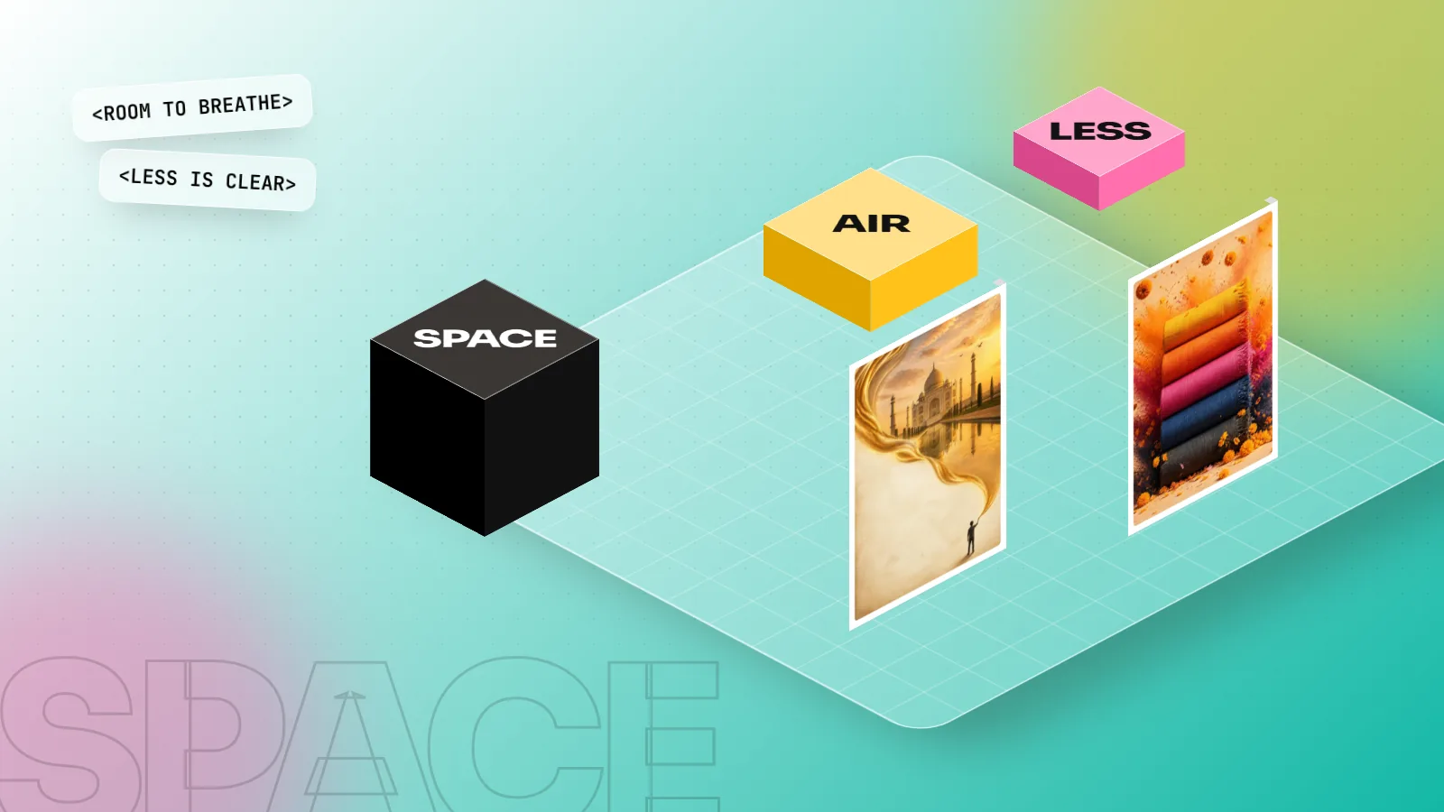
Negative space in design is the empty area around and between the elements of a layout, also called white space. It is not wasted room. It separates groups, gives the main message focus, makes text easier to read and can even form a hidden shape, like the arrow between the E and x in the FedEx logo.
Negative space in design is the empty area around and between the parts of a layout: the margins, the gaps between lines and the space around a logo or headline. It is also called white space, even when it is not white. Beginners often see it as wasted room and fill it with more text, more icons and more colour. Experienced designers treat it as a design element in its own right. Used well, negative space makes a layout calm, guides the eye to the main message and can even hide a second image inside a logo. This guide explains what negative space is, the types you will use, famous examples and six practical ways to use it in your own work.
What negative space means
Every design has two parts:
- Positive space: the things you place. Text, photos, shapes, logos, buttons.
- Negative space: everything else. The background and all the gaps between the things you place.
The two depend on each other. Change the space around a headline and the headline itself looks different: bigger, more confident or more cramped.
The idea comes from art and perception, not from software. The Danish psychologist Edgar Rubin published his famous "vase" drawing in 1915. Look at the white area and you see a vase; look at the black area and you see two faces in profile. Your brain switches between the two because it cannot treat both as the main shape at once. Designers use this same figure and ground effect in logos, posters and packaging. Our guide to the Gestalt principles explains figure and ground along with the other rules of how the eye groups shapes.
The types of negative space
| Type | What it is | Where you see it |
|---|---|---|
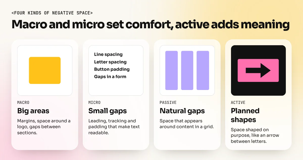
| Macro space | Large areas: page margins, space around a logo, space between sections | Luxury ads, book covers, website hero sections |
| Micro space | Small gaps: letter spacing, line spacing, padding inside buttons | Body text, menus, forms, business cards |
| Passive space | Space that appears naturally around content | Margins and gutters in a grid |
| Active space | Space planned on purpose to guide the eye or form a shape | Hidden-arrow logos, posters with one small subject |
Macro and micro space work together. A page with good margins but tight line spacing still feels crowded to read. A page with comfortable line spacing but no margins feels like a wall of text.
Famous negative space examples
Logos are where negative space gets the most attention, because a clever use of space makes a mark memorable.
FedEx: the hidden arrow
The FedEx logo was designed in 1994 by Lindon Leader, then a senior design director at Landor Associates. According to an account in Retail Brew, the team had mocked up more than 200 designs before Leader noticed that a lowercase "x" placed after a capital "E" hinted at an arrow. He refined the letters by hand so the gap between the "E" and "x" forms a clean arrow pointing forward. The arrow suggests speed and direction without adding a single extra shape. Leader himself put it simply: "Either you see it or you don't."
WWF: the panda drawn by its gaps
The WWF panda was first presented in 1961. According to WWF, British environmentalist and artist Gerald Watterson made the first sketches and WWF founder Sir Peter Scott created the logo from them. The panda was inspired by Chi-Chi, a giant panda at London Zoo. In the current version, the outline of the head and back is not drawn at all. Your eye completes the shape from a few black patches and the white space around them.
What these logos teach
- The best negative space ideas look simple once you see them.
- The hidden shape must support the brand message (speed for a courier, nature for a wildlife charity). A clever trick with no meaning is just a puzzle.
- They work even if people never notice the trick. The FedEx logo is clear and readable on its own.
Why negative space matters in everyday design
Most of your work will not involve hidden arrows. Negative space still does four practical jobs on every project:
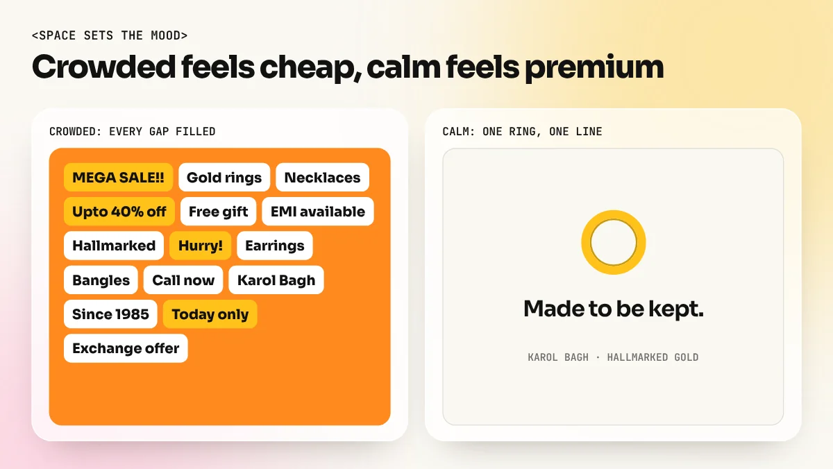
- It creates focus. One product with a lot of space around it looks premium. The same product squeezed between offers looks cheap. This is why luxury brands use so much empty area in their ads.
- It groups information. Items close together read as one unit; a bigger gap starts a new group. You can organise a page with space alone, no lines or boxes needed.
- It improves reading. Comfortable line spacing, short line lengths and clear paragraph gaps make text faster to read, especially on phones.
- It sets the mood. Lots of space feels calm, modern and expensive. Little space feels busy, loud and urgent, which suits a Diwali sale but not a jewellery brand.
6 ways to use negative space well
- Start with wide margins. On print, keep at least 5 mm inside the trim line for safety, then add more if the design allows. On social posts, keep a clear margin so text never touches the edge.
- Space between groups more than within them. If lines inside a paragraph are 6 px apart, the gap between paragraphs should be clearly larger, for example 18 px. This one rule fixes most crowded layouts.
- Give the hero element room. The headline, product or face that matters most should have the most space around it. Our post on branding design shows how logo clear space rules protect a brand mark in the same way.
- Cut before you shrink. When text does not fit, do not reduce the font size and squeeze the gaps. Cut words or move content to another page.
- Use line spacing of about 1.4 to 1.6 for body text. Tight leading saves space but slows reading. Headlines can be tighter, around 1.0 to 1.2.
- Plan active space in logos. Sketch the letters or shapes and look for gaps that could form a meaningful shape. Then refine the curves in Illustrator so the gap is clean and intentional.
Common mistakes with negative space
| Mistake | What happens | Fix |
|---|---|---|
| Filling every gap with icons or stars | Nothing stands out; the design feels cheap | Remove decoration that does not carry a message |
| Equal spacing everywhere | Groups are not clear; the eye wanders | Use small gaps inside groups, large gaps between them |
| Trapped white space | Odd empty pockets in the middle of a layout look like mistakes | Push space to the edges or between groups, not in random holes |
| Text touching the edge | Looks cut off on print and on phone screens | Keep a safe margin on all sides |
| Too much space with weak content | The page looks empty, not premium | Space works when the content inside it is strong; improve the photo or line first |
How to explain negative space to a client
Clients in India often say, "There is so much empty space, add our phone number there too." Here is a calm way to handle it:
- Make two versions: the crowded one they asked for and your version with space.
- Show both at the size people will really see them, such as an Instagram post on a phone or a hoarding photo from across the road.
- Ask, "Which one tells you the offer faster?"
- Offer a place for the extra detail that does not hurt the design, such as the caption, the back of the leaflet or the website.
Most clients pick the clearer version once they see it in real use. Showing beats arguing.
Practice exercises
- One object poster. Design a poster for a chai brand using only one kulhad photo, one line of text and the logo. Use at least half the poster as empty space.
- Hidden letter logo. Take your initials and try to form a simple shape, such as an arrow, a leaf or a house, in the gap between two letters.
- Spacing redo. Pick a crowded menu or pamphlet and redesign it with the same words, changing only margins, line spacing and group spacing.
- Rubin test. Create your own figure and ground image where two shapes share one edge, like the vase and the faces.
The figure and ground exercises are easiest with vector tools. An Illustrator course covers the Pen tool, Shape Builder and Pathfinder you need. For the full mix of layout, type, branding and portfolio work, the 6-month graphic design diploma builds these habits project by project.
The bottom line
Negative space is the empty area around and between the parts of a design. It is not wasted; it creates focus, groups information, improves reading and sets the mood. Use wide margins, larger gaps between groups than within them and generous room around the main element. When you are ready, try active space in logos, as Lindon Leader did with the FedEx arrow. Learn to see the space as well as the things. Your layouts will look cleaner overnight.
Frequently asked questions
Is negative space the same as white space?
Yes, the two terms mean the same thing. The space does not have to be white; it can be any colour, texture or photo background as long as it is free of content.
What is the difference between active and passive negative space?
Passive space is the natural gap around text and margins. Active space is planned on purpose to guide the eye or to form a shape, such as the hidden arrow in the FedEx logo.
How much negative space should a design have?
There is no fixed percentage. Start with generous margins, increase space between groups more than within them and use the squint test to check that the main message stands out.
Why do clients want me to fill the empty space?
Many clients see space as wasted money. Show them two versions side by side, one crowded and one with space. Ask which one they read faster. The clearer version usually wins.