Colour Theory for Graphic Designers: Wheel, Harmony and Meaning
Colour theory explained simply: the colour wheel, hue, saturation and value, six colour harmonies, the 60-30-10 rule, contrast and what colours mean in India.
Colour theory is the set of rules designers use to choose colours that work together. It covers the colour wheel, the three properties of colour (hue, saturation and value), harmonies such as complementary, analogous and triadic, contrast for readability and the meaning colours carry for an audience. Most good designs use one main colour, one support colour and one accent.
Colour theory is the set of ideas designers use to pick colours that look good together, send the right feeling and stay easy to read. It starts with the colour wheel, adds the three properties of every colour (hue, saturation and value) and gives you tested combinations called harmonies. This guide explains each part in plain words, with Indian examples, a simple process for building a palette and the contrast rules that keep text readable.
Think of a Diwali poster with a deep maroon background, gold text and a small touch of bright orange. Now think of the same poster with seven random bright colours. Both use colour. Only one looks planned. Colour theory is what makes the difference. It is a skill you can learn step by step.
The colour wheel: primary, secondary and tertiary colours
Isaac Newton arranged the colours of light in a circle in his book Opticks, published in 1704. Artists later turned this idea into the colour wheel that designers still use. The traditional painter's wheel is built on red, yellow and blue.
| Group | Colours (traditional RYB wheel) | How you get them |
|---|---|---|
| Primary | Red, yellow, blue | Cannot be mixed from other paint colours |
| Secondary | Orange, green, violet | Mix two primaries |
| Tertiary | Red-orange, yellow-orange, yellow-green, blue-green, blue-violet, red-violet | Mix a primary with the secondary next to it |
There are three wheels you will hear about. RYB is used to teach harmonies. RGB (red, green, blue) is how phone and laptop screens mix light. CMYK (cyan, magenta, yellow and key or black) is how printers mix ink. You plan a palette on the wheel, then choose RGB for screen work or CMYK for print. Our guide on CMYK vs RGB explains when to use each colour mode.
Hue, saturation and value
Every colour you pick in Photoshop, Illustrator or Canva has three properties.
| Property | Meaning | Example |
|---|---|---|
| Hue | The colour family on the wheel | Red, blue, green |
| Saturation | How pure or greyed the colour is | Bright Holi pink vs dusty rose |
| Value | How light or dark it is | Sky blue vs navy |
Value matters most for readability. Two colours with very different hues but similar value, such as pure red on medium green, look loud but are hard to read. A quick test: convert your design to black and white. If the headline disappears, the values are too close.
You also hear three more words. A tint is a colour mixed with white, a shade is mixed with black and a tone is mixed with grey. Using tints and shades of one hue is the easiest way to get a calm, professional palette.
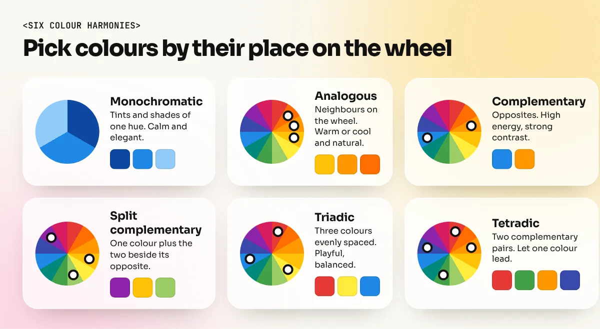
Six colour harmonies designers use
Harmonies are tested ways to pick colours based on their position on the wheel.
| Harmony | How to pick it | Feel | Indian example idea |
|---|---|---|---|
| Monochromatic | Tints and shades of one hue | Calm, elegant | All-blue hospital signage |
| Analogous | Two to four neighbours on the wheel | Warm or cool, natural | Yellow, orange and red for a mithai box |
| Complementary | Two colours opposite each other | High energy, strong contrast | Blue and orange for a sale banner |
| Split complementary | One colour plus the two beside its opposite | Strong but softer than complementary | Violet with yellow-orange and yellow-green |
| Triadic | Three colours evenly spaced | Playful, balanced | Red, yellow, blue for a kids' toy brand |
| Tetradic | Two pairs of complementary colours | Rich, needs one dominant colour | Festival posters with many elements |
A harmony is a starting point, not a finished palette. Real brand palettes usually pick one harmony and then adjust saturation and value until the colours sit well together.
The 60-30-10 rule and how to build a palette
The 60-30-10 rule is a rule of thumb often credited to interior design. Use a dominant colour on about 60 percent of the area, a secondary colour on about 30 percent and an accent on about 10 percent. The accent goes on the thing you want people to notice: the price, the button, the date.
- Start from the message. Write three words for the feeling you want, for example "fresh, trusted, local".
- Pick one main hue. Choose the colour that best matches those words and the client's existing brand.
- Choose a harmony. Analogous for calm, complementary for energy.
- Add neutrals. White, off white, warm grey or near black give the bright colours room to breathe.
- Set the 60-30-10 roles. Decide which colour is background, which is support and which is accent.
- Test contrast. Check every text and background pair with a contrast checker.
- Test in black and white. Make sure the hierarchy still works without colour.
- Write the codes down. Save HEX for screen, CMYK for print and a Pantone reference if the client prints a lot.
Free tools such as Adobe Color let you spin the wheel, choose a harmony and copy the colour codes. Treat them as helpers. The decisions are still yours.
Contrast and readability
Good colour is useless if people cannot read the text. The Web Content Accessibility Guidelines (WCAG), published by the W3C, set a minimum contrast ratio of 4.5:1 for normal text and 3:1 for large text, such as headings at 18 point or 14 point bold. These rules are written for websites but they work as a sensible check for social posts and print too.
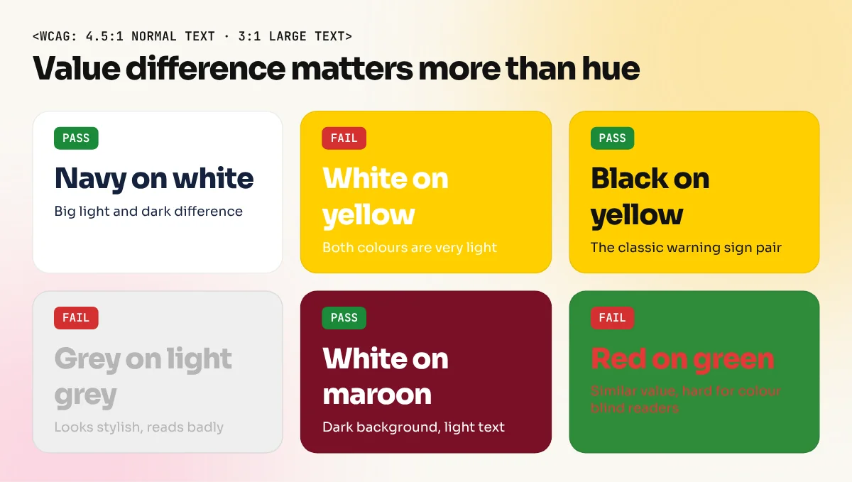
| Pair | Usually | Why |
|---|---|---|
| Near black on white | Passes easily | Big value difference |
| White on bright yellow | Fails | Both are very light |
| Black on bright yellow | Passes | Classic warning sign combination |
| Light grey on white | Fails | Looks stylish, reads badly |
| White on navy or maroon | Passes | Dark background, light text |
| Red on green | Risky | Similar value, hard for colour blind readers |
Never use colour as the only signal. If a form marks errors only in red, a reader with red-green colour blindness may miss it. Add an icon or a word too.

In the video above, the designer behind the GraphiqVibe channel shows the 60-30-10 rule on real layouts, explains why fewer colours look more mature and builds a three colour poster in Photoshop with a gradient map to tie the colours together.
What colours mean and why context matters
Colour meaning is not fixed. It changes with culture, industry and the other colours around it. In India some associations are strong and worth knowing.
| Colour | Common associations in India | Watch out |
|---|---|---|
| Red | Weddings, festivals, energy, sale | Can feel like danger or a warning |
| Saffron and orange | Spiritual, festive, warm | Strong religious links, so use with care |
| Yellow | Haldi, spring, cheerful, low cost | Hard to read as text colour |
| Green | Fresh, natural, vegetarian food marking | Brand overlap with many food and finance names |
| Blue | Trust, banks, hospitals, tech | Can feel cold without a warm accent |
| White | Clean, calm, also mourning in many traditions | Avoid an all-white card for a wedding |
| Black | Premium, bold | Can feel heavy for children's products |
| Pink | Playful, sweet, modern | Very trend driven, may date quickly |
Always ask who the audience is and what competitors use. A spice brand in all-blue packaging may stand out on the shelf, or it may confuse buyers who expect red and yellow. Colour theory gives you options. Research tells you which option to choose. Colour also works with the other basics, so read our guide to the principles of graphic design to see how it ties in with contrast, balance and hierarchy.
Practise colour theory in one week
| Day | Exercise |
|---|---|
| 1 | Make a 12 part colour wheel in Illustrator or Canva |
| 2 | Pick one photo and pull a five colour palette from it |
| 3 | Design the same poster in monochromatic, analogous and complementary palettes |
| 4 | Apply the 60-30-10 rule to a social media post |
| 5 | Check every text pair with a contrast checker and fix the failures |
| 6 | Redesign a local shop's signboard in two palettes |
| 7 | Put the best three pieces in your portfolio with a short note on your colour choices |
Colour is one of the first subjects in any serious design course because it shows up in every project. Our 6-month graphic design diploma teaches colour, typography and layout through real briefs. To build palettes and swatches for logos and branding, the Illustrator course covers the colour panel, global swatches and recolouring artwork.
Frequently asked questions
What are the basics of colour theory?
The colour wheel, the three properties of colour (hue, saturation and value), colour harmonies such as complementary and analogous and contrast between text and background. Learn these four and you can build most palettes with confidence.
What is the 60-30-10 rule in colour?
Use one dominant colour on about 60 percent of the design, a second colour on about 30 percent and an accent colour on about 10 percent. It is a guide for hierarchy, not an exact measurement.
What is the difference between RYB, RGB and CMYK colour wheels?
RYB (red, yellow, blue) is the traditional painter's wheel used to teach harmonies. RGB (red, green, blue) is how screens mix light. CMYK (cyan, magenta, yellow, black) is how printers mix ink. Designers pick harmonies on a wheel, then set the right colour mode for screen or print.
How much contrast does text need?
The Web Content Accessibility Guidelines (WCAG) ask for a contrast ratio of at least 4.5:1 for normal text and 3:1 for large text. Use a contrast checker before you finalise text colours.