Cover Page Design for Projects and Reports: Simple Layouts That Look Neat
Cover page design for school projects, college assignments and reports: what to include, A4 size and margins, 5 simple layouts and quick steps in Word or Canva.
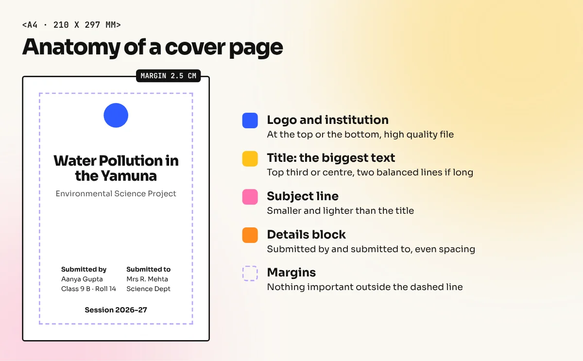
A good cover page design for a project or report uses an A4 page, one clear title as the biggest text, the subject, your name, class or roll number, the school or college with its logo and the submission date. Keep margins of about 2.5 cm, use one or two fonts and leave plenty of white space.
Cover page design is the layout of the first page of a project, assignment or report so that it shows the title and the key details clearly and makes a neat first impression. A good cover page uses the same size as the inner pages (usually A4), puts the title in the biggest text, groups the student or author details together and leaves enough white space. This guide shows what to include, the size and margins, five simple layouts and quick steps in Word, Canva or InDesign.
Every student in India makes dozens of cover pages: a science project in Class 8, a lab file in Class 11, a college assignment, an internship report, a final year project. Teachers see the cover first. A clean cover will not change the marks for the content, but a messy one with five fonts, a rainbow border and a blurry Google image makes a weak start. The same skills also apply to office reports, proposals and portfolios.
What to include on a cover page
The details depend on the school, college or office, so always read the instructions first. This table covers the common items.
| Detail | School project | College assignment or report | Office report |
|---|---|---|---|
| Title | Yes, biggest text | Yes, biggest text | Yes, biggest text |
| Subject or course | Yes | Yes, with course code if asked | Department or project name |
| Your name | Yes | Yes | Prepared by |
| Class, section or roll number | Yes | Roll number or enrolment number | Not needed |
| School or college name and logo | Yes | Yes | Company name and logo |
| Submitted to (teacher or guide) | Usually | Usually | Prepared for (client or manager) |
| Session, year or date | Yes | Yes | Date and version |
| An image | Optional | Optional | Optional |
Keep the order logical: title first, then subject, then the "submitted by" and "submitted to" blocks, then the institution and date. Your reader should find each detail without searching.
Cover page size and margins
Most projects and reports in India are printed on A4 paper. Under the ISO 216 standard, A4 is 210 x 297 mm. Design the cover at the same size as the inside pages so it lines up when you bind or staple the file.
| Setting | Recommended value | Why |
|---|---|---|
| Page size | A4, 210 x 297 mm, portrait | Same as inner pages |
| Margins | About 2.5 cm (1 inch) on all sides | Word's Normal margins are 1 inch. Leaves room for binding |
| Binding edge | Add 0.5 to 1 cm extra on the left for spiral or file binding | Text does not hide in the binding |
| Title size | About 28 to 40 pt | Clearly the biggest item |
| Details size | About 12 to 14 pt | Easy to read when printed |
| Fonts | One or two | Looks planned, not random |
If you add a full colour background that touches the edges, remember that most home and college printers cannot print to the very edge. A white border will appear. Either keep a white margin in the design or get it printed at a shop that can print with bleed.
Five simple cover page layouts
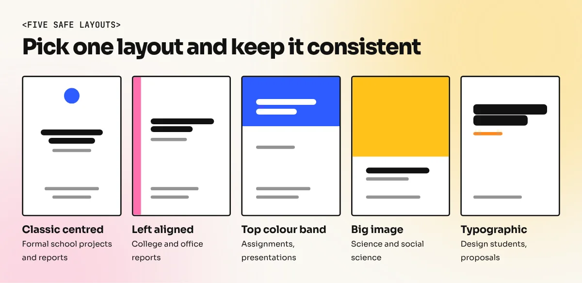
You do not need a new idea for every project. Pick one of these and adjust the colours.
| Layout | How it looks | Good for |
|---|---|---|
| Classic centred | Logo top centre, title in the middle, details below, all centred | School projects, formal reports |
| Left aligned | Everything aligned to the left margin with a thin colour bar | College reports, office documents |
| Top colour band | A solid colour block across the top third with the title in white | Assignments, presentations |
| Big image | One large photo or illustration with the title over a plain area | Science and social science projects |
| Typographic | No image, just a large title and clean details with lots of space | Design students, portfolios, proposals |
Whatever you choose, align everything to one axis. Either centre all the items or align them all to the left. Mixing centred and left aligned text is the most common reason a cover page looks untidy. Our guide to layout design explains alignment, grids and white space in more detail.
How to make a cover page, step by step
These steps work in any software. The next section shows the exact menus.
- Collect the details. Write the title, subject, your name, roll number, teacher's name, institution and date in a plain text file. Check spellings, especially names.
- Set the page. A4 portrait with margins of about 2.5 cm.
- Place the title. Put it in the top third or the centre of the page. Make it the biggest text by far. Break a long title into two balanced lines.
- Add the subject line. Smaller than the title, often in a lighter weight or a second colour.
- Build the details block. Put "Submitted by" and "Submitted to" side by side or one below the other. Keep line spacing even.
- Add the logo and institution name. Usually at the top or the bottom. Use a clear, high quality logo file, not a screenshot.
- Choose colours. Use the school or college colours, or one dark colour with one accent. Two colours plus black are enough.
- Add an image only if it helps. One relevant photo or illustration is better than three clip art pieces. Use your own photo, a free stock image you are allowed to use or a simple illustration.
- Print a test page. Check that nothing is cut at the edges and that small text is readable.
If you are unsure about font sizes and pairing, our guide to typography in graphic design explains it in simple words.
Making a cover page in Word, Canva or InDesign
| Software | Best for | How to start |
|---|---|---|
| Microsoft Word | Students and offices who already write the report in Word | Insert, then Cover Page, then pick a built-in design and replace the text |
| Canva | Quick, colourful covers with templates | Create an A4 document, search "project cover" or "report cover" templates and edit |
| Google Docs | Shared reports | Insert a drawing or table for the layout, then add text and image |
| Adobe InDesign | Long reports, magazines and professional documents | Create an A4 document with margins, place text frames and images on a grid |
| Illustrator or CorelDraw | Covers with custom graphics and print finishes | Create an A4 artboard and export a print PDF |
In Word you can also design your own cover and save it for reuse: select everything on the page, then go to Insert, Cover Page and choose Save Selection to Cover Page Gallery. If the cover shows a page number, open the header or footer and tick Different First Page to hide it.

The video above, by technical writer Erin Wright, shows both methods in Word: inserting a built-in cover page and saving your own custom design to the Cover Page gallery. It also shows how to remove the page number from the cover.
Common cover page mistakes
| Mistake | Result | Fix |
|---|---|---|
| Too many fonts | Looks random and childish | One or two fonts only |
| Title not the biggest | Reader does not know what the project is | Make the title clearly larger |
| Mixed alignment | Untidy, unplanned look | Centre everything or left align everything |
| Thick decorative borders | Looks dated and crowded | Use white space or a thin line |
| Blurry images from the internet | Pixelated print | Use high quality, allowed images |
| Spelling mistakes in names | Bad first impression | Check every name and roll number twice |
| Details touching the edges | Cut off when printed or bound | Keep 2.5 cm margins |
Cover page ideas by subject
| Subject | Simple idea |
|---|---|
| Science | One clean photo or diagram related to the topic, title on a white band |
| Maths | A large typographic title with a subtle grid or geometric pattern |
| Social science or history | One historical photo you are allowed to use, title in a classic serif font |
| English or literature | Typographic cover with a short quote style subtitle |
| Commerce or business | Left aligned layout with a colour bar and a simple chart icon |
| Computer science | Dark background with light text and a simple line icon |
A cover page is a small design job, but it teaches the same basics as every layout: hierarchy, alignment, spacing and restraint. If you enjoy making documents look neat, our Canva course helps you build quick, polished covers and social posts. For long reports, magazines and books, the InDesign course teaches proper page layout, master pages and print-ready PDFs.
Frequently asked questions
What should be written on a project cover page?
The project title, subject, your name, class and section or roll number, the school or college name with its logo, the teacher's name under "Submitted to" and the session or date. Some schools also want a guide's name or a project number, so check the instructions first.
What is the size of a cover page?
Most projects and reports in India are printed on A4 paper, which is 210 x 297 mm under the ISO 216 standard. Design the cover at the same size as the pages inside so it binds neatly.
Can I make a cover page in Microsoft Word?
Yes. Word has built-in cover pages under Insert, then Cover Page. You can also design your own with shapes, text boxes and an image, then save it to the Cover Page gallery to reuse it.
How do I make a cover page look professional?
Use one strong title, one or two fonts, two colours at most and generous margins. Align everything to the centre or to one edge, not both. Leave empty space instead of filling the page with clip art and borders.