What Is a Mood Board and How Graphic Designers Use It (With Steps)
A mood board is a collage of images, colours and type that shows the feel of a design before you start. Learn the types, tools and steps designers use.
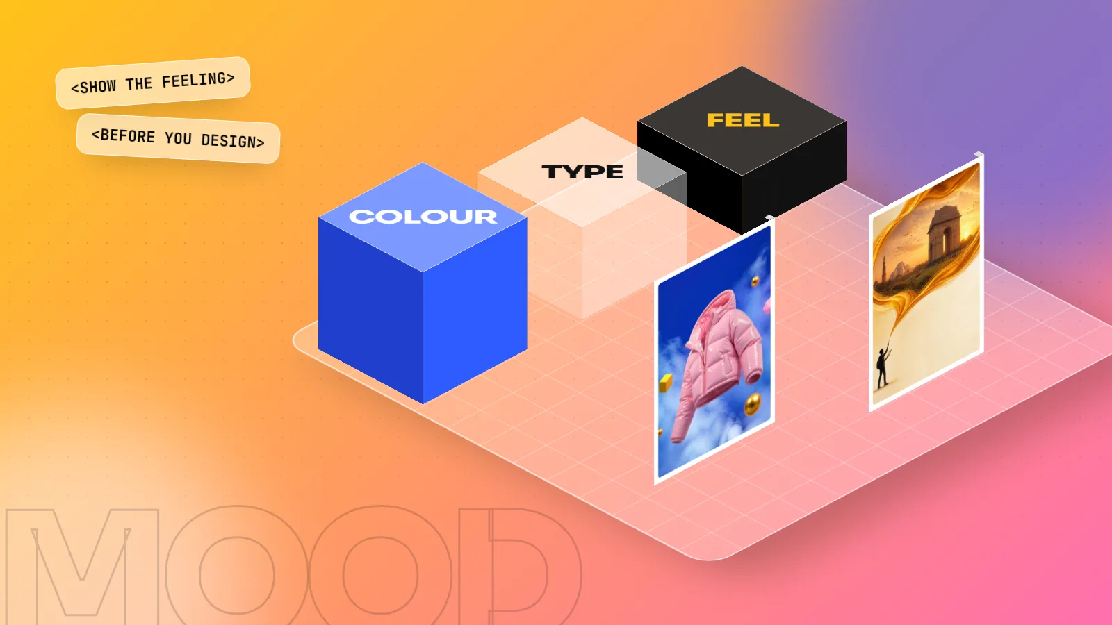
A mood board is one page or board that collects images, colours, fonts, textures and words to show how a design should feel before any real design work starts. Designers use it to agree a direction with the client early, so the logo, poster or campaign that follows matches what the client imagined and needs fewer rounds of changes.
A mood board is a single page or board that collects images, colours, fonts, textures and a few words to show how a design should look and feel before any real design work starts. Graphic designers use a mood board to agree a direction with the client early. It turns vague words like "premium", "fun" or "desi but modern" into something everyone can see and point at. This guide explains what goes on a mood board, the main types, the tools and a step-by-step method you can use on your next project.
Why designers make a mood board first
Clients rarely describe what they want clearly. One person's "modern" is clean white space; another person's "modern" is neon gradients. A mood board settles that question in one meeting instead of five rounds of revisions.
| Without a mood board | With a mood board |
|---|---|
| Client says "make it premium" and you guess | Client points at images and says "this one, not that one" |
| First draft often misses the feel | First draft starts in the agreed direction |
| Many rounds of changes | Fewer, smaller changes |
| Arguments about taste | A shared reference everyone signed off |
A mood board also helps you. It forces you to think about the audience and the feeling before you jump into Photoshop or Illustrator. It is a cheap way to test ideas: changing a board takes ten minutes, changing a finished logo system takes days.
What goes on a mood board
A good mood board has a clear mix of items, all pointing the same way.
| Item | What to add | Why it matters |
|---|---|---|
| Images | 8 to 20 photos, illustrations or design samples | Sets the overall feeling and style |
| Colour palette | 4 to 6 swatches with HEX or CMYK codes | Locks the colour direction early |
| Typography | 1 or 2 font samples with a headline and a line of text | Shows the voice: classic, playful, bold |
| Textures and patterns | Paper, fabric, block print, metal, grain | Adds depth, very useful for packaging |
| Keywords | Three words such as "warm, handmade, honest" | Gives the board a one-line meaning |
| Reference work | A few layouts or packaging samples you admire | Shows composition and finish |
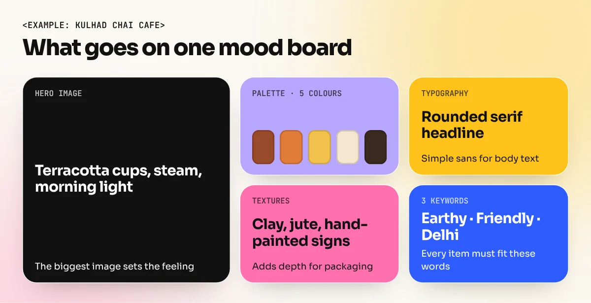
Take the example of a new kulhad chai cafe in Hauz Khas. Its board might show terracotta cups, steam in morning light, hand-painted signage, a warm brown and saffron palette, a rounded serif headline font and the words "earthy, friendly, Delhi". Anyone who sees that board understands the brand before a logo exists.
Types of mood boards
Designers make different boards for different stages and jobs:
- Brand mood board. The overall look of a new brand or a rebrand. Used before logo and identity work. If you are planning a full identity, our guide to branding design shows where the board fits in the larger process.
- Colour mood board. Images chosen mainly for their colour, with a palette pulled from them. Good when the client already has a logo but needs a fresh campaign palette.
- Typography mood board. Several font options shown in real headlines and body text so the client can compare voice. Our guide to font pairing helps you pick combinations that work.
- Photography or art direction board. Lighting, angles, models, props and backgrounds for a shoot. Photographers and stylists work from this.
- Campaign board. The feel of one ad campaign or festival series, for example a Diwali social media set with diyas, marigold, deep jewel colours and gold foil type.
You do not need all five on every job. A small social media job may need only one board with images, colours and fonts together.
How to make a mood board, step by step
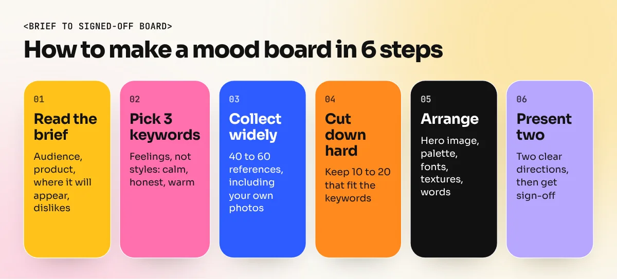
- Read the brief and list the facts. Who is the audience, what is the product, where will the design appear (hoarding, packaging, Instagram) and what does the client dislike?
- Pick three keywords. Choose words that describe a feeling, not a style. "Calm, trustworthy, clean" for a clinic. "Loud, young, fast" for a sneaker drop. These words decide every image you keep.
- Collect widely. Save 40 to 60 references from Pinterest, your own phone photos, magazines, packaging in shops and design sites. Walk through a market such as Dilli Haat or Sarojini Nagar and photograph colours, signs and textures. Real-world photos make your board less like everyone else's.
- Cut down hard. Remove anything that does not fit the three keywords, even if you love it. Most strong boards end with 10 to 20 images.
- Arrange the board. Put one hero image largest, group similar items, pull a palette of 4 to 6 colours with the eyedropper and add the font samples and keywords. Leave some white space so the board is easy to read.
- Present two directions. Show two boards with clearly different feelings, for example "heritage" and "modern minimal". Let the client choose one or mix the parts they like. Then write down the decision before you start designing.
Keep the board as a PDF or image file and refer back to it at every stage. When the client later asks "can we try neon green?", you can show the agreed board and discuss whether the change still fits.
Tools for making a mood board
| Tool | Best for | Notes |
|---|---|---|
| Collecting ideas | Make a secret board per project; quick but full of the same popular images | |
| Canva | Quick boards for clients | Ready mood board templates, easy to share |
| Adobe Express | Quick boards with Adobe fonts | Templates and simple layouts |
| Figma or FigJam | Team boards and client comments | Free plan available, works in the browser |
| Milanote | Boards with notes and links | Made for visual planning |
| Photoshop or InDesign | Polished presentation boards | Full control over layout and colour |
| Physical board | Packaging, fabric, print finishes | Foam board, real paper and material samples |
Photoshop Generative Fill and AI image tools can help when you cannot find the right reference, for example "a steel tiffin on a wooden table in soft morning light". Use these AI images as reference only and tell the client which images are AI-generated. The final design should still be built by you, with your own layouts and licensed or original images.
Digital or physical mood board?
Most client boards today are digital because they are quick to share on email or WhatsApp and easy to change. A physical board still has a place. For packaging, wedding cards, textiles or interiors, the client needs to touch the paper, feel a matt or gloss finish and see real colour in daylight. Many print designers in Delhi keep a box of paper samples, foil swatches and fabric pieces from the market for exactly this reason.
| Choose digital when | Choose physical when |
|---|---|
| The client is in another city | The job is packaging, cards or textiles |
| The work is for screens or social media | Paper, finish and texture matter |
| You need quick changes and comments | The client wants to see real material |
A simple approach is to start digital, agree the direction, then make a small physical board with real samples only for print-heavy jobs.
Common mood board mistakes
- Too many directions on one board. If half the board is pastel and half is neon, the client will pick the wrong half. One board, one feeling.
- Only pretty pictures, no reason. Every image should connect to the brief and the keywords. Be ready to explain why each one is there.
- Copying one reference. A mood board shows a direction, not a design to copy. Taking one famous poster and redrawing it is not design.
- No colour codes or fonts. Without them, the board is just a collage. Pull the palette and name the fonts so the board becomes useful.
- Skipping client sign-off. A board nobody approved does not protect you from later changes. Get a clear yes in writing or email.
Mood boards in your portfolio
Employers and clients like to see how you think, not only the final result. For two or three portfolio projects, show the mood board next to the finished logo, packaging or poster. It proves you can take a brief, set a direction and deliver work that matches it. Interviewers at agencies often ask how you start a project. A mood board is a strong answer.
You will practise mood boards on every major project in our 6-month graphic design diploma, from brand identity to packaging. If you want to use AI images for faster reference boards, the AI graphic design course covers Photoshop Generative Fill and AI image tools next to real design skills.
Frequently asked questions
What should a mood board include?
Usually 8 to 20 images, a colour palette of 4 to 6 colours, one or two font samples, a few textures or patterns and three keywords that describe the feeling. Every item should support the same direction. Remove anything that pulls the board somewhere else.
Which app is best for making a mood board?
Pinterest is good for collecting ideas. Canva, Adobe Express, Figma, Milanote and Photoshop are all good for arranging the final board. Many designers collect on Pinterest and lay out the final board in Figma or Photoshop.
Can I use images from Google on a mood board?
For a private board shown only to a client as reference, designers commonly use found images. Never put those images into the final design without a licence or permission. Use your own photos, licensed stock or original artwork in the finished work.
Is a mood board the same as a style guide?
No. A mood board comes at the start and shows a direction and a feeling. A style guide comes at the end and fixes exact rules: logo use, colour codes, font sizes and spacing.