"Rhythm in Design: Repetition and Pattern With Examples"
Rhythm in design is repetition with a pattern that guides the eye. Learn the 5 types, see Indian ad examples and use 6 simple steps to add rhythm to your layouts.
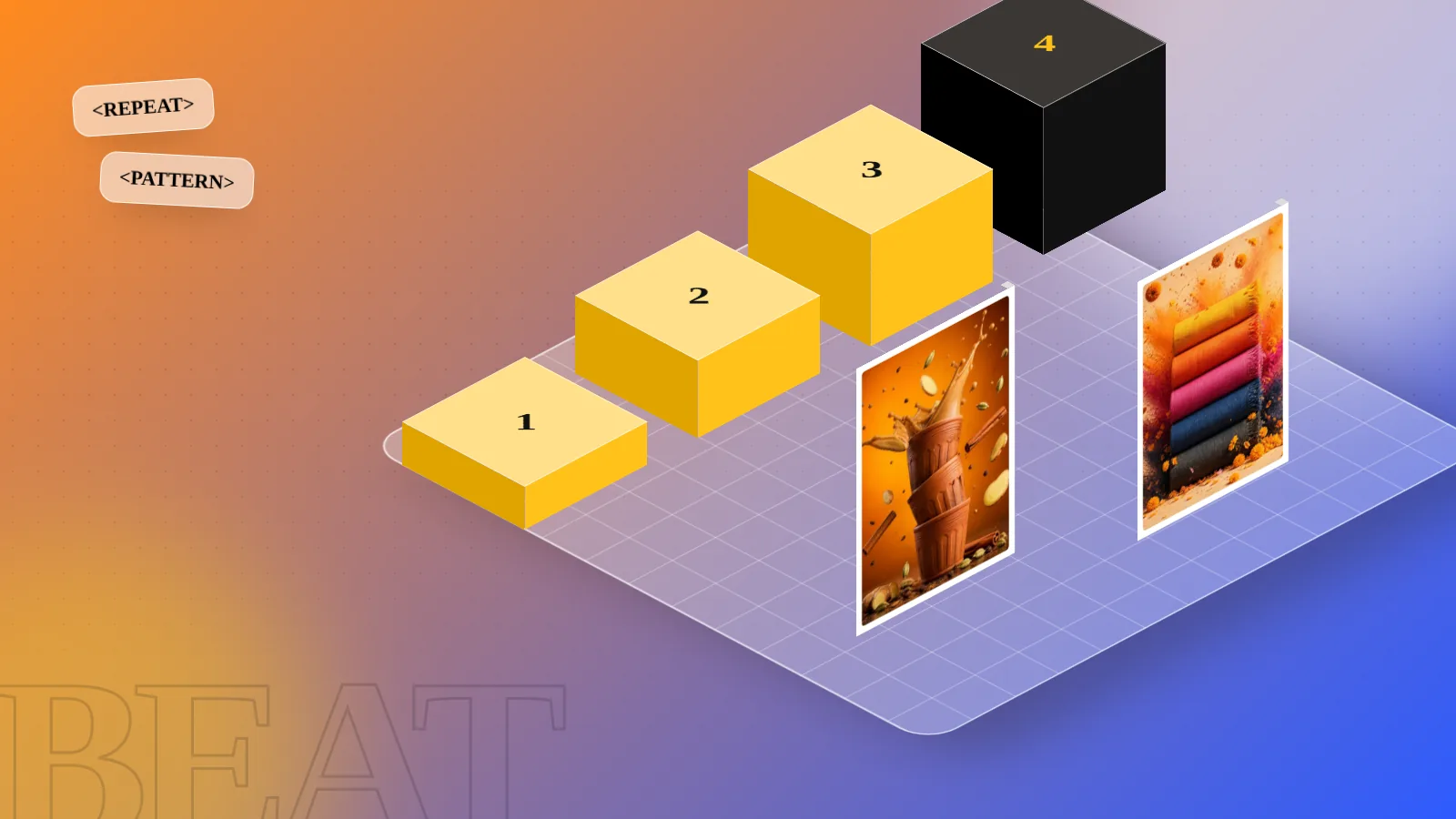
Rhythm in design is the repeating of shapes, colours, spaces or type in a planned pattern so the eye moves smoothly across a layout. It works like a beat in music. The five common types are regular, random, alternating, flowing and progressive rhythm. Use it to guide the viewer and to make a design feel organised.
Rhythm in design is a repeating pattern of shapes, colours, spaces or text that moves the viewer's eye across a layout, the way a beat moves you through a song. If you place the same element again and again with planned gaps, the design starts to feel organised. If you also change the pattern in one place, the design feels alive. This guide explains the five types of rhythm, shows where each one works and gives you six steps to use rhythm in posters, social posts, brochures and websites.
What rhythm means in design
Rhythm comes from music. A drum plays the same beat many times. Your head starts to nod. A design does the same thing with your eyes. When the viewer sees a shape or a block of colour repeat, they expect the next one and their eye jumps ahead to find it.
Rhythm has three parts you can control:
- The element: what repeats. It can be a circle, a photo frame, a bold word or a stripe of colour.
- The gap: the space between each repeat. Equal gaps feel calm. Changing gaps feel playful.
- The change: any difference in size, colour or direction from one repeat to the next.
Think of a kulhad stall at a railway station. Rows of clay cups stand in even lines. The pattern looks neat and a little warm. You want to look at it. Now imagine the cups piled in one heap. Same cups, no rhythm, no order.
Rhythm, repetition and pattern: how they differ
Beginners mix up these three words. They are close cousins, but each one does a different job.
| Term | Meaning | Simple example |
|---|---|---|
| Repetition | Using the same element more than once | The same logo on every slide |
| Pattern | A set of elements repeated to fill an area | A jaali design on a wrapping paper |
| Rhythm | A repeat with planned spacing, size or order that leads the eye | Product photos that get bigger across a banner |
Repetition is the ingredient. Pattern is the surface. Rhythm is the movement. You can read more about the wider rules in our guide to the principles of graphic design, where repetition and rhythm sit next to balance and contrast.
The 5 types of rhythm in design
Different books name these a little differently, but these five are the ones designers use most.
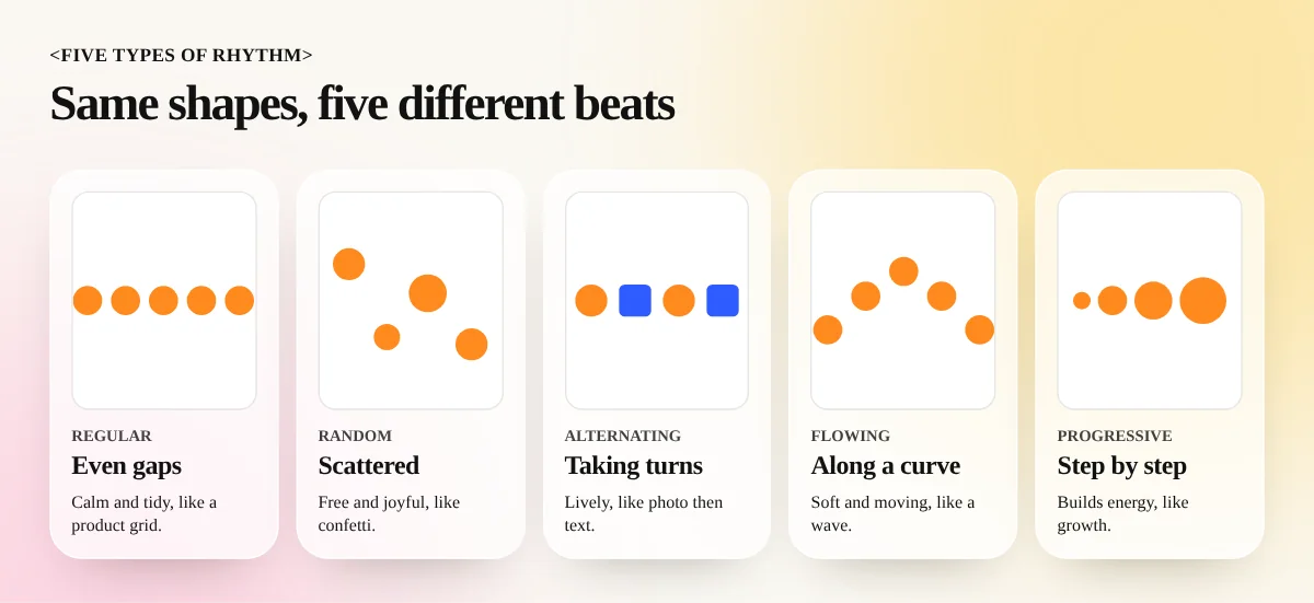
1. Regular rhythm
The same element repeats with the same gap each time. Think of dots on a measuring scale or product photos in an even grid on an e-commerce page. It feels calm, trustworthy and tidy. It is the easiest rhythm to build and the easiest to make dull.
2. Random rhythm
The same kind of element repeats, but the spacing and placement are not fixed. Scattered confetti on a festival poster or sprinkles of petals around a wedding invitation are random rhythm. It feels free and joyful. The trick is to keep one shared thing, such as colour or shape, so it still looks planned.
3. Alternating rhythm
Two or more elements take turns: photo, text, photo, text. Or a dark block, then a light block, then dark again. It feels lively and is very good for long layouts like brochures, magazine spreads and website sections, because each step gives the eye a fresh thing to look at.
4. Flowing rhythm
Elements follow a curve or wave, like the lines of a river or the ripple of a dupatta. The eye slides along the path. It suits fashion, music, water and travel designs where you want a soft, moving feeling.
5. Progressive rhythm
The element changes a little with each repeat: bigger, smaller, lighter or darker. Steps that grow taller show growth. Circles that fade from orange to yellow show a sunrise. It builds energy and is a favourite for charts, timelines and "before to after" stories.
Where rhythm shows up in real design work
Rhythm is not only for art school books. You will use it on almost every job.
| Design job | How rhythm helps | Type to try |
|---|---|---|
| Instagram carousel | Same layout on each slide with one changing image | Alternating |
| Brochure | Photo, text, photo across the pages | Alternating |
| Product catalogue | Equal grid so buyers can compare items | Regular |
| Festival poster | Scattered diyas, stars or petals | Random |
| Timeline or process chart | Steps that grow in size or colour | Progressive |
| Music or fashion ad | Curved lines and repeated waves | Flowing |
A sweet shop in Chandni Chowk can use regular rhythm on its menu card, with each mithai in a same-sized photo box. The same shop can use random rhythm on its Diwali hoarding, with diyas scattered around the offer text. Same brand, two rhythms, each matched to the mood of the job. If you design menus, our menu card design guide shows how spacing and repeated blocks keep a long list easy to read.
How to add rhythm to a layout: 6 steps
- Choose the element that will repeat. Pick one clear thing, such as a rounded photo frame, a coloured bar or a small icon.
- Pick the rhythm type. Ask what feeling the brief needs. Calm and trusted means regular. Lively means alternating. Energy and growth mean progressive.
- Set the gap first. Decide on a spacing number, for example 24 pixels or 8 millimetres. Use it every time. A grid helps a lot here. Our grid system guide shows how to set one up.
- Repeat the element at least three times. Two items look like a pair. Three or more look like a pattern.
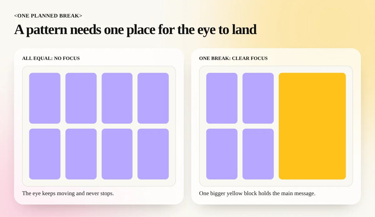
- Add one deliberate break. Make one photo bigger, use one different colour or leave one empty gap. The break gives the viewer a place to rest and the main message a place to shine.
- Squint and check. Blur your eyes and look at the design from a distance. You should see a clear beat. Your eye should end on the most important thing.
Common rhythm mistakes
- Too even for too long. A page of equal boxes with no break tires the eye. Add a bigger image, a pull quote or a coloured band.
- Too many different patterns. If a layout has a wave, a grid, a zigzag and scattered dots, nothing repeats enough to feel like rhythm. Keep to one main pattern and one supporting pattern.
- Uneven gaps by accident. Gaps that are almost equal look like a mistake. Make them exactly equal or clearly different.
- Ignoring text. Rhythm also lives in type. A headline, a short line, a headline, a short line gives text a beat. Long paragraphs of the same size remove it. See how type size steps create order in our visual hierarchy guide.
- Rhythm without a message. A pattern is only a tool. If the pattern does not lead the eye to the offer, the date or the logo, it is decoration.
Practice exercises for beginners
You learn rhythm faster by doing small exercises than by reading about it.
- The ten-square test. Draw ten squares in a row. Make them equal for regular rhythm. Then make each one 10 per cent bigger for progressive rhythm. Compare the feeling.
- Photo wall. Take six photos of the same subject, such as chai glasses. Place them in an even grid, then try an alternating layout with text blocks between them.
- Carousel in five slides. Keep the same background, font and logo position on all slides and change only the image. Add one slide that breaks the pattern at the end with a call to action.
- Look around. On your next metro ride, notice the pillars, the ceiling lights and the shop boards. Which type of rhythm is each one using?
At the end of this practice you should be able to look at any layout and say in one line which rhythm it uses and why.
Learn rhythm and the other principles properly
Rhythm is one of a small set of rules that every strong layout shares. When you practise it together with contrast, hierarchy and spacing on real briefs, the rules stop feeling like theory. Our 6-month graphic design diploma teaches these principles with live projects. The InDesign course shows how to build rhythm across multi-page brochures, magazines and catalogues using grids and master pages.
Frequently asked questions
What is rhythm in design in simple words?
Rhythm is a pattern made by repeating an element with planned gaps, like the beat of a song. In a design the element can be a shape, a colour, a photo or a line of text. The pattern tells the eye where to go next.
What is the difference between rhythm and repetition?
Repetition means using the same element again. Rhythm is repetition with a pattern in the spacing, size or order. Five identical icons in a row are repetition. Five icons that get bigger one by one show progressive rhythm.
How many types of rhythm are there in design?
Most design books list five: regular, random, alternating, flowing and progressive. Some lists give only three or four. The names matter less than knowing what each pattern feels like, which this guide explains with examples.
Can a design have too much rhythm?
Yes. A pattern that never changes becomes boring and the eye stops looking. Add one break, such as a bigger photo or a different colour, so the viewer has a place to stop and read.