YouTube Thumbnail Design: Size, Layout and Click-Worthy Tips
YouTube thumbnail design made simple: the right size (1280x720), safe areas, a 3-part layout, colour and text rules plus a step-by-step Photoshop workflow.
Good YouTube thumbnail design uses a 1280x720 pixel image (16:9) with one clear subject, usually a face showing emotion, three words or fewer of bold text and strong contrast between the subject and background. Keep the bottom-right corner clear for the time stamp and check that the design still reads at phone size.
YouTube thumbnail design is the small 16:9 image people see before they decide to click your video. A good one is built at 1280x720 pixels with one clear subject, a few bold words and strong contrast. It is a poster that has to work at the size of a matchbox on a phone screen. This guide covers the correct size and file rules, a simple three-part layout, colour and text tips, a step-by-step Photoshop workflow and the mistakes that quietly kill clicks.
YouTube thumbnail size and file rules
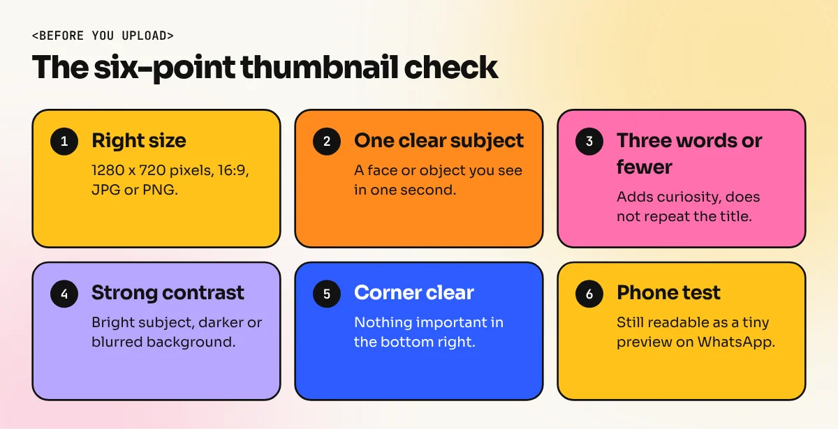
Start with the technical basics, because a blurry or cropped thumbnail fails before anyone reads it. These are the specifications in YouTube Help:
| Setting | Value |
|---|---|
| Recommended size | 1280 x 720 pixels |
| Aspect ratio | 16:9 |
| Minimum width | 640 pixels |
| File types | JPG, PNG or GIF |
| Who can upload | Verified channels only |
A tip many designers follow: design at 1920x1080, then export. You get sharper results on TV and large monitors and the 16:9 ratio stays the same. YouTube has long listed a file size limit of 2 MB for thumbnails; check YouTube Studio for the current limit before you export at high quality.
If you also make Shorts, remember the Shorts feed shows vertical frames. That is a different design problem with its own sizes.
The safe areas: what YouTube covers
YouTube places its own items on top of your thumbnail:
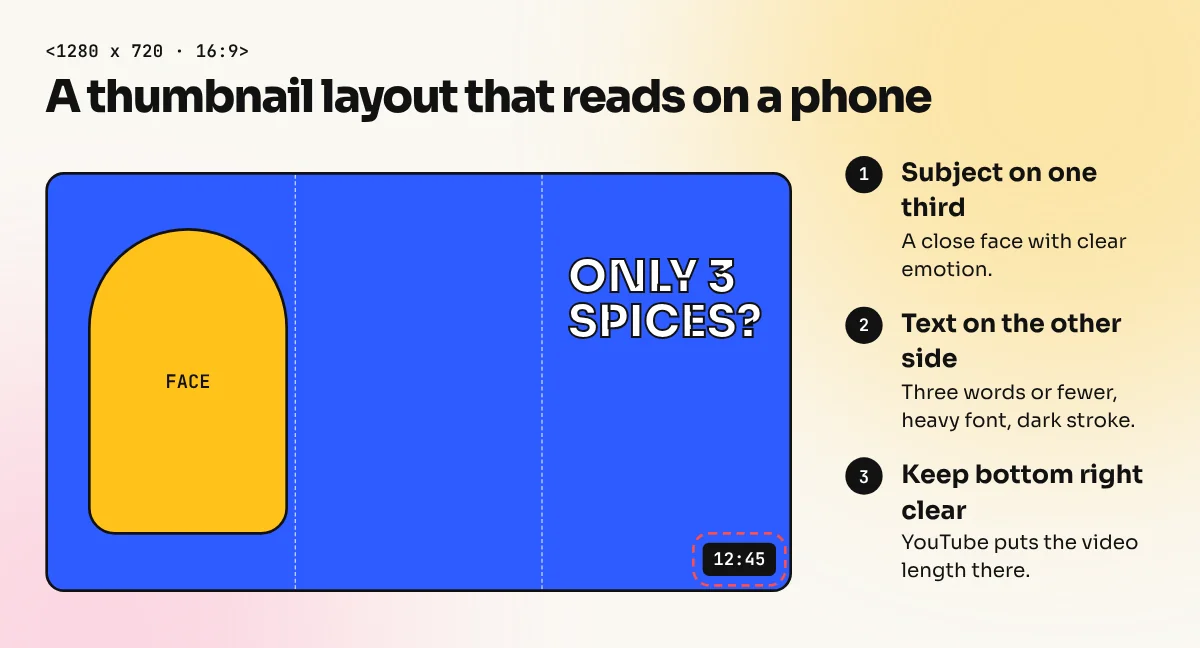
- Time stamp, bottom right. The video length sits in a dark box. Never put a face, a key word or a logo there.
- Progress bar, bottom edge. For people who have started watching, a coloured progress bar runs along the bottom.
- Hover previews. On desktop the thumbnail can turn into a moving preview when someone points at it, so the first seconds of your video also matter.
Keep important things in the centre and upper two-thirds of the frame.
A simple 3-part layout that works
Most strong thumbnails use only three parts. More than that and the image turns into noise at phone size.
| Part | Job | Example for a chai recipe video |
|---|---|---|
| Subject | Grabs attention in a split second | A close-up face, surprised, holding a kulhad |
| Object or result | Shows what the video is about | Steaming masala chai with visible spices |
| Text (optional) | Adds curiosity or emotion | "ONLY 3 SPICES?" |
Put the subject on one side, usually the left or right third and the text on the other. This follows the rule of thirds and gives the eye a clear path. Our guide to visual hierarchy explains why the eye reads big, bright and close things first.
Colour, contrast and text tips
Contrast beats everything. The subject must stand out from the background in brightness and colour. A bright yellow shirt on a dark blue background works; a beige face on a beige wall does not.
- Use two or three main colours. Pick a strong pair from the colour wheel, like orange and blue or yellow and purple.
- Add an outline or glow around the subject. A thin white or light stroke separates a cut-out person from a busy background.
- Brighten faces and eyes. People are drawn to faces and clear eye contact, so lift the exposure on the face a little and sharpen the eyes.
- Text: three words or fewer. Use a heavy, condensed sans-serif font, all caps, with a dark stroke or shadow so it reads on any background.
- Do not repeat the title. If the title says "Learn Photoshop in 10 Minutes", the thumbnail text could say "BEGINNER?" or nothing at all.
- Check your brand. Using the same font, colours and layout style on every video makes your channel easy to recognise in a crowded feed.
How to design a YouTube thumbnail in Photoshop
Here is a clean workflow most thumbnail designers use, step by step:
- New file. File > New, 1920 x 1080 pixels, 72 ppi, RGB colour.
- Background. Add a photo or a gradient. Blur it slightly (Filter > Blur > Gaussian Blur) and darken it so the subject stands out.
- Cut out the subject. Use Select > Subject, then Select and Mask to clean hair edges. Put it on its own layer.
- Fix light and colour. Add Curves and Hue/Saturation adjustment layers clipped to the subject. Brighten the face a little.
- Add a stroke or glow. Layer Style > Stroke (white, 6 to 10 px) or Outer Glow.
- Add the object. Place the second element, such as the product or result, smaller than the face.
- Add text. Use the Type tool, a heavy font, a dark stroke and a soft drop shadow.
- Zoom out to test. Zoom to around 15 percent. If you cannot understand it in one second, simplify.
- Export. File > Export > Export As, JPG at 1280 x 720, then check the file size.
Photoshop shortcuts save a lot of time in this workflow. Keep our Photoshop shortcut keys list open the first few times. Photoshop Generative Fill and AI image tools can also extend a background that is too narrow, but always check the result for odd details.
Common thumbnail mistakes
| Mistake | Why it hurts | Fix |
|---|---|---|
| Too many elements | Nothing stands out on a phone | Keep three parts: subject, object, text |
| Small, thin text | Unreadable at small size | Heavy font, 3 words, stroke or shadow |
| Face in the bottom-right corner | Covered by the time stamp | Move the face to the left or centre |
| Low contrast | Thumbnail disappears in the feed | Darken or blur the background, brighten the subject |
| Misleading image | Viewers leave fast, which hurts the video | Show what the video really delivers |
| Using a random screenshot | Looks unplanned and blurry | Design the thumbnail before you film, then shoot a photo for it |
Thumbnail ideas by video type
Different videos need different hooks. Use this table as a starting point when you plan a new thumbnail:
| Video type | What to show | Text idea |
|---|---|---|
| Tutorial | The finished result, large and clear | "IN 5 MINUTES" |
| Review | The product in hand plus your honest reaction | "WORTH IT?" |
| Before and after | A split frame with a clear divider | "BEFORE / AFTER" |
| Vlog or travel | One striking place, like India Gate at dusk | A place name only |
| Recipe | The dish up close with steam or texture | "ONLY 3 SPICES?" |
| Comparison | Two items side by side with a "VS" | "WHICH ONE?" |
Notice that each row uses one big idea. Before you open Photoshop, write the one feeling you want a viewer to have, such as surprise, curiosity or "I need this", then design only for that feeling.
Test and improve your thumbnails
You do not have to guess which thumbnail works best. YouTube Studio has a Test and compare feature on desktop that lets eligible channels upload up to three thumbnails for one video. YouTube shows them to different viewers and picks the one with the highest share of watch time.
Two simple habits help too:
- Check click-through rate in YouTube Studio analytics. If a video gets impressions but few clicks, the thumbnail and title are the first things to change.
- Do the phone test. Send the thumbnail to yourself on WhatsApp and look at it as a small preview. If it still reads, it is ready.
Learn thumbnail design properly
Thumbnail design is now a real freelance skill. Many YouTubers in India pay a designer per thumbnail and a strong portfolio of 10 to 15 thumbnails is enough to start pitching. The skills behind it are classic graphic design: selections, masking, colour, typography and layout.
Our Photoshop course covers selections, retouching, layer styles and export in depth, while the Canva course is a quicker route if you want simple, template-based thumbnails for your own channel or a small business.
Frequently asked questions
What is the correct YouTube thumbnail size?
YouTube Help recommends 1280x720 pixels with a 16:9 ratio and a minimum width of 640 pixels. Use JPG or PNG. Many designers work at 1920x1080 and export a smaller copy, which keeps the image sharp on big TV screens.
Which app is best for YouTube thumbnail design?
Photoshop is the most used because of its selection, masking and colour tools. Canva is fine for simple text-and-photo thumbnails. Photopea and Affinity are free options that handle layers well.
How many words should a thumbnail have?
Three words or fewer is a good rule. The title already explains the video, so the thumbnail text should add curiosity or emotion, not repeat the title.
Why can't I upload a custom thumbnail?
YouTube allows custom thumbnails only on verified accounts. Verify your channel in YouTube Studio, usually with a phone number. The option then appears on the video details page.