Types of Fonts: Serif, Sans Serif, Script and More (With Examples)
Types of fonts explained in plain words: serif vs sans serif, slab, script, display and monospace, with example fonts, best uses and a quick way to choose.
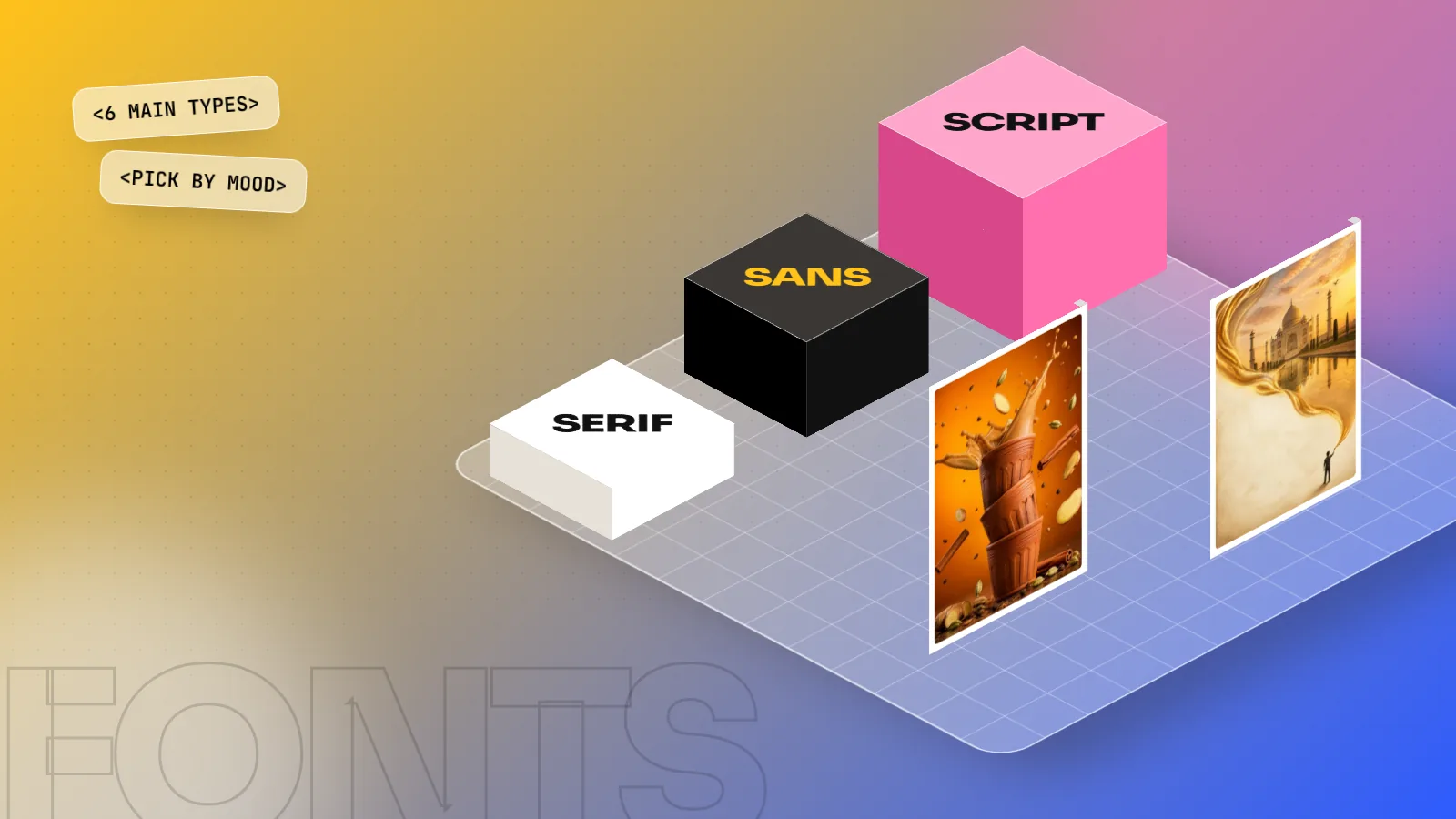
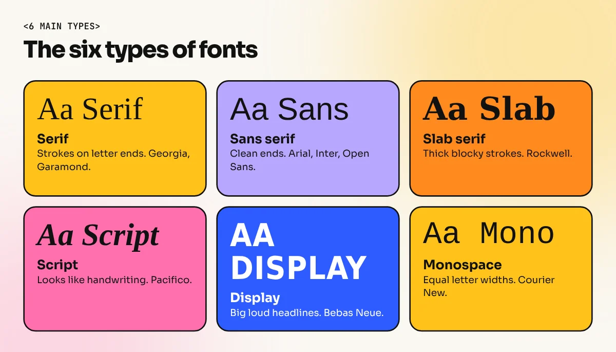
The main types of fonts are serif, sans serif, slab serif, script, display and monospace. Serif fonts have small strokes on the letter ends. Sans serif fonts do not. Slab serifs have thick blocky strokes, script fonts copy handwriting, display fonts are for big headlines and monospace fonts give every letter the same width.
The main types of fonts are serif, sans serif, slab serif, script, display and monospace. Each type has a different look and a different job. A serif font suits a wedding card. A sans serif suits an app. A script font suits a bakery logo. Pick the wrong type and even a good layout looks off. This guide shows each type with example fonts, where to use it and a simple way to choose when you are stuck.
Font vs typeface: a quick clear-up
People use these words as if they mean the same thing, but they do not.
- A typeface is the whole design family, for example Helvetica or Garamond.
- A font is one version of it, for example Helvetica Bold at 24 point.
In daily talk, "fonts" is fine. The search term "font types" is just another way people ask for the same groups. When you read about type styles in a design class, you will hear both words, so it helps to know the difference.
The 6 main types of fonts at a glance
| Type | What it looks like | Example fonts | Best for |
|---|---|---|---|
| Serif | Small strokes at letter ends | Times New Roman, Georgia, Garamond | Books, newspapers, wedding cards |
| Sans serif | Clean ends, no strokes | Arial, Helvetica, Open Sans, Inter | Apps, websites, signs, posters |
| Slab serif | Thick, blocky strokes | Rockwell, Roboto Slab | Headlines, posters, packaging |
| Script | Looks like handwriting | Pacifico, Brush Script, Lobster | Logos, invitations, short lines |
| Display | Bold and decorative | Bebas Neue, Impact | Big headlines, banners |
| Monospace | Every letter has equal width | Courier New, Roboto Mono | Code, forms, typewriter looks |
Serif fonts
A serif font has small strokes, called serifs, at the ends of letters. Think of the letters in a newspaper or a printed novel. Times New Roman, Georgia and Garamond are well known examples. Playfair Display is a free choice from Google Fonts with high contrast between thick and thin strokes.
Serif fonts feel traditional, serious and trusted. That is why law firms, publishers, jewellers and wedding card designers like them. On a printed page they guide the eye along a line of text. They can look thin on a small phone screen, so test them before you commit.
Sans serif fonts
"Sans" means without, so a sans serif font has no serifs. The letter ends are clean. Arial, Helvetica, Open Sans, Inter and Montserrat belong here. Search data shows people look for sans serif fonts a lot, because most apps and websites use them.
Sans serif feels modern, simple and friendly. Most Indian start-up logos, app screens and highway signs use a sans serif. Within the group there are three common looks:
- Geometric (Montserrat, Poppins): round circles and straight lines. Clean and bold.
- Humanist (Open Sans, Mukta): softer shapes that feel close to handwriting. Easy to read.
- Grotesque (Helvetica, Arial): neutral and plain, used for signs and brand names.
Serif vs sans serif: which one should you use?
This is the most common question in font choice. There is no single winner. Use this table.
| Question | Serif | Sans serif |
|---|---|---|
| Mood | Classic, formal, warm | Modern, clean, direct |
| Small text on a phone | Can look thin | Usually clear |
| Long printed text | Very comfortable | Comfortable if spaced well |
| Typical use | Books, magazines, luxury brands | Apps, websites, signs, packaging |
| Safe pairing role | Heading or body | Body or heading |
A common trick is to use both. A serif heading with a sans serif body gives contrast and a clear hierarchy. Our guide to font pairing with simple rules shows 12 ready combinations.
Slab serif fonts
Slab serifs are serifs with thick, square ends. They look sturdy and a little retro. Rockwell is a classic example and Roboto Slab is a free one. Use them for posters, packaging, sports brands and shop boards where you want a strong, friendly voice. Do not use them for a long paragraph, because the heavy shapes tire the eye.
Script fonts
Script fonts copy handwriting or calligraphy. The letters join or lean like pen strokes. Pacifico, Lobster and Brush Script are common names. Some are formal, like invitation lettering. Others are casual, like a brush on a sweet shop sign.
Use script fonts for a logo word, a quote or a short line on an invitation. Follow these rules:
- Never set a script font in all capital letters. It becomes hard to read.
- Keep it to a few words.
- Pair it with a plain sans serif for the rest of the text.
- Check readability on a phone before you print.
Display fonts
Display fonts are made for big sizes. They are loud, narrow, wide, shaped or decorated. Bebas Neue and Impact are well known. Use them for a shop banner, a movie poster title, a YouTube thumbnail or a festival sale hoarding. At small sizes they fall apart, so never use a display font for body text.
Monospace fonts
In a monospace font every letter takes the same width, so an "i" is as wide as a "w". Courier New and Roboto Mono are examples. They come from typewriters and are used in code. In design they give a technical or retro look, good for captions, labels and tech posters.
Handwriting and blackletter: two extra groups
Some lists add two more groups. Handwriting fonts look like casual pen or marker writing and are less formal than script fonts. Blackletter fonts have sharp, old European letterforms. They suit heavy metal posters, newspaper nameplates and tattoo shops. Both are strong styles. Use them in small doses.
How to choose the right type of font in 5 steps
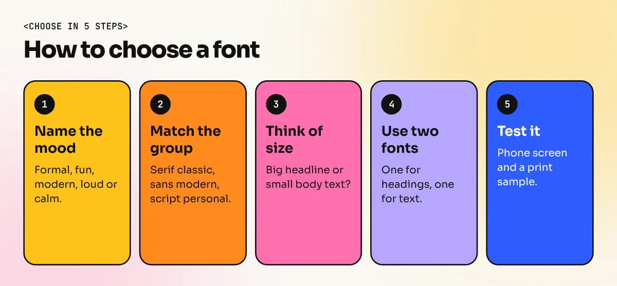
- Write the mood in one word. Formal, fun, modern, loud or calm.
- Pick the group that matches. Serif for classic, sans serif for modern, script for personal, display for loud.
- Choose by size. Big headline: display or script. Body text: a plain serif or sans serif.
- Limit yourself to two fonts. One for heading and one for text.
- Test it. Print a sample or view it on a phone. Ask someone to read it from a metre away.
Free and licence checks
Many designers use Google Fonts because most of its families are free to use, including for client work, under open licences. Always read the licence of the exact font before you use it in a logo or print job. Fonts that came with your laptop are licensed for use on that device, so check before you send a file to a printer. When you share a design with a printer, send the font files or convert the text to outlines. Our print ready file checklist lists the steps.
Learn type with real briefs
Reading about type helps, but your eye improves only when you set real text. At our South Extension institute, the InDesign course covers paragraph styles, leading and layout for brochures and magazines. The 6-month graphic design diploma covers typography along with Photoshop, Illustrator and CorelDRAW. For a wider view of how type shapes a page, read typography in graphic design.
The bottom line
The main types of fonts are serif, sans serif, slab serif, script, display and monospace. Choose by mood first. Use a serif for classic and formal work, a sans serif for clean modern work, a script for a few personal words and a display font for big headlines only. Keep to two fonts, test on a phone and always check the licence.
Frequently asked questions
What is the difference between serif and sans serif?
Serif fonts have small strokes at the ends of letters, like Times New Roman. Sans serif fonts have clean ends with no strokes, like Arial. "Sans" means without. Neither is always better. Pick by mood, size and where the text will be read.
What is the difference between a font and a typeface?
A typeface is the design family, for example Helvetica. A font is one style of it, such as Helvetica Bold at 12 point. In daily use most people say font for both. In design talk, the typeface is the family and the fonts are its weights and styles.
Which type of font is best for reading long text?
Choose a clean serif or a plain sans serif with good spacing and a comfortable size. Research does not show one type always wins. Size, line spacing, contrast and the quality of the font matter more than the category.
How many types of fonts are there?
Designers usually sort fonts into six main groups: serif, sans serif, slab serif, script, display and monospace. Some lists add handwriting and blackletter. The groups overlap, so a few fonts fit in two of them.