"Brand Guidelines: What Goes in a Brand Book"
Brand guidelines explained with a page-by-page plan. See what goes in a brand book, how long it should be, which tools to use and the mistakes that make it useless.
Brand guidelines are a document that shows how a brand must look and sound. A good brand book has the brand story, logo rules, colour codes, fonts, image style, layout examples and real applications. Keep it short, show wrong uses next to right ones and give the team files they can use the same day.
Brand guidelines are the rule book that tells everyone how a brand should look and sound. A brand book holds the logo rules, colour codes, fonts, image style and real examples, so a printer in Okhla and a social media intern in Gurugram can both make work that looks like the same brand. This guide gives you a page-by-page plan, the exact details to put on each page, the tools to use and the mistakes that make a brand book useless.
If you want the bigger picture first, read our guide to branding design and how a brand identity is built. This post goes deeper on the document itself.
What brand guidelines are for
A logo is easy to copy badly. Somebody stretches it. Somebody puts it on a busy photo. Somebody picks a nearly matching blue because they could not find the right one. After a year the brand looks like five brands.
Brand guidelines stop that. They answer the small daily questions without a phone call to the designer:
- Which logo file do I use on a dark background?
- What is the exact brand red for print?
- How big should the logo be on a visiting card?
- Which font goes on a hoarding and which goes in a WhatsApp forward?
Adobe, in its own brand guide resources, describes a brand guide as a document that keeps a company's visuals and voice consistent. That is the whole job.
The page-by-page plan
Use this order. It moves from the idea to the rules to the real examples.
| Page | What to put on it | Why it matters |
|---|---|---|
| 1. Cover and contents | Brand name, version number and date | Teams must know they hold the latest version |
| 2. Brand story | Purpose, three personality words, audience | Gives the reason behind every rule |
| 3. Logo | Main logo, short version, icon only | Shows which file fits which space |
| 4. Logo space and size | Clear space, minimum size in mm and pixels | Stops the logo getting crowded or tiny |
| 5. Logo wrong uses | Six crossed out examples | The fastest way to teach |
| 6. Colour | Main and support colours with CMYK, RGB and HEX | Print and screen must match |
| 7. Typography | Heading font, body font, sizes and spacing | Text carries most of the brand |
| 8. Imagery | Photo or illustration style, with good and bad examples | Keeps pictures from clashing |
| 9. Graphic elements | Icons, patterns, shapes and borders | Adds a signature look |
| 10. Layout | Grid, margins, a sample poster and a sample post | Shows how the parts fit together |
| 11. Applications | Visiting card, letterhead, packaging, signboard, social post | Proves the system works |
| 12. Files and contact | File names, download folder, who to ask | Makes the guide usable |
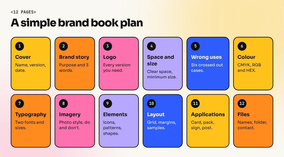
How to write each section
Brand story
Keep it to half a page. Write the purpose in one plain sentence. Add three personality words, such as "warm, honest, quick". Then name the people the brand talks to. Skip long mission speeches. Nobody designs from a mission speech.
Logo rules
Show the logo in every version a team needs: full colour, one colour, white on dark and the small icon. Then give two numbers. The clear space is the empty area around the logo that nothing may enter. A common trick is to use the height of one letter from the logo as the clear space. The minimum size is the smallest size where the logo is still readable, for example 20 mm wide in print and 80 px on screen.
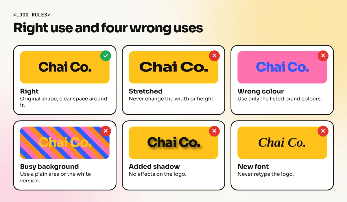
The wrong uses page is the most useful page in the book. Show the logo stretched, rotated, recoloured, with a shadow, on a busy photo and with a new font. Put a red cross on each.
Colour
List every colour with its name and all four values. Screen colours use RGB and HEX. Print uses CMYK. Many brands add a Pantone number for packaging. Our colour theory guide explains how to pick a palette. In the brand book, keep it to one main colour, one or two support colours and a few neutrals. Add a simple ratio, for example 60 percent neutral, 30 percent main and 10 percent accent.
Typography
Name two fonts at most. Give one for headings and one for body text. Then show real sizes: a heading at 32 pt, a subheading at 20 pt and body text at 11 pt, with line spacing. If the brand needs Hindi text, add a matching Devanagari font here so nobody guesses. Our guide to font pairing shows how to choose a pair that works.
Check the font licence. Many fonts are free to view but need a paid licence for commercial use. Write the licence note in the book.
Imagery and graphic elements
Describe the picture style in words and show six examples. For a Delhi sweet shop it might be "close warm photos of food on brass plates, natural light, no stock smiles". Add a "do not" row with two bad examples. Then show icons, patterns and shapes with their rules, for example "icons use a 2 px line and rounded ends".
Applications
Show the system at work. A brand book without real examples is a list of promises. Mock up a visiting card, a letterhead, a shop signboard, a packaging box and an Instagram post. Our social media post sizes guide helps you set up the templates at the right dimensions.
Tools to build a brand book
| Tool | Best for | Note |
|---|---|---|
| Adobe InDesign | A designed PDF with many pages | Paragraph and character styles keep the text consistent |
| Adobe Illustrator | A short 8 to 12 page book | Good when the book is mostly logos and shapes |
| Figma | A living guide the team edits | Share components and styles in one place |
| Canva | A simple guide for a small business | Easy for a client to update |
| Notion or a web page | Guides that change often | Always shows the latest version |
For most client work, build the book in InDesign and export a PDF. Our InDesign course covers page layout and styles, which is exactly the skill a brand book needs.
Mistakes that make brand guidelines useless
- Too long. A 60 page book that nobody opens is worse than a 12 page book people use.
- No numbers. "Use plenty of space" is not a rule. "Leave space equal to the letter N" is a rule.
- No files. If the team cannot find the logo file, they will take a screenshot from Google.
- Only pretty pictures. Add the codes and sizes that people actually need.
- No update date. Brands change. Put a version number on the cover and tell the team when it changes.
- Rules that nobody can follow. If the brand font is not free and the client will not buy it, give a fallback such as Arial or Calibri for everyday documents.
Test the book before you hand it over
Give the draft to someone who did not work on the project. Ask them to make a social post and a visiting card using only the book. Watch where they get stuck. Every question they ask is a missing page.
How to show a brand book in your portfolio
A brand book is strong portfolio proof because it shows you can build a system, not only a single design. Show three or four spreads as images, one full page of wrong uses and two real applications. Write a short note on the problem, your choices and what changed after testing. Our Behance portfolio guide shows how to present such a case study.
If you want to learn the full process under a mentor, from logo to layout to a finished brand book, look at our 6-month graphic design diploma. Students build complete identity projects for their portfolio.
Frequently asked questions
What is the difference between brand guidelines and a brand book?
Most designers use both words for the same thing. Some studios use "brand book" for a longer document that also holds the brand story and strategy; "brand guidelines" for the shorter rule list. Check what the client expects before you start.
How many pages should brand guidelines have?
A small business can manage with 10 to 20 pages. A company with many products or many regions may need 40 pages or more. Length matters less than clarity. If nobody reads page 30, cut it.
Which software is best for making brand guidelines?
Adobe InDesign is the usual choice for a PDF brand book because it handles pages, grids and styles well. Illustrator, Figma and Canva also work. Pick the tool the client's team can open and update later.
Can I make brand guidelines for a small shop?
Yes. A one-page style sheet with the logo, two colours, two fonts and a few examples is already a brand guideline. Add pages only when the business really needs them.