"Social Media Post Design: Layouts That Stop the Scroll"
Social media post design made simple. Learn 7 layouts, text size rules, colour tips and a 6-step process to make posts people stop and read, with tools to use.

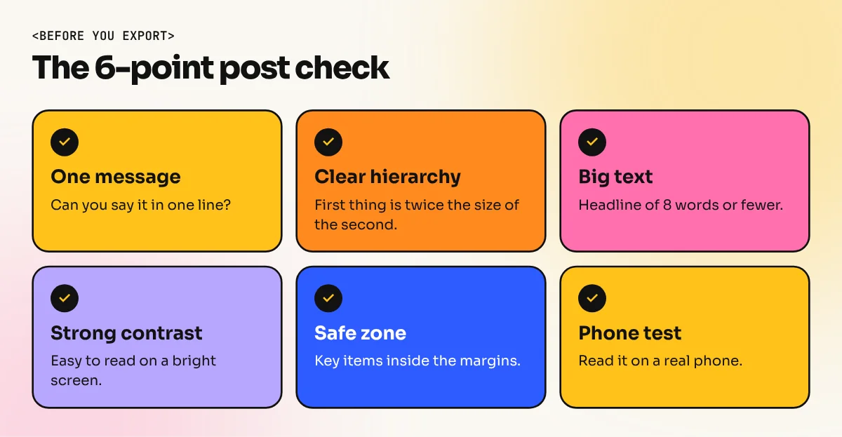
A good social media post has one message, one focal point and big readable text. Use a 4:5 portrait canvas, keep the headline under 8 words, limit yourself to two fonts and three colours and leave a clear space around the edges. Check the design on a phone before you post it.
Good social media post design comes down to one message, one focal point and text that is easy to read on a small phone screen. People scroll fast. Your post gets about a second to say "stop here". This guide shows the layouts that work, the text and colour rules to follow, a six-step process you can repeat every day and the mistakes that make a post look amateur.
Set the right canvas first. Our guide to social media post sizes lists every size. For feed posts, use 1080 x 1350 px.
The three jobs of a post
Every post has to do three things in order:
- Get noticed. A big picture, bold colour or short headline that wins a quick glance.
- Be understood. The message is clear in about three seconds.
- Ask for one action. Save, share, visit, call or buy. Not five of them.
If the design does the first job but not the second, people stop and then leave confused. Plan all three before you open any software.
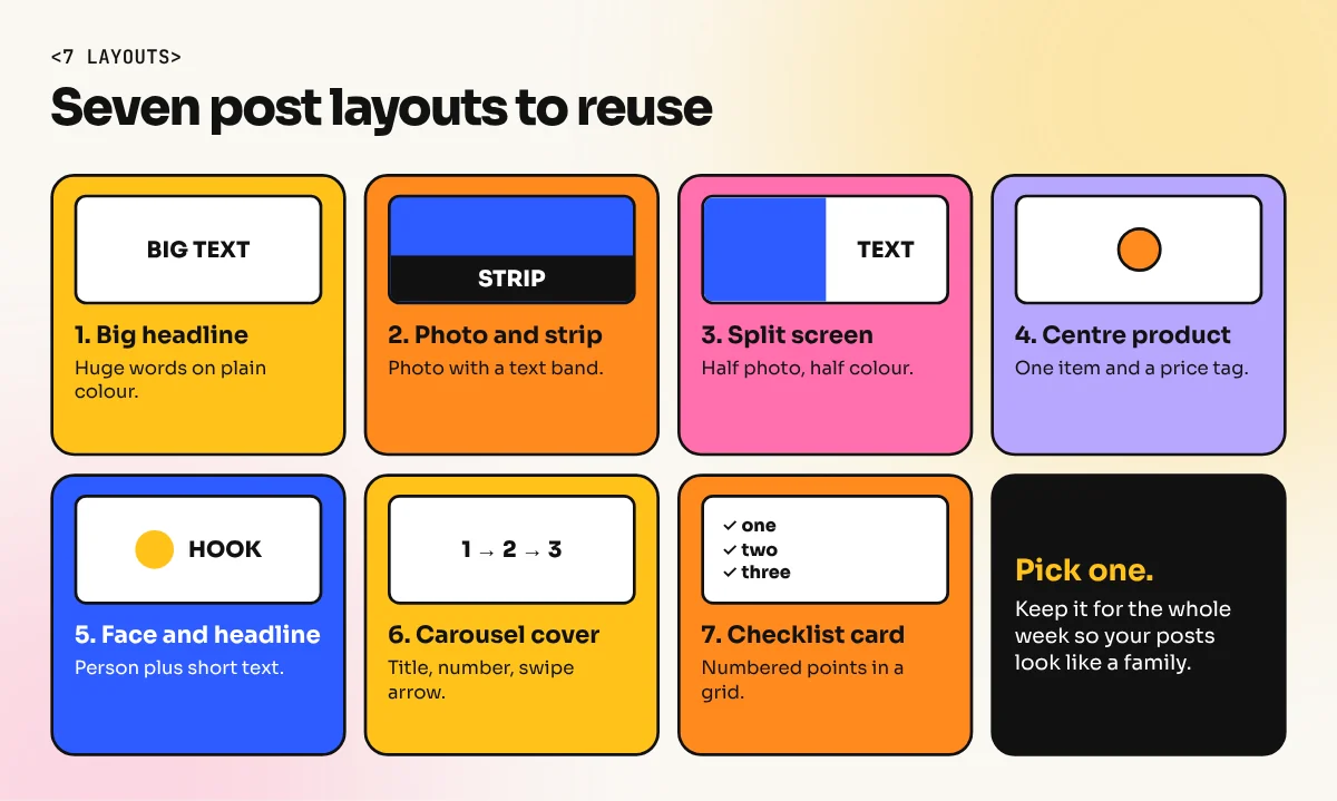
7 layouts you can use again and again
You do not need a new idea for every post. Designers keep a small set of layouts and change the content.
| Layout | How it looks | Best for |
|---|---|---|
| Big headline | Huge text on a plain colour | Quotes, offers, announcements |
| Photo with text strip | Full photo with a band of text at the bottom | Products, events |
| Split screen | Half photo and half colour with text | Before and after, comparisons |
| Centre product | One product on a clean background with a price tag | Shops and sales |
| Face and headline | A person looking at the viewer with short text | Personal brands, teachers |
| Carousel cover | Title, number and a swipe arrow | Tips and guides |
| Checklist card | Numbered points in a clean grid | Tips, steps, rules |
Visual hierarchy: what the eye reads first
Hierarchy means the viewer knows what to read first, second and third. In a post it usually runs like this:
- The picture or the biggest word.
- The headline or offer.
- The small support line.
- The logo and call to action.
Make the first thing at least twice as large as the second. Our visual hierarchy guide explains size, colour and position in more detail.
Text rules that work on a phone
Most people see your post on a screen about 6 inches tall. Design for that.
- Headline: 8 words or fewer. Put the key word in a different colour or weight.
- Size: If you design at 1080 px wide, keep headlines above about 60 px and support text above about 32 px. Check it on your own phone. If you have to squint, the text is too small.
- Fonts: Two at most. One bold font for headlines and one plain font for details. See our font pairing guide for safe pairs.
- Contrast: Dark text on a light background or the other way round. Avoid light grey on white and yellow on white.
- Alignment: Pick left aligned or centred and stay with it across the whole post.
- Hindi text: Use a font made for Devanagari so the letters keep their shape. Do not squeeze or stretch them.
Colour and brand consistency
Pick three colours: one main, one accent and one neutral. Use the accent only for the one thing you want noticed, like a price or a button. Our colour theory guide helps you build a palette.
If you post for a brand, write the colours, fonts and logo rules in one page. That is a small version of a brand book. It saves hours every month.
Carousel posts: a quick note
Carousels, the swipe posts, get saved and shared more often than single images on many accounts. Treat each slide as a small poster. Slide one is the hook: a short title and a swipe arrow. Slides two to eight carry one point each, with the same layout so the eye learns the pattern. The last slide holds the call to action and your logo. Keep the same background colour across slides so the set looks like one piece.
Safe zones: keep important things inside
Apps cover parts of your design with buttons, names and captions. Instagram also trims the profile grid preview to a 3:4 shape, so a 4:5 post can lose a thin strip at the top and bottom there. Keep logos, prices and headlines inside the middle of the canvas. Leave an even margin of at least 60 px on every side.
A 6-step process for each post
- Write the message in one line, for example "Diwali sale: flat 20 percent off on all kurtas".
- Pick a layout from the table above.
- Set the canvas at 1080 x 1350 px and add your brand colours and fonts.
- Place the focal point first: the photo, product or headline.
- Add the support text and logo. Remove anything that does not help the message.
- Test on a phone. Step back from your screen or shrink the preview. If the message still reads, export.
Tools to use
| Tool | Strength | Good for |
|---|---|---|
| Canva | Fast templates and team sharing | Daily posts, small business, beginners |
| Adobe Photoshop | Photo editing, cut-outs and effects | Product ads, photo-heavy posts |
| Adobe Illustrator | Clean vector shapes and logos | Icon and illustration posts |
| Figma | Shared components and templates | Teams who need many versions |
Beginners can start in Canva and move to Photoshop when they need more control. Our Canva course teaches fast, brand-safe post design. Our Photoshop course goes further into photo editing, cut-outs and ad layouts.
Mistakes that make a post look weak
- Too much text. If the post looks like a paragraph, move most of it to the caption.
- Too many fonts and colours. Two fonts and three colours are enough.
- A cluttered background. Text over a busy photo is hard to read. Add a solid band or a dark overlay.
- Logo too big. Your logo should be present but quiet. The message comes first.
- No clear action. Say what to do next in a few words, such as "Call today" or "Swipe for tips".
- Different look every time. A brand that changes style daily is hard to remember.
- Never testing on a phone. A design that looks great on a 24 inch monitor can fail on a small screen.
Practice plan for one week
Pick a local business, such as a chai stall or a bookshop. Design one post a day for seven days using a different layout each day. Keep the same colours and fonts. On day seven put all seven posts side by side. If they look like one family, you understand consistency. Put that set in your portfolio.
For a full path from layout basics to client-ready campaigns, see our 6-month graphic design diploma.
Frequently asked questions
What is the best size for a social media post design?
For Instagram and Facebook feeds, 1080 x 1350 px (4:5 portrait) is the best choice because it fills more of the phone screen. Use 1080 x 1920 px for Stories and Reels. Keep important text away from the edges.
How much text should a social media post have?
Keep the main headline to about 8 words or fewer. Put longer details in the caption. If a viewer cannot read the post in about 3 seconds, there is too much on it.
Which app is best for designing social media posts?
Canva is the quickest for beginners and teams. Photoshop gives full control over photos and effects. Illustrator suits logo and shape based posts. Pick one tool, learn it well and build templates.
How do I make my social media posts look professional?
Use the same colours, fonts and layout every time. Keep one message per post, use a strong visual hierarchy and leave empty space. A consistent look matters more than fancy effects.