Magazine Design: Covers, Grids and Page Layout for Beginners
Magazine design made simple: size, grid, cover, fonts and page layout steps in InDesign, plus print setup for India. Build your first magazine with a clear plan.
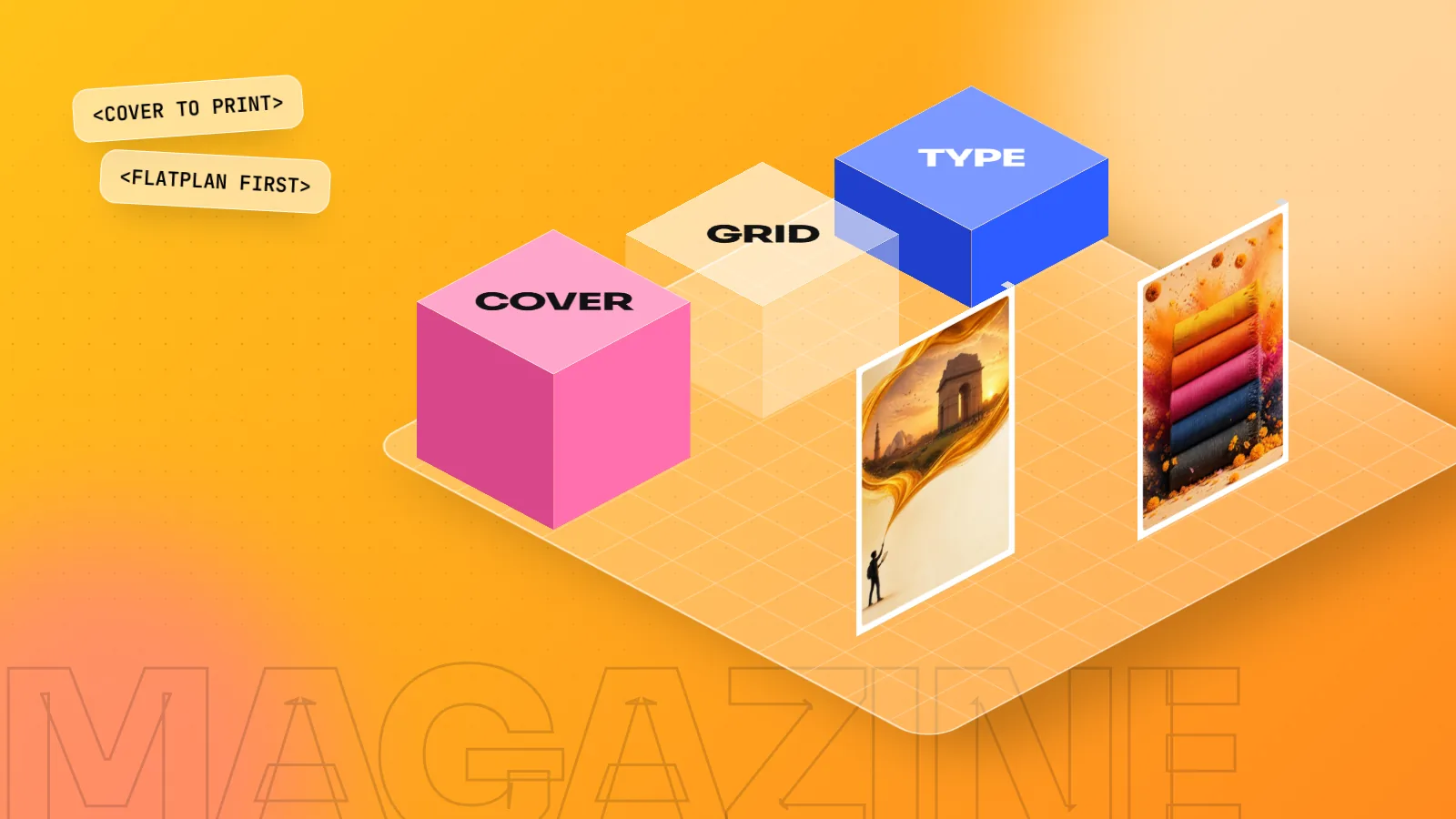
Magazine design is planning and laying out a multi-page publication so readers move easily from cover to contents to stories. Pick a trim size, build a column grid, set master pages and paragraph styles in InDesign, design a strong cover, then export a print-ready PDF with 3 mm bleed and CMYK colour.
Magazine design is the work of planning a publication so that readers enjoy moving from the cover to the contents page to every story. It covers the page size, the grid, the fonts, the colours, the cover and the print file. This beginner guide shows you how a magazine is built and gives you a clear step-by-step plan you can follow in InDesign.
What magazine design really includes
A poster is one page. A magazine is many pages that must feel like one family. That is the big difference.
When you design a magazine you make three kinds of decisions:
- Structure. How many pages, what sections, what goes where.
- System. The grid, fonts, colours and styles that repeat on every page.
- Moments. The cover, the opening page of each story and the big photo spreads that make people stop and look.
The system keeps the magazine neat. The moments keep it exciting. Beginners often only design moments and the magazine ends up looking messy. Good magazine design needs both.
It builds on ideas from our guides to layout design and the grid system in graphic design.
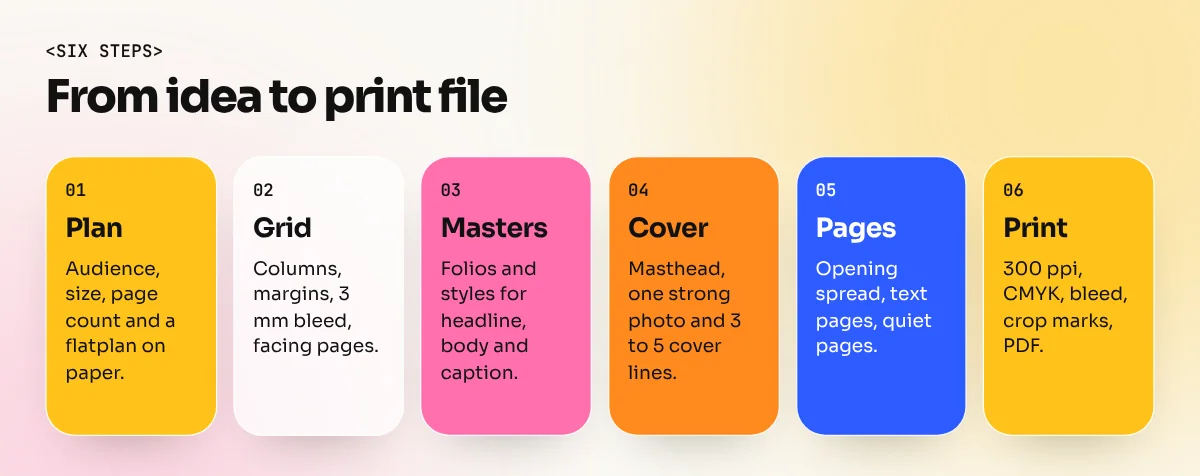
Step 1: Plan the magazine before opening any software
Spend your first hour on paper. Decide these things:
| Decision | Common choice | Why it matters |
|---|---|---|
| Audience | College students, a brand's customers, a resident society | Decides tone, fonts and photo style |
| Trim size | A4 (210 x 297 mm) or A5 (148 x 210 mm) | Fixes your grid and your printing cost |
| Page count | A multiple of 4, such as 16, 24 or 32 | Pages are printed on folded sheets |
| Sections | Cover, contents, 3 to 5 features, one interview, back cover | Gives readers a clear path |
| Binding | Saddle stitch (staples) for thin books, perfect binding (glued spine) for thick ones | Decides spine width and margins |
Draw a flatplan. It is a small sheet with one box for each page, where you write what goes on each page. A flatplan lets you see the rhythm: a big photo page, then a text page, then a quiet page, then a big photo page again.
Step 2: Build the grid and margins
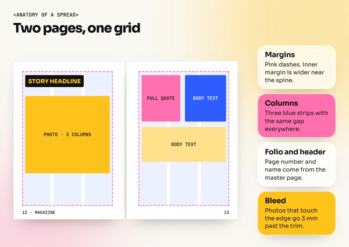
A column grid is what lets you place text and images quickly without guessing. For an A4 magazine, a good starting point is:
- 3 columns for a calm, readable page, or 4 to 6 columns for a busy, fashion-style page.
- Inside margins a little wider than outside margins, because the page curls near the spine.
- A baseline grid so lines of text in different columns sit on the same invisible lines.
- 3 mm bleed on every side for any image or colour that touches the edge.
Adobe's InDesign help explains how to set columns, margins and bleed in the New Document box. Tick Facing Pages so you work in spreads the way readers see them.
Step 3: Set up master pages and styles
This step saves you hours. It is also the step that separates a student layout from a professional one.
Master pages hold items that repeat: page numbers (folios), the magazine name, thin lines and guides. Build them once and every page copies them.
Paragraph styles store text settings. Make a small set:
- Headline
- Standfirst (the short intro under the headline)
- Body text
- Pull quote
- Caption
- Byline
Now if the editor says "make body text a little smaller", you change one style and the whole magazine updates.
For body text, a font between 8.5 and 10 pt with comfortable line spacing is a common range for print magazines. Our guides to font pairing and typography in graphic design will help you choose fonts that work together.
Step 4: Design the cover
The cover is your advertisement. On a stand at a railway station or a bookshop, it has only a few seconds to win attention.
A magazine cover usually has these parts:
| Part | What it does | Tip |
|---|---|---|
| Masthead | The magazine's name | Keep it big, same place every issue |
| Main image | One strong photo or illustration | The face or subject should not be hidden by text |
| Cover lines | Short headlines for inside stories | Use 3 to 5 with one clearly bigger than the rest |
| Issue date and price | Helps buyers and shops | Keep small and tidy |
| Barcode area | Needed if the magazine is sold in shops | Leave the space early |
| Spine | Shows on perfect-bound magazines | Add name and issue number |
A useful rule: let the masthead sit behind the head of the person in the photo so the face overlaps the first letters. It creates depth. Do this only when the name stays readable.
Choose two or three colours from the photo and use them for your cover lines. This makes the cover feel designed instead of decorated. See our colour theory guide if you want to pick palettes with confidence.
Step 5: Lay out the inside pages
Use a simple pattern for each feature story:
- Opening spread: a large photo, a big headline and a short standfirst.
- Text pages: body text in columns with one pull quote and one or two photos.
- Closing page: a final image or a small box with the next step for the reader.
A few habits that make pages look professional:
- Align everything to the grid. Let the biggest photo break the grid on purpose, but only the biggest.
- Keep captions close to the photo, always in the same style.
- Avoid a single word alone on the last line of a paragraph (a widow).
- Leave white space. Empty space makes a spread feel calm and premium.
- Use visual hierarchy: headline first, photo second, standfirst third, body text last. Our guide to visual hierarchy shows how.
Step 6: Prepare the print file
Printing is where many first magazines go wrong. Check this list before you send anything:
- All photos at 300 ppi at the size they are used.
- Colour mode CMYK for print, as your printer asks.
- 3 mm bleed and crop marks on the PDF.
- Fonts embedded or converted by the PDF export.
- Pages in the right order, with the page count matching the binding.
- Text kept inside a safe margin, away from the trim edge.
Export with the print preset your printer gives you. If they do not give one, ask. Our print-ready file checklist and the guide on CMYK vs RGB cover the same points in more detail.
Common beginner mistakes
- Using five or six fonts. Two or three are enough.
- Designing each page from scratch instead of using master pages and styles.
- Placing text over a busy photo without a dark or light overlay.
- Making every page equally loud. Mix busy pages with quiet pages.
- Forgetting bleed, so thin white lines show after trimming.
How to learn magazine design properly
You can learn the basics from this guide. To build a full portfolio piece you need practice with InDesign, Photoshop for photo correction and Illustrator for logos and icons. At our South Extension institute, the InDesign course covers multi-page layout, master pages and print export. The 6-month graphic design diploma puts it together with branding and portfolio projects.
A good first project: a 12-page magazine for a Delhi neighbourhood cafe or a college fest. Real content gives you real layout problems to solve.
The bottom line
Great magazine design is a system plus a few memorable moments. Plan with a flatplan, build a grid, set up master pages and styles. Make the cover simple and bold. Check the print file twice. Do these things and your first magazine will look like it came from a studio.
Frequently asked questions
Which software is best for magazine design?
Adobe InDesign is the standard. It handles many pages, master pages, text that flows between columns and print-ready PDF export. Photoshop is used to prepare photos and Illustrator for logos and icons.
What size should a magazine be?
A4 (210 x 297 mm) is the most common size for Indian print magazines because paper and printers are set up for it. Smaller formats such as A5 suit pocket or digest-style magazines. Always confirm the trim size with your printer before you start.
How many pages does a magazine have?
Pages are printed in sheets folded together, so the count is usually a multiple of 4. Student and small-brand magazines are often 16, 24 or 32 pages. Ask your printer which multiples work for the binding you choose.
Can I design a magazine in Canva?
You can make a simple digital magazine in Canva. For a printed magazine with many pages, tight text control and a print-ready PDF, InDesign is the better tool.